All the solutions provided in McGraw Hill My Math Grade 2 Answer Key PDF Chapter 9 Lesson 4 Make Bar Graphs will give you a clear idea of the concepts.
McGraw-Hill My Math Grade 2 Answer Key Chapter 9 Lesson 4 Make Bar Graphs
Explore and Explain
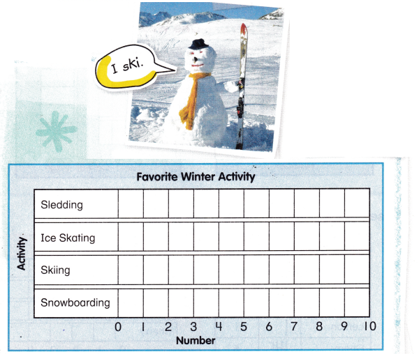
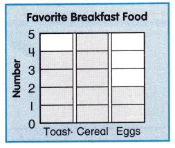
Our class likes ______________ the best.
Teacher Directions: Ask 10 classmates to pick their favorite winter activity. Color one square for each vote in the correct row. Write your classmates’ favorite activity.
Answer: Snowboarding has got highest votes.
Explanation:
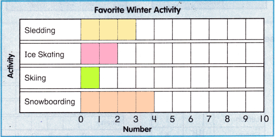
From the given Bar graph,
Sledding got 3 votes,
Ice skating got 2 votes,
Skiing got 1 vote,
Snowboarding got 4 votes,
So, Snowboarding has got highest votes.
See and Show
A bar graph uses bars to show data. To make a bar graph, color one box for each vote. Bar graphs can look different.
One Way
Another Way
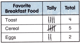
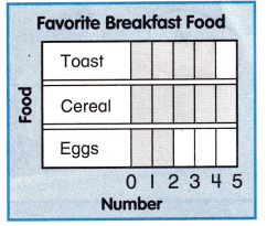
Use the tally chart to make a bar graph.
Question 1.
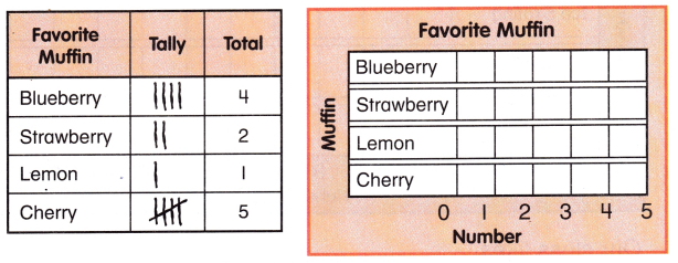
Answer: Cherry got most of the votes.
Explanation:
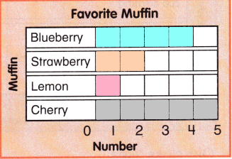
From the given bar graph,
Blueberry got 4 votes,
Strawberry got 2 votes,
Lemon got 1 vote
Cherry got 5 votes
So, Cherry got most of the votes.
Talk Math How are bar graphs different from picture graphs?
Answer: Bar graphs use bars and numbers to show information, and pictographs use pictures to show information. With a pictograph you need to count each time to find how many, but with a bar graph you can just look at the number.
On My Own
Complete the tally chart. Use the tally chart to make a bar graph.
Helpful Hint
Color 1 box for each tally mark.
Question 2.
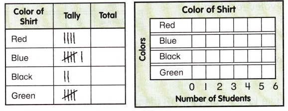
Answer: Both Blue and Green got equal votes.
Explanation:
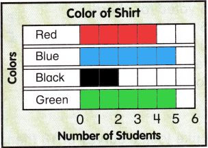
From, the given Bar graph,
Red got 4 votes
Blue got 5 votes
Black got 2 votes
Green got 5 votes,
So, Both Blue and Green got equal votes.
Question 3.
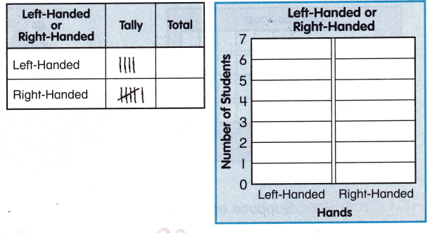
Answer: Right handed people got more votes.
Explanation:
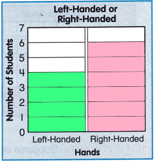
From the given bar graph,
Left handed people got 4 votes,
Right handed people got 6 votes,
So, Right handed people got more votes.
Problem Solving
Use the data to fill in the bar graphs.
Question 4.
Alyssa took a survey to find which juice pop flavor 15 friends like. 6 voted for cherry. 5 voted for grape. 2 voted for orange. The rest of her friends voted for lime.
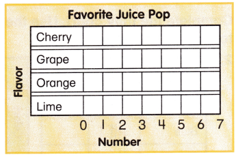
Answer:
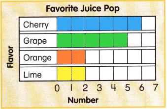
From the Given data,
Alyssa took a survey to find which juice pop flavor 15 friends like. 6 voted for cherry. 5 voted for grape. 2 voted for orange. The rest of her friends voted for lime.
The bar graph has Shown that,
Lime has got 2 votes.
Question 5.
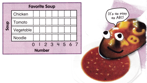
Luke took a survey of 18 friends to find their favorite soup. 4 voted for chicken soup. 6 voted for vegetable. The same number voted for tomato soup and noodle soup.
Answer: Vegetable soup has the highest votes.
Explanation:
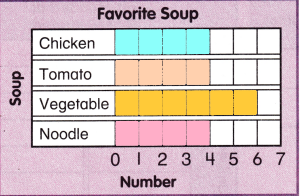
From the bar graph
Given, Luke took a survey of 18 friends to find their favorite soup.
4 voted for chicken soup. 6 voted for vegetable.
The same number voted for tomato soup and noodle soup.
So, Vegetable soup has the highest votes.
HOT Problem Suppose each square in the Favorite Soup graph above was worth 2 votes. How would your bar graph change?
Answer: Still Vegetable soup has the highest votes.
Explanation:
If each square in the Favorite Soup graph above was worth 2 votes, then
McGraw Hill My Math Grade 2 Chapter 9 Lesson 4 My Homework Answer Key
Practice
Use the tally chart to make a bar graph.
Helpful Hint
Color 1 box for each tally mark.
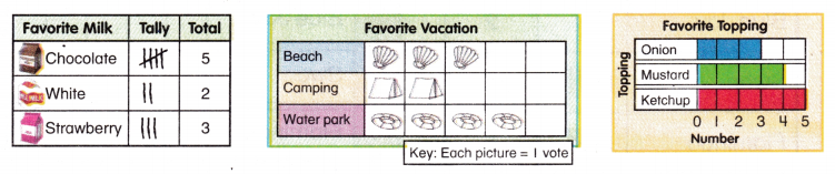
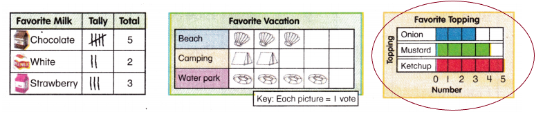
Question 1.
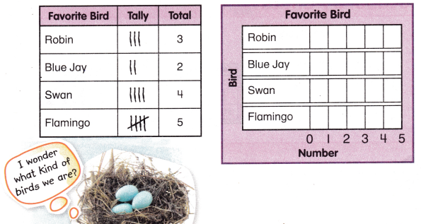
Answer: Flamingo got highest votes
Explanation:
From the given tally chart,
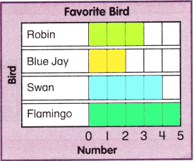
So, Flamingo got highest votes
Question 2.
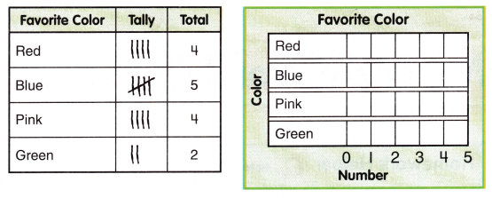
Answer: Blue got the highest votes
Explanation:
From the given tally chart
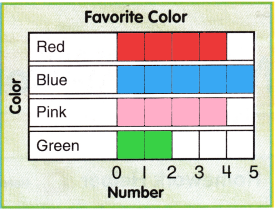
So, Blue got the highest votes
Use the data to fill in the bar graph.
Question 3.
15 people voted on their favorite field trip. 2 voted for the symphony. 5 voted for the zoo. The same number voted for the museum and the aquarium.
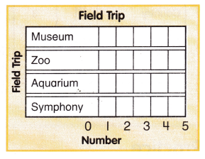
Answer: Zoo got the highest votes.
Explanation:
From the given data,
15 people voted on their favorite field trip.
2 voted for the symphony. 5 voted for the zoo. The same number voted for the museum and the aquarium.
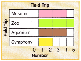
So, Zoo got the highest votes
Vocabulary Check
Question 4.
Circle the bar graph.
Answer: A bar graph can be defined as a chart or a graphical representation of data, quantities or numbers using bars or strips
Explanation:
Math at Home Help your child make a bar graph of the type of weather he or she sees for a week.
Answer: Rainy weather got the highest votes.
Explanation:
For example,
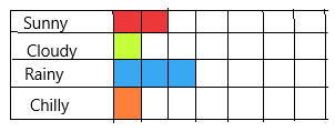
Sunny day got 2 votes
Cloudy day got 1 vote,
Rainy day got 3 vote,
Chilly day got 1 vote,
So, Rainy weather got the highest votes.