All the solutions provided in McGraw Hill My Math Grade 2 Answer Key PDF Chapter 9 Lesson 3 Analyze Picture Graphs will give you a clear idea of the concepts.
McGraw-Hill My Math Grade 2 Answer Key Chapter 9 Lesson 3 Analyze Picture Graphs
Explore and Explain
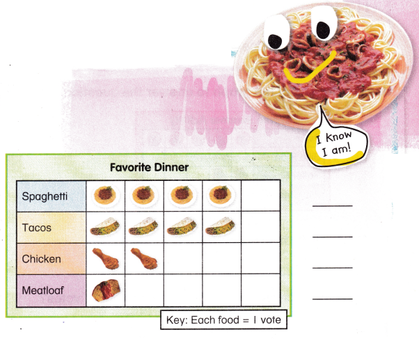
Which dinner is the least favorite? ______________
Answer: Meat loaf is the least favorite
Teacher Directions: Use the data in the picture graph. Write the number of votes for each dinner. Write the least favorite dinner.
Answer: Meat loaf is the least favorite dinner.
Explanation:
From the given Picture graph,
Spaghetti got 4 votes
Tacos got 4 votes
Chicken 2 votes
meatloaf 1 vote,
So, Meat loaf is the least favorite dinner.
See and Show
You can use a picture graph to answer questions.
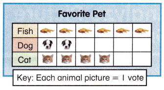
What pet is the favorite?
![]()
How many votes does each picture show? ![]()
Use the data from the graph to answer the questions.
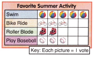
Question 1.
What activity is liked the least?
Answer: Roller Blade is the least liked Activity
Explanation:
From the given Picture graph,
Roller Blade got 2 votes
So, Roller Blade is the least liked Activity
Question 2.
Which two activities have the same number of votes?
Answer: Bike ride and Play Baseball got same number of votes.
Explanation:
From the given Picture graph,
Bike ride got 3 votes and
Play baseball got 3 votes
So, Bike ride and Play Baseball got same number of votes.
Question 3.
How many people like to swim and play baseball in all?
Answer: 8 people like to swim and play baseball.
Explanation:
From the given Picture graph,
Swim got 5 votes
Play base ball got 3 votes
So, 8 people like to swim and play baseball.
Talk Math How would you count the votes for bike riding if each picture stood for 2 votes?
Answer: Bike riding would get 6 votes
Explanation:
From the given Picture graph,
Bike riding got 3 pictures
If each picture would get 2 votes then,
3 pictures gets 6 votes
So, Bike riding would get 6 votes
On My Own
Use the data from the graph to answer the questions.
Question 4.
How do most students get to school?
Answer: Most students get to school by walk
Explanation:
From the given Picture graph,
Walk got 5 votes, which is the highest of all
So, Most students get to school by walk.
Question 5.
How many students ride the bus and ride in cars?
Answer: 4 Students ride the bus and ride in cars
Explanation:
From the given Picture graph,
Bus got 2 votes
Car got 2 votes
So, 4 Students ride the bus and ride in cars.
Question 6.
How many students voted?
Answer: Totally 10 students have voted.
Explanation:
From the given Picture graph,
Bus got 2 votes
Walk got 5 votes
Bike got 1 vote
Car got 2 votes
So, Totally 10 students have voted.
Question7.
How will the graph change if you add another way to get to school?
Answer: No change
Explanation:
From the given Picture graph,
Because all means of possibilities have shown in the graph,
So, there will be no change if we add another way to get to school.
Question 8.
Write a question that can be answered using the data in the picture graph.
Answer: How do most students get to school?
Explanation:
For example,
How do most students get to school?
Then Answer will be, From the given Picture graph,
Walk got 5 votes, which is the highest of all
So, Most students get to school by walk.
Question 9.
Write a number sentence you can use to answer your question.
![]()
Answer: 2 + 2 = 4
Explanation:
For example, How many students ride the bus and ride in cars?
From the given Picture graph,
Bus got 2 votes
Car got 2 votes
2 + 2 = 4 .
So, 4 Students ride the bus and ride in cars.
Problem Solving
Use the data from the graph to answer the questions.
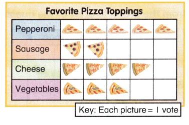
Question 10.
Three more people were surveyed. They all like cheese. What topping is now the favorite?
Answer: Cheese will be the favorite topping
Explanation:
From the given Picture graph,
Cheese got 4 votes,
Given, Three more people were surveyed. They all like cheese.
Then , it will be 4 + 3 = 7 votes
So, Cheese will be the favorite topping
Question 11.
Carter voted for cheese. Kylie voted for vegetables. Whose favorite pizza topping got more votes?
Answer: Carter favorite pizza topping got more votes
Explanation:
From the given Picture graph,
Cheese got 4 votes
Vegetable got 3 votes,
If Carter voted for cheese. Kylie voted for vegetables.
Then, Cheese got 4 votes + 1 vote = 5 votes
So, Carter favorite pizza topping got more votes
Write Math Write a question about the graph above. Have a friend answer the question.
Answer: both sausages and cheese got 6 votes.
Explanation:
From the given Picture graph,
Example will be,
How many people like both sausages and cheese
Answer will be, sausages got 2 votes and cheese got 4 votes
So, both sausages and cheese got 6 votes
McGraw Hill My Math Grade 2 Chapter 9 Lesson 3 My Homework Answer Key
Practice
Use the data from the graph to answer the questions.
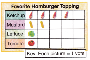
Question 1.
How many people voted?
Answer: 8 people voted
Explanation:
From the given Picture graph,
Ketchup got 4 votes
Mustard got 2 votes
Lettuce got 1 vote
Tomato got 1 vote
So, 8 people voted
Question 2.
Which topping got the most votes?
Answer: Ketchup got the most votes.
Explanation:
From the given Picture graph,
Ketchup got 4 votes,
So, Ketchup got the most votes.
Question 3.
Which two toppings got the least votes?
Answer: Lettuce and Tomato got the least votes
Explanation:
From the given Picture graph,
Lettuce got 1 vote
Tomato got 1 vote
So, Lettuce and Tomato got the least votes
Question 4.
How many people like ketchup or tomato?
Answer: 5 people like ketchup or tomato
Explanation:
From the picture graph,
Ketchup got 4 votes
tomato got 1 vote
So, 5 people like ketchup or tomato
Use the data from the graph to answer the questions.
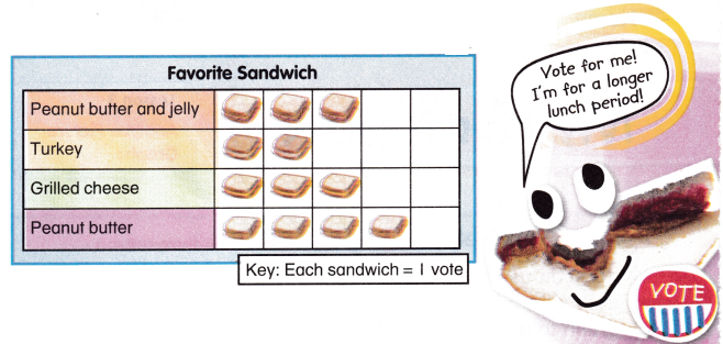
Question 5.
How many people voted for turkey or grilled cheese?
Answer: 5 people voted for turkey or grilled cheese
Explanation:
From the given picture graph,
turkey got 2 votes
grilled cheese got 3 votes
So, 5 people voted for turkey or grilled cheese
Question 6.
Maria voted for peanut butter. She really wanted to vote for peanut butter and jelly. How would that change the picture graph?
Answer: Peanut butter and jelly would got the highest votes
Explanation:
From the given picture graph,
peanut butter has 4 votes
Peanut butter and jelly has 3 votes
If, Maria voted for peanut butter. She really wanted to vote for peanut butter and jelly.
So, Peanut butter and jelly would got the highest votes.
Test Practice
Question 7.
In the graph above, how many more people like grilled cheese than turkey?
(A) 1
(B) 2
(C) 4
(D) 7
Answer: A
Explanation:
From the given graph,
Turkey got 2 votes,
grilled cheese got 3 votes,
So, grilled cheese got 1 vote more than turkey
Math at Home Create a picture graph for your child about your family’s favorite activities. Ask your child questions about the data on the graph.
Answer: The detailed example is given below,
Explanation:
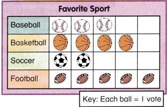
Base ball got 3 votes
Basket ball got 4 votes
Soccer got 2 votes
Foot ball got 5 votes,
So, Football got highest votes.