Big Ideas Math Answers Grade 6 Chapter 10 Data Displays: Free step by step solutions to Big Ideas Math Answers Grade 6 Chapter 10 Data Displays are available here. You can learn the concepts of Stem and leaf plot, histogram, shapes of distribution, Box and Whisker plots in an easy manner. Hence Download Answer Key of Big Ideas Math 6th Grade Chapter 10 Data Displays for free of cost. Start practicing the Big Ideas Math Answers Grade 6 Data Displays problems and score good marks in the exams.
Big Ideas Math Book 6th Grade Answer Key Chapter 10 Data Displays
Solve the problems on Data Displays listed below and become a master in maths. I know it is difficult for parents to explain the homework problems. So, in order to help them, we are providing the solutions for BIM Math 6th Grade Answer Key Chapter 10 Data Displays. Make use of the Big Ideas Math Grade 6 Solution Key and make your child completer their homework in time.
Performance Task
Lesson 1 – Stem-and-Leaf Plots
Lesson 2 – Histograms
Lesson 3 – Shapes of Distributions
Lesson 4 – Choosing Appropriate Measures
Lesson 5 – Box-and-Whisker Plots
Data Displays
- Data Displays Connecting Concepts
- Data Displays Chapter Review
- Data Displays Practice Test
- Data Displays Cumulative Practice
Data Displays STEAM Video/Performance Task
STEAM Video
Choosing a Dog
Different animals grow at different rates. Given a group of puppies, describe an experiment that you can perform to compare their growth rates. Describe a real-life situation where knowing an animal’s growth rate can be useful.
Watch the STEAM Video “Choosing a Dog.” Then answer the following questions.
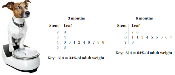
1. Using Alex and Tony’s stem-and-leaf plots below, describe the weights of most dogs at 3 months of age and 6 months of age.
Answer:
Weight of dogs at 3 months:
29, 34, 40, 40, 41, 42, 44, 46, 47, 48, 48, 53
Weight of dogs at 6 months:
57, 58, 61, 61, 63, 64, 65, 65, 65, 66, 67, 73
2. Make predictions about how the stem-and-leaf plot will look after 9 months and after 1 year.
Weight of dogs at 9 months
77, 78, 81, 81, 83, 84, 85, 85, 85, 86, 87, 91
Weight of dogs at 1 year
87, 88, 89, 93, 94, 95, 95, 95, 95, 96, 97, 99
Performance Task
Classifying Dog Breeds by Size
After completing this chapter, you will be able to use the concepts you learned to answer the questions in the STEAM Video Performance Task. You will be given names, breeds, and weights of full-grown dogs at a shelter.

You will use a data display to make conclusions about the sizes of dogs at the shelter. Why might someone be interested in knowing the sizes of dogs at a shelter?
Answer:
Because they need time to adjust.
You can buy the dog shelter based on the height and weight of the dogs.
Data Displays Getting Ready for Chapter 10
Chapter Exploration
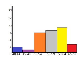
Work with a partner. A famous data set was collected in Scotland in the mid-1800s. It contains the chest sizes(in inches) of 5738 men in the Scottish Militia.
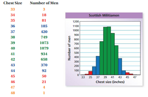
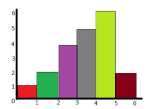
1. Describe the shape of the bar graph shown above.
Answer: The shape of the above graph is Histogram.
2. Which of the following data sets have a bar graph that is similar in shape to the bar graph shown above? Assume the sample is selected randomly from the population. Explain your reasoning.
a. the heights of 500 women
b. the ages of 500 dogs
c. the last digit of 500 phone numbers
d. the weights of 500 newborn babies
Answer: The last digit of 500 phone numbers is similar in shape to the bar graph shown above.
3. Describe two other real-life data sets, one that is similar in shape to the bar graph shown above and one that is not.
Answer: The height of 500 students in the school and age of students in the classroom.
Vocabulary
The following vocabulary terms are defined in this chapter. Think about what each term might mean and record your thoughts.
stem-and-leaf plot
box-and-whisker plot
frequency table
five-number summary
Answer:
i. stem-and-leaf plot: A stem-and-leaf display or stem-and-leaf plot is a device for presenting quantitative data in a graphical format, similar to a histogram, to assist in visualizing the shape of a distribution.
ii. A box and whisker plot—also called a box plot—displays the five-number summary of a set of data. The five-number summary is the minimum, first quartile, median, third quartile, and maximum. In a box plot, we draw a box from the first quartile to the third quartile. A vertical line goes through the box at the median.
iii. In statistics, a frequency distribution is a list, table, or graph that displays the frequency of various outcomes in a sample. Each entry in the table contains the frequency or count of the occurrences of values within a particular group or interval.
iv. The five-number summary is a set of descriptive statistics that provides information about a dataset.
Lesson 10.1 Stem-and-Leaf Plots
EXPLORATION 1
Making a Data Display
Workwith a partner. The list below gives the ages of women when they became first ladies of the United States.

a. The incomplete data display shows the ages of the first ladies in the left column of the list above. What do the numbers on the left represent? What do the numbers on the right represent?
b. This data display is called a stem-and-leaf plot. What numbers do you think represent the stems? leaves? Explain your reasoning.
c. Complete the stem-and-leaf plot using the remaining ages.
Answer:
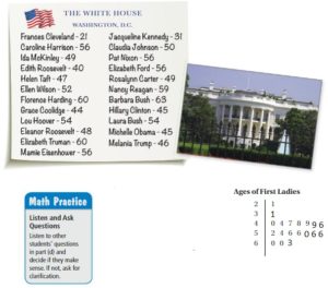
The tens place represents the stem and the ones place represents the leaf.
d. REASONING
Write a question about the ages of first ladies that is easier to answer using a stem-and-leaf plot than a dot plot.
Answer: Make the stem and leaf plot to find the ages of the first ladies.
By using the above data you can make the stem and leaf plot easily.
Key Idea
Stem-and-Leaf Plots
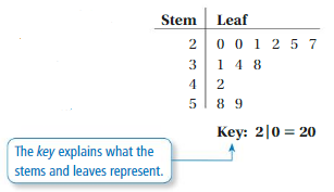
A stem-and-leaf plot uses the digits of data values to organize a data set. Each data value is broken into a stem(digit or digits on the left) and a leaf(digit or digits on the right).
A stem-and-leaf plot shows how data are distributed.
EXAMPLE 1
Making a Stem-and-Leaf Plot
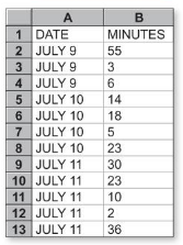
Make a stem-and-leaf plot of the lengths of the 12 phone calls.
Step 1: Order the data.
2, 3, 5, 6, 10, 14, 18, 23, 23, 30, 36, 55
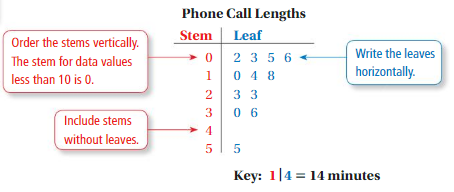
Step 2: Choose the stems and the leaves. Because the data values range from 2 to 55, use the tens digits for the stems and the ones digits for the leaves. Be sure to include the key.
Step 3: Write the stems to the left of the vertical line.
Step 4: Write the leaves for each stem to the right of the vertical line.
Try It
Question 1.
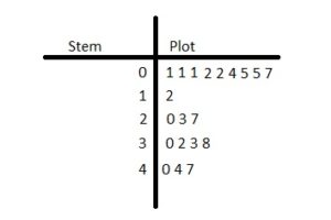
Make a stem-and-leaf plot of the hair lengths.

Answer:
Step 1: Order the data.
1, 1, 1, 2, 2, 4, 5, 5, 7, 12, 20, 23, 27, 30, 32, 33, 38, 40, 44, 47
Step 2: Choose the stems and the leaves. Because the data values range from 1 to 47, use the tens digits for the stems and the ones digits for the leaves. Be sure to include the key.
Step 3: Write the stems to the left of the vertical line.
Step 4: Write the leaves for each stem to the right of the vertical line.
EXAMPLE 2
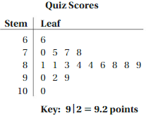
The stem-and-leaf plot shows student quiz scores. (a) How many students scored less than 8 points? (b) How many students scored at least 9 points? (c) How are the data distributed?
a. There are five scores less than 8 points:
6.6, 7.0, 7.5, 7.7, and 7.8.
Five students scored less than 8 points.10
b. There are four scores of at least 9 points:
9.0, 9.2, 9.9, and 10.0.
Four students scored at least 9 points.
c. There are few low quiz scores and few high quiz scores. So, most of the scores are in the middle, from 8.1 to 8.9 points.
Try It
Question 2.
Use the grading scale at the right.
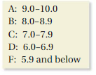
a. How many students received a B on the quiz?
Answer: There are 9 students who received a B on the quiz.
b. How many students received a C on the quiz?
Answer: There are 4 students who received a C on the quiz.
Self – Assessment for Concepts & Skills
Solve each exercise. Then rate your understanding of the success criteria in your journal.
Question 3.
MAKING A STEM-AND-LEAF PLOT
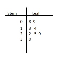
Make a stem-and-leaf plot of the data values 14, 22, 9, 13, 30, 8, 25, and 29.
Answer:
The ones represent the leaf and the tens place represent the stem.
Question 4.
WRITING
How does a stem-and-leaf plot show the distribution of a data set?
Answer:
02, 03, 1, 21, 26, 30, 34, 36, 44, 45, 48, 48, 49
Explanation:
A stem-and-leaf display or stem-and-leaf plot is a device for presenting quantitative data in a graphical format, similar to a histogram, to assist in visualizing the shape of a distribution.
Question 5.
REASONING
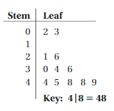
Consider the stem-and-leaf plot shown.
a. How many data values are at most 10?
Answer: By seeing the above stem and leaf plot we can find the data values of at most 10.
The data values less than or equal to 10 are 3.
b. How many data values are at least 30?
Answer: By seeing the above stem and leaf plot we can find the data values of at least 30.
The data values of less than 30 are 5.
c. How are the data distributed?
Answer: The data is distributed according to the stem and leaf plot. The tens place is given to the stem and the ones place is given to the leaf.
Question 6.
CRITICAL THINKING
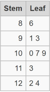
How can you display data whose values range from 82 through 129 in a stem-and-leaf plot?
Answer:
Given data range from 82 to 129
Considering 9 random values between 82 and 129.
From the data 86, 91, 93, 100, 107, 109, 113, 122, 124, stem and leaf are calculated for each number.
86 is split into 8 (stem) and 6 (leaf)
91 is split into 9 (stem) and 1 (leaf)
93 is split into 9 (stem) and 3 (leaf)
100 is split into 10 (stem) and 0 (leaf)
107 is split into 10 (stem) and 7 (leaf)
109 is split into 10 (stem) and 9 (leaf)
113 is split into 11 (stem) and 3 (leaf)
122 is split into 12 (stem) and 2 (leaf)
124 is split into 12 (stem) and 4 (leaf)
EXAMPLE 3
Modeling Real Life
The stem-and-leaf plot shows the heights of several houseplants. Use the data to answer the question, “What is a typical height of a houseplant?
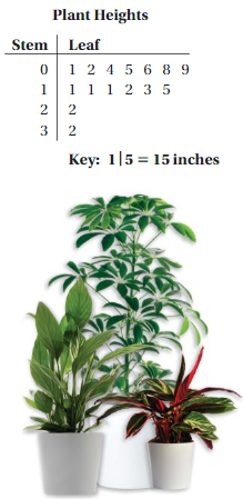
Find the mean, median, and mode of the data. Use the measure that best represents the data to answer the statistical question.
Mean: \(\frac{162}{15}\) = 10.8
Median: 11
Mode: 11
The mean is slightly less than the median and mode, but all three measures can be used to represent the data.
So, the typical height of a houseplant is about 11 inches.
Self-Assessment for Problem Solving
Solve each exercise. Then rate your understanding of the success criteria in your journal.
Question 7.
DIG DEEPER!
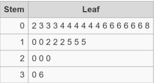
Work with a partner. Use two number cubes to conduct the following experiment. Then use a stem-and-leaf plot to organize your results and describe the distribution of the data.
• Toss the cubes and find the product of the resulting numbers. Record your results.
• Repeat this process 30 times.
Answer:
From the data 15,4,6,30,6,8,36,12,12,6,6,4,15,10,4,2,20,3,15,6,4,6,3,10,3,20,4,12,4,20.
Stem and leaf are calculated for each number.
15 is split into 1 (stem) and 5 (leaf)
04 is split into 0 (stem) and 4 (leaf)
06 is split into 0 (stem) and 6 (leaf)
30 is split into 3 (stem) and 0 (leaf)
06 is split into 0 (stem) and 6 (leaf)
08 is split into 0 (stem) and 8 (leaf)
36 is split into 3 (stem) and 6 (leaf)
12 is split into 1 (stem) and 2 (leaf)
12 is split into 1 (stem) and 2 (leaf)
06 is split into 0 (stem) and 6 (leaf)
06 is split into 0 (stem) and 6 (leaf)
04 is split into 0 (stem) and 4 (leaf)
15 is split into 1 (stem) and 5 (leaf)
10 is split into 1 (stem) and 0 (leaf)
04 is split into 0 (stem) and 4 (leaf)
02 is split into 0 (stem) and 2 (leaf)
20 is split into 2 (stem) and 0 (leaf)
03 is split into 0 (stem) and 3 (leaf)
15 is split into 1 (stem) and 5 (leaf)
06 is split into 0 (stem) and 6 (leaf)
04 is split into 0 (stem) and 4 (leaf)
06 is split into 0 (stem) and 6 (leaf)
03 is split into 0 (stem) and 3 (leaf)
20 is split into 2 (stem) and 0 (leaf)
04 is split into 0 (stem) and 4 (leaf)
12 is split into 1 (stem) and 2 (leaf)
04 is split into 0 (stem) and 4 (leaf)
20 is split into 2 (stem) and 0 (leaf)
Question 8.
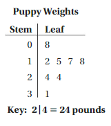
The stem-and-leaf plot shows the weights (in pounds) of several puppies at a pet store. Use the data to answer the question, “How much does a puppy at the pet store weigh?
Answer:
We can use the mean of the data. To find the mean, add the data then divide the sum of the number of data
(8+12+15+17+18+24+24+31)/8 = 149/8 = 18.625
To the nearest pound, a puppy weighs about 19 pounds
Stem-and-Leaf Plots Homework & Practice 10.1
Review & Refresh
Find and interpret the mean absolute deviation of the data.
Question 1.
8, 6, 8, 5, 3, 10, 11, 5, 7
Answer:
First, arrange the given values in the ascending order.
3, 5, 5, 6, 7, 8, 8, 10, 11
We find the mean of the data
mean = (3 + 5 + 5 + 6 + 7 + 8 + 8 + 10 + 11)/9
mean = 7
Question 2.
55, 46, 39, 62, 55, 51, 48, 60, 39, 45
Answer:
First, arrange the given values in the ascending order.
39, 39, 45, 46, 48, 51, 55, 55, 60, 62
We find the mean of the data
mean = (39 + 39 + 45 + 46 + 48 + 51 + 55 + 55 + 60 + 62)/10
mean = 50
Question 3.
37, 54, 41, 18, 28, 32
Answer:
First, arrange the given values in the ascending order.
18, 28, 32, 37, 41, 54
We find the mean of the data
mean = (18+28+32+37+41+54)/6
mean = 35
Question 4.
12, 25, 8, 22, 6, 1, 10, 4
Answer:
First, arrange the given values in ascending order.
1, 4, 6, 8, 10,12, 22, 25
mean = (1+ 4 + 6 + 8 + 10 + 12 + 22 + 25)/8
mean = 11
Use the Distributive Property to simplify the expression.
Question 5.
5(n + 8)
Answer: 5n + 40
Explanation:
5(n + 8) = 5 × n + 5 × 8
5n + 40
Question 6.
7(y – 6)
Answer: 7y – 42
Explanation:
7(y – 6) = 7 × y – 7 × 6
7y – 42
Question 8.
14(2b + 3)
Answer: 28b + 42
Explanation:
14(2b + 3) = 14 × 2b + 14 × 3
28b + 42
Question 9.
11(9 + s)
Answer: 99 + 11s
Explanation:
11(9 + s) = 11 × 9 + 11 × s
99 + 11s
Solve the equation.
Question 9.
\(\frac{p}{2}\) = 8
Answer: 16
Explanation:
\(\frac{p}{2}\) = 8
p = 8 × 2
p = 16
Question 10.
28 = 6g
Answer: 4.66
Explanation:
28 = 6g
g = 28/6 = 4.66
Thus g = 4.66
Question 11.
3d ÷ 4 = 9
Answer: 12
Explanation:
3d ÷ 4 = 9
3d = 9 × 4
3d = 36
d = 36/3
d = 12
Thus d = 12
Question 12.
10 = \(\frac{2z}{3}\)
Answer:
Explanation:
10 = \(\frac{2z}{3}\)
10 × 3 = 2z
2z = 30
z = 30/2
z = 15
So, z = 15
Concepts, Skills, & Problem Solving
REASONING
Write a question that is easier to answer using the stem-and-leaf plot than a dot plot. (See Exploration 1, p. 457.)
Question 13.
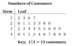
Answer:
Make a stem leaf plot to find the number of customers who visit your shop.
12, 13, 16, 17, 20, 21, 21, 23, 23, 28, 28, 32, 33, 34, 34, 35, 35, 36, 39, 39, 40, 41, 41, 42, 44, 46, 47, 48, 49, 49
Question 14.
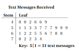
Answer:
Make the stem leaf plot to find the number of text messages you received per hour.
40, 40, 42, 46, 46, 49, 51, 51, 53, 53, 57, 57, 57, 59, 59, 59, 61, 62, 62, 65, 65, 66, 67, 68, 68, 70, 72, 72, 73, 74.
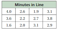
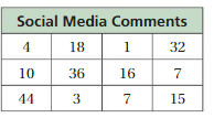
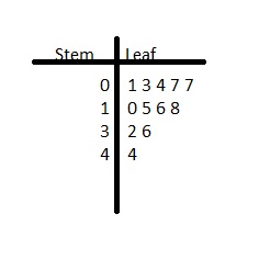
MAKING A STEM-AND-LEAF PLOT Make a stem-and-leaf plot of the data.
Question 15.
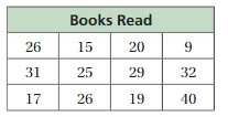
Answer:
We have to write the stem and leaf plot for the above table.
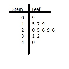
Question 16.
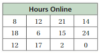
Answer:
We have to write the stem and leaf plot for the above table.

Question 17.
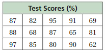
Answer:
We have to write the stem and leaf plot for the above table.
Question 18.
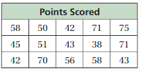
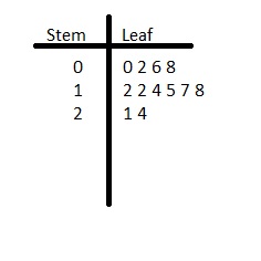
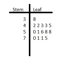
Answer:
We have to write the stem and leaf plot for the above table.
Question 19.
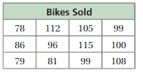
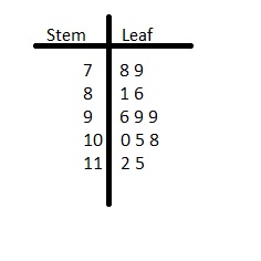
Answer:
We have to write the stem and leaf plot for the above table.
Question 20.
Answer:
We have to write the stem and leaf plot for the above table.
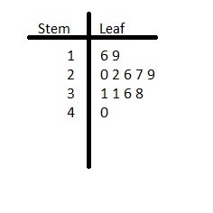
Question 21.
YOU BE THE TEACHER
Your friend makes a stem-and-leaf plot of the data. Is your friend correct? Explain your reasoning.
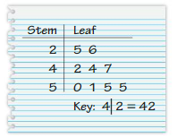
51, 25, 47, 42, 55, 26, 50, 44, 55
Answer: your friend is correct
Explanation:
In stem and leaf plot the tens place represent stem and the ones place represent the leaf.
MODELING REAL LIFE
The stem-and-leaf plot shows the numbers of confirmed cases of a virus in 15 countries.
Question 22.
How many of the countries have more than 60 confirmed cases?
Answer: 6 countries
Explanation:
By seeing the above stem and leaf plot we can find the number of cases more than 60.
The number of leaf represents the number of countries.
62, 63, 63, 67, 75, 97.
Thus there are 6 countries that have more than 60 confirmed cases.
Question 23.
Find the mean, median, mode, range, and interquartile range of the data.
Answer:
41, 41, 43, 43, 45, 50, 52, 53, 54, 62, 63, 63, 67, 75, 97
In its simplest mathematical definition regarding data sets, the mean used is the arithmetic mean, also referred to as mathematical expectation, or average.
Mean:
mean = (41+41+43+43+45+50+52+53+54+62+63+63+67+75+97)/15
mean = 56.6
Median:
In the odd cases where there are only two data samples or there is an even number of samples where all the values are the same, the mean and median will be the same.
41, 41, 43, 43, 45, 50, 52, 53, 54, 62, 63, 63, 67, 75, 97
So, the median of the given data is 53.
Mode:
The mode is the value in a data set that has the highest number of recurrences.
41, 41, 43, 43, 45, 50, 52, 53, 54, 62, 63, 63, 67, 75, 97
mode = 41, 43, 63 (Repeated 2 times)
Question 24.
How are the data distributed?
Answer:
The distribution of a data set is the shape of the graph when all possible values are plotted on a frequency graph. Usually, we are not able to collect all the data for our variable of interest.
Question 25.
Which data value is an outlier? Describe how the outlier affects the mean.
Answer:
Outliers affect the mean value of the data but have little effect on the median or mode of a given set of data.
Example: A student receives a zero on a quiz and subsequently. has the following scores: 0, 70, 70, 80, 85, 90, 90, 90, 95, 100. Outlier: 0.
Question 26.
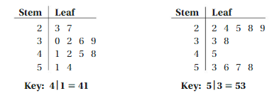
REASONING
Each stem-and-leaf plot below has a mean of 39. Without calculating, determine which stem-and-leaf plot has the lesser mean absolute deviation. Explain your reasoning.
Answer:
i. 23, 27, 30, 32, 36, 39, 41, 42, 45, 48, 51, 54
Mean = (23+27+30+32+36+39+41+42+45+48+51+54)/12
Mean = 39
The mean absolute deviation is 7.833
ii. 22, 24, 25, 28, 29, 33, 38, 45, 53, 56, 57, 58
Mean = (22+24+25+28+29+33+38+45+53+56+57+58)/12
Mean = 39
The mean absolute deviation is 12.333
Thus the first stem and leaf plot has the lesser mean absolute deviation.
Question 27.
DIG DEEPER!
The stem-and-leaf plot shows the daily high temperatures (in degrees Fahrenheit) for the first 15 days of June.
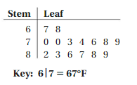
a. When you include the daily high temperatures for the rest of the month, the mean absolute deviation increases. Draw a stem-and-leaf plot that could represent all of the daily high temperatures for the month.
Answer:
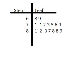
b. Use your stem-and-leaf plot from part(a) to answer the question, “What is a typical daily high temperature in June?”
Answer: 89°F is the high temperature in the month of June.
Question 28.
CRITICAL THINKING
The back-to-back stem-and-leaf plot shows the 9-hole golf scores for two golfers. Only one of the golfers can compete in a tournament as your teammate. Use measures of center and measures of variation to support choosing either golfer.
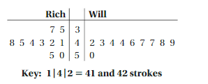
Answer:
The scores of Rich are
35, 37, 41, 42, 43, 44, 45, 48
The scores of Will are
42, 43, 44, 44, 46, 47, 47, 48, 49
Will can compete in the tournament.
Lesson 10.2 Histograms
EXPLORATION 1
Performing an Experiment
Work with a partner.
a. Make the airplane shown from a single sheet of 8\(\frac{1}{2}\) by-11-inch paper. Then design and make your own paper airplane.
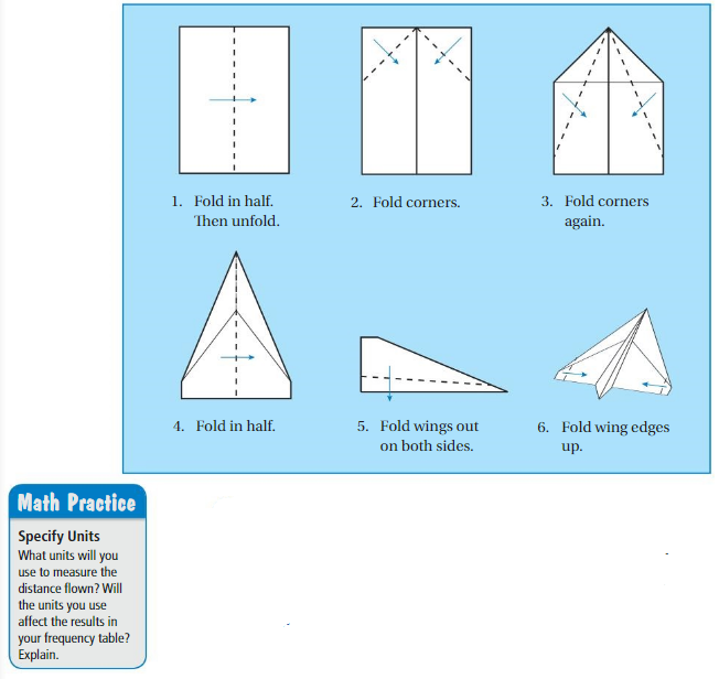
b. PRECISION
Fly each airplane 20 times. Keep track of the distance flown each time. Specify Units. What units will you use to measure the distance flown? Will the units you use affect the results in your frequency table? Explain.
c. A frequency table groups data values into intervals. The frequency is the number of values in an interval. Use a frequency table to organize the results for each airplane.
d. MODELING Represent the data in the frequency tables graphically. Which airplane flies farther? Explain your reasoning.
Answer:
Key Idea
Histograms
p. 463 frequency, A histogram is a bar graph that shows the frequencies of data values in intervals of the same size.
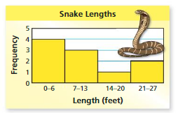
The height of a bar represents the frequency of the values in the interval.
EXAMPLE 1
Making a Histogram
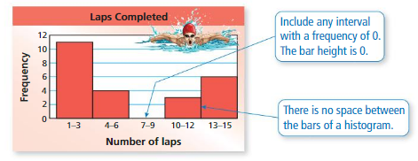
The frequency table shows the numbers of laps that people in a swimming class completed today. Display the data in a histogram.
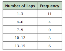
Step 1: Draw and label the axes.
Step 2: Draw a bar to represent the frequency of each interval.
Try It
Question 1.
The frequency table shows the ages of people riding a roller coaster. Display the data in a histogram.

Answer:
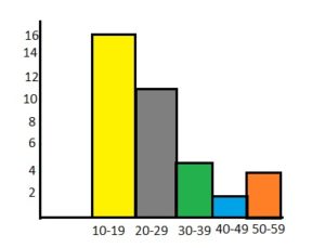
EXAMPLE 2
Using a Histogram
The histogram shows winning speeds at the Daytona 500.
(a) Which interval contains the most data values?
(b) How many of the winning speeds are less than 140 miles per hour?
(c) How many of the winning speeds are at least 160 miles per hour?
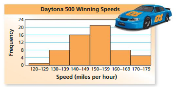
a. The interval with the tallest bar contains the most data values.
So, the 150−159 miles per hour interval contains the most data values.
b. One winning speed is in the 120−129 miles per hour interval, and eight winning speeds are in the 130−139 miles per hour interval.
So, 1 + 8 = 9 winning speeds are less than 140 miles per hour.
c. Eight winning speeds are in the 160−169 miles per hour interval, and five winning speeds are in the 170−179 miles per hour interval.
So, 8 + 5 =13 winning speeds are at least 160 miles per hour.
Try It
Question 2.
The histogram shows the numbers of hours that students in a class slept last night.
a. How many students slept at least 8 hours?
b. How many students slept less than 12 hours?

Answer:
A. Number of students who slept for 8 to 11 hours is 8.
Number of students who slept for 12 to 15 hours is 3.
The total number of students who slept for atleast 8 hours is 8.
B. Number of students who slept for 8 to 11 hours is 8.
Number of students who slept for 4 to 7 hours is 8.
Number of students who slept for 0 to 3 hours is 2.
Thus the number of students who slept for less than 12 hours is 8 + 8 + 2 = 18 students
EXAMPLE 3
Comparing Data Displays
The data displays show how many push-ups students in a class completed for a physical fitness test. Which data display can you use to find how many students are in the class? Explain.
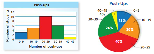
You can use the histogram because it shows the number of students in each interval. The sum of these values represents the number of students in the class. You cannot use the circle graph because it does not show the number of students in each interval.
Try It
Question 3.
Which data display should you use to describe the portion of the entire class that completed 30−39 push-ups? Explain.
Answer: You should use the percentage of the number of students in the interval of 30-39 to find the completed push-ups.
The portion of the entire class that completed 30−39 push-ups is 24%
Self-Assessment for Concepts & Skills
Solve each exercise. Then rate your understanding of the success criteria in your journal
Question 4.
MAKING A HISTOGRAM
The table shows the numbers of siblings of students in a class.
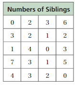
a. Display the data in a histogram.b. Explain how you chose reasonable intervals for your histogram in part
Answer:
Question 5.
NUMBER SENSE
Can you find the range and the interquartile range of the data in the histogram? If so, find them. If you cannot find them, explain why not.
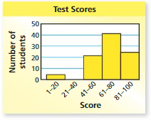
Answer:
EXAMPLE 4
Modeling Real Life made using the data displays in Example 3?
A. Twelve percent of the class completed 9 push-ups.
B. Five students completed at least 10 and at most 19 push-ups.
C. At least one student completed more than 39 push-ups.
D. Less than \(\frac{1}{4}\) of the class completed 30 or more push-ups.
The circle graph shows that12% completed 0−9 push-ups, but you cannot determine how many completed exactly 9. So, Statement A cannot be made.

In the histogram, the bar height for the 10−19 interval is 5, and the bar height for the 40−49 interval is 1. So, Statements B and C can be made.
The circle graph shows that24% completed 30−39 push-ups, and 4% completed 40−49 push-ups. So, 24% + 4% =28% completed 30 or more push-ups. Because \(\frac{1}{4}\) = 25% and 28% > 25%, Statement D cannot be made.
The correct answers are A and D.
Self-Assessment for Problem Solving
Solve each exercise. Then rate your understanding of the success criteria in your journal.
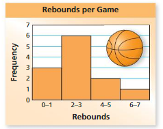
Question 6.
The histogram shows the numbers of rebounds per game for a middle school basketball player in a season.
a. Which interval contains the most data values?
b. 54 How many games did the player play during the season?
c. In what percent of the games did the player have 4 or more rebounds?
Answer:
Question 7.
Determine whether you can make each statement by using the histogram in the previous exercise.Explain.Rebounds
a. The basketball player had 2 rebounds in 6 different games.
b. The basketball player had more than 1 rebound in 9 different games
Answer:
Histograms Homework & Practice 10.2
Review & Refresh
Make a stem-and-leaf plot of the data.
Question 1.
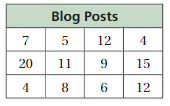
Answer:
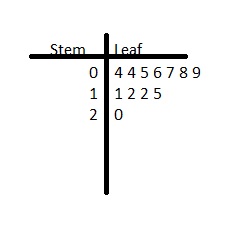
Question 2.
Answer:
Find the percent of the number.
Question 3.
25% of 180
Answer: 45
Explanation:
25% = 25/100
25/100 × 180
We get 45
So, 25% of 180 is 45.
Question 4.
30% of 90
Answer: 27
Explanation:
30% = 30/100
30/100 × 90 = 27
So, 30% of 90 is 27
Question 5.
16% of 140
Answer: 22.4
Explanation:
16% = 16/100
16/100 × 140 = 22.4
So, 16% of 140 is 22.4
Question 6.
64% of 807.
Answer: 516.48
Explanation:
64% = 64/100
64/100 × 807 = 516.48
So, 64% of 807 is 516.48
Question 7.
What is the least common multiple of 7 and 12?
A. 28
B. 42
C. 84
D. 168
Answer: 84
Explanation:
Find and list multiples of each number until the first common multiple is found. This is the lowest common multiple.
Multiples of 7:
7, 14, 21, 28, 35, 42, 49, 56, 63, 70, 77, 84, 91, 98
Multiples of 12:
12, 24, 36, 48, 60, 72, 84, 96, 108
Therefore,
LCM(7, 12) = 84
Thus the correct answer is option c.
Concepts, Skills, & Problem Solving
MAKING A FREQUENCY TABLE Organize the data using a frequency table. (See Exploration 1, p. 463.)
Question 8.
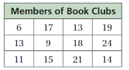
Answer:
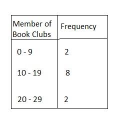
Question 9.
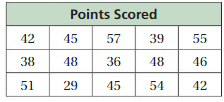
Answer:
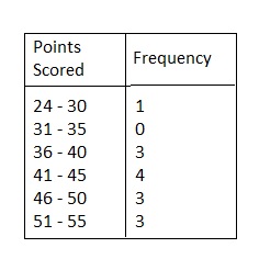
MAKING A HISTOGRAM Display the data in a histogram.
Question 10.
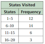
Answer:
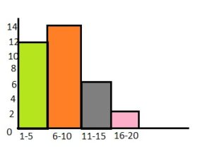
Question 11.
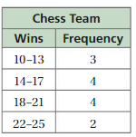
Answer:
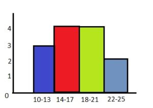
Question 12.
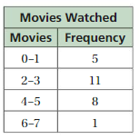
Answer:
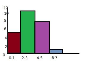
Question 13.
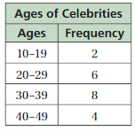
Answer:
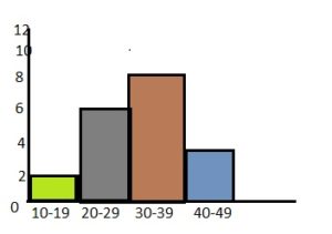
Question 14.
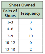
Answer:
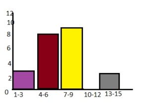
Question 15.
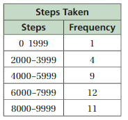
Answer:
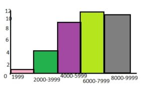
Question 16.
YOU BE THE TEACHER
Your friend displays the data in a histogram. Is your friend correct? Explain your reasoning.
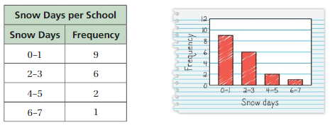
Answer: yes your friend is correct.
The frequency table matches the histogram.
Question 17.
MODELING REAL LIFE
The histogram shows the numbers of magazines read last month by the students in a class.
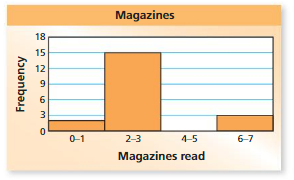
a. Which interval contains the fewest data values?
Answer: The interval 4-5 has the fewest data values.
b. How many students are in the class?
Answer:
0-1 = 2
2-3 = 15
4-5 = 0
6-7 = 3
2 + 15 + 3 = 20
c. What percent of the students read fewer than six magazines?
Answer: By seeing the above histogram we can say that 25% of the students read fewer than six magazines.
Question 18.
YOU BE THE TEACHER
Your friend interprets the histogram. Is your friend correct? Explain your reasoning.
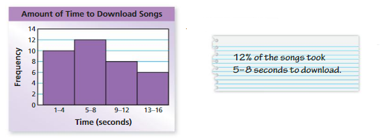
Answer:
Compare your friend with the above histogram.
By seeing the above histogram we can say that it took 12 seconds to download songs.
So, your friend is correct.
Question 19.
REASONING
The histogram shows the percent of the voting-age population in each state who voted in a presidential election. Explain whether the graph supports each statement.
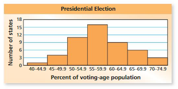
a. Only 40% of one state voted.
b. In most states, between 50% and 64.9% voted.
c. The mode of the data is between 55% and 59.9%
Answer:
Question 20.
PROBLEM SOLVING
The histograms show the areas of counties in Pennsylvania and Indiana. Which state do you think has the greater area? Explain.
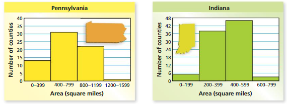
Answer:
Question 21.
MODELING REAL LIFE
The data displays show how many pounds of garbage apartment residents produced in 1 week. Which data display can you use to find how many residents produced more than 25 pounds of garbage? Explain.

Answer:
Question 22.
REASONING
Determine whether you can make each statement by using the data displays in Exercise 21. Explain your reasoning.
a. One resident produced 10 pounds of garbage.
b. Twelve residents produced between 20 and 29 pounds of garbage.
Answer:
Question 23.
DIG DEEPER!
The table shows the lengths of some whales in a marine sanctuary.
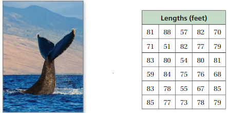
a. Make a histogram of the data starting with the interval 51−55.
b. Make another histogram of the data using a different-sized interval.
c. Compare and contrast the two histograms.
Answer:
Question 24.
LOGIC
Can you find the mean or the median of the data in Exercise 17? Explain.
Answer:
Lesson 10.3 Shapes of Distributions

EXPLORATION
Describing Shapes of Distributions
Work with a partner. The lists show the first three digits and last four digits of several phone numbers in the contact list of a cell phone.
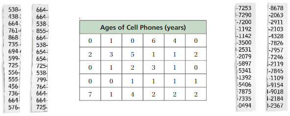
a. Compare and contrast the distribution of the last digit of each phone number to the distribution of the first digit of each phone number. Describe the shapes of the distributions.
b. Describe the shape of the distribution of the data in the table below. Compare it to the distributions in part(a).
Answer:
You can use dot plots and histograms to identify shapes of distributions.
Key Ideas
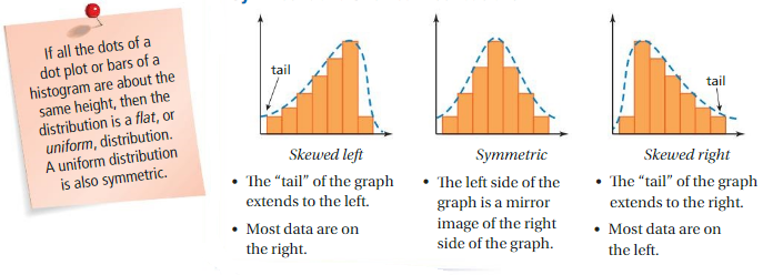
Symmetric and Skewed Distributions
EXAMPLE 1
Describing Shapes of Distributions
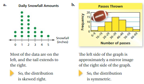
Describe the shape of each distribution.
Try It
Question 1.
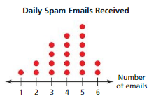
Describe the shape of the distribution.
Answer:
A symmetric distribution has a graph in which the left side is a mirror image of the right side.
A skewed distribution has a graph in which a “tail” extends to the left and most data are on the right OR a “tail” extends to the right and most data are on the left.
EXAMPLE 2
Describing the Shape of a Distribution
The frequency table shows the ages of people watching a comedy in a theater. Display the data in a histogram. Then describe the shape of the distribution.
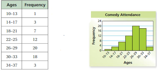
Draw and label the axes. Then draw a bar to represent the frequency of each interval.
Most of the data are on the right, and the tail extends to the left.
So, the distribution is skewed left.
Answer:
For a distribution that is skewed right, the tail extends to the right and most of the data are on the left side of the graph.
Try It
Question 2.
The frequency table shows the ages of people watching a historical movie in a theater. Display the data in a histogram. Describe the shape of the distribution.

Answer:
Self-Assessment for Concepts & Skills
Solve each exercise. Then rate your understanding of the success criteria in your journal.
Question 3.
WRITING
Explain in your own words what it means for a distribution to be (a) skewed left, (b) symmetric, and (c) skewed right.
Answer:
Question 4.
DESCRIBING A DISTRIBUTION
Display the data shown in a histogram. Describe the shape of the distribution.
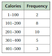
Answer:
Question 5.
WHICH ONE DOESN’T BELONG?
Which histogram does not belong with the other three? Explain your reasoning.

Answer:
EXAMPLE 3
Modeling Real Life
The histogram shows the ages of people watching an animated movie in the same theater as in Example 2. Which movie has an older audience?
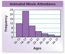
Understand the problem
You are given histograms that display the ages of people watching two movies. You are asked to determine which movie has an older audience.
Make a plan
Use the intervals and distributions of the data to determine which movie has an older audience.
Solve and check
The intervals in the histograms are the same. Most of the data for the animated movie are on the left, while most of the data for the comedy are on the right. This means that the people watching the comedy are generally older than the people watching the animated movie.
So, the comedy has an older audience.

Check Reasonableness
The movies have similar attendance. However,only4 people watching the comedy are 17 or under. A total of 35 people watching the animated movie are 17 or under. So, it is reasonable to conclude that the comedy has an older audience.
Self-Assessment for Problem Solving
Solve each exercise. Then rate your understanding of the success criteria in your journal.
Question 6.
The frequency table shows the numbers of visitors each day to parks in Aurora and Grover in one month. Which park generally has more daily visitors? Justify your answer.
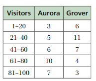
Answer:
Question 7.
DIG DEEPER!
The frequency tables below show the ages of guests on two cruises. Can you make accurate comparisons of the ages of the guests? Explain your reasoning.
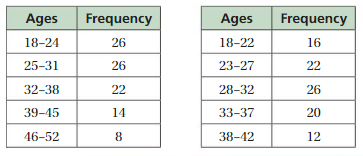
Answer:
Shapes of Distributions Homework & Practice 10.1
Review & Refresh
Display the data in a histogram.
Question 1.
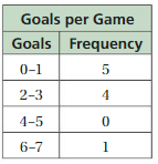
Answer:
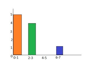
On the vertical axis, place frequencies. Label this axis “Frequency”.
On the horizontal axis, place the lower value of each interval.
Draw a bar extending from the lower value of each interval to the lower value of the next interval.
Question 2.
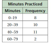
Answer:
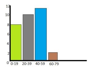
On the vertical axis, place frequencies. Label this axis “Frequency”.
On the horizontal axis, place the lower value of each interval.
Draw a bar extending from the lower value of each interval to the lower value of the next interval.
Question 3.
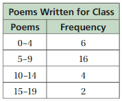
Answer:
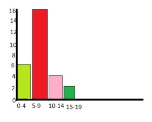
On the vertical axis, place frequencies. Label this axis “Frequency”.
On the horizontal axis, place the lower value of each interval.
Draw a bar extending from the lower value of each interval to the lower value of the next interval.
Write a unit rate for the situation.
Question 4.
$200 per 8 days
Answer:
200/8 = 25
Thus $25 per day.
Question 5.
60 kilometers for every 1.5 hours
Answer:
Your average speed is 60 km per 1.5 hours.
60/1.5 = 40 km/hr
Concepts, Skills, &Problem Solving
DESCRIBING SHAPES OF DISTRIBUTIONS Describe the shape of the distribution of the data in the table. (See Exploration 1, p. 471.)
Question 6.

Answer:
Step 1:
Order the data
0, 0, 1, 1, 1, 1, 2, 2, 2, 2, 2, 2, 3, 3, 3, 3, 4, 4, 4, 5, 5, 6
Question 7.

Answer:
Step 1:
Order the data
12, 12, 12, 13, 13, 13, 14, 14, 14, 15, 15, 15, 16, 16, 16.
DESCRIBING SHAPES OF DISTRIBUTIONS
Describe the shape of the distribution.
Question 8.
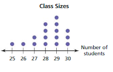
Answer: 25, 26, 27, 27, 28, 28, 28, 28, 29, 29, 29, 29, 29, 30, 30, 30
Question 9.
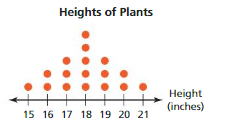
Answer:
15, 16, 16, 17, 17, 17, 18, 18, 18, 18, 18, 19, 19, 19, 20, 20, 21
Question 10.
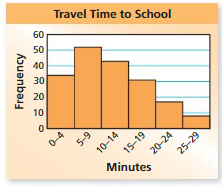
Answer:
Question 11.
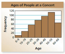
Answer:
Question 12.
MODELING REAL LIFE
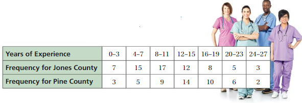
The frequency table shows the years of experience for the medical states in Jones County and Pine County. Display the data for each county in a histogram. Which county’s medical state has less experience? Explain.
Answer:
Question 13.
REASONING
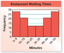
What is the shape of the distribution of the restaurant waiting times? Explain your reasoning.
Answer:
Question 14.
LOGIC
Are all distributions either approximately symmetric or skewed? Explain. If not, give an example.
Answer:
Question 15.
REASONING
Can you use a stem-and-leaf plot to describe the shape of a distribution? Explain your reasoning.
Answer:
Question 16.
DIG DEEPER!
The table shows the donation amounts received by a charity in one day.

a. Make a histogram of the data starting with the interval 0–14. Describe the shape of the distribution.
b. A company adds $5 to each donation. Make another histogram starting with the same interval as in part(a). Compare the shape of this distribution with the distribution in part(a). Explain any differences in the distributions.
Answer:
Question 17.
CRITICAL THINKING
Describe the shape of the distribution of each bar graph. Match the letters A, B, and C with the mean, the median, and the mode of each data set. Explain your reasoning.

Answer:
Lesson 10.4 Choosing Appropriate Measures
EXPLORATION 1
Using Shapes of Distributions
Work with a partner.
In Section 10.3 Exploration 1(a), you described the distribution of the first digits of the numbers at the right. In Exploration 1(b), you described the distribution of the data set below.
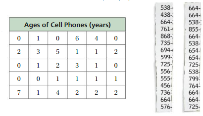
What do you notice about the measures of center, measures of variation, and the shapes of the distributions? Explain.
b. Which measure of center best describes each data set? Explain your reasoning.

c. which measures best describe the data. Which measure of variation best describes each data set? Explain your reasoning.
Answer:
You can use a measure of center and a measure of variation to describe the distribution of a data set.e shape of the distribution can help you choose which measures are the most appropriate to use.
Key Idea
Choosing Appropriate Measures
The mean absolute deviation (MAD) uses the mean in its calculation. So, when a data distribution is symmetric,
• use the mean to describe the center and
• use the MAD to describe the variation.
The interquartile range (IQR) uses quartiles in its calculation. So, when a data distribution is skewed,
• use the median to describe the center and
• use the IQR to describe the variation.
EXAMPLE 1
Choosing Appropriate Measures
The frequency table shows the number of states that border each state in the United States. What are the most appropriate measures to describe the center and the variation?
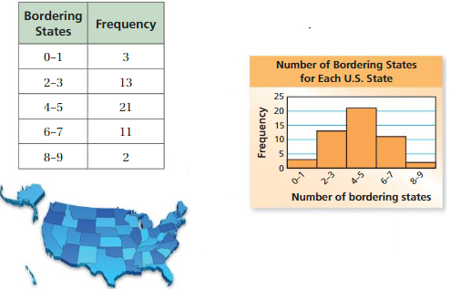
To see the distribution of the data, display the data in a histogram.
The left side of the graph is approximately a mirror image of the right side of the graph. The distribution is symmetric.
So, the mean and the mean absolute deviation are the most appropriate measures to describe the center and the variation.
Try It
Question 1.
The frequency table shows the gas mileages of several motorcycles made by a company. What are the most appropriate measures to describe the center and the variation?

Answer:
To see the distribution of the data, display the data in a histogram.
EXAMPLE 2
Describing a Data Set
The dot plot shows the average numbers of hours students in a class sleep each night. Describe the center and the variation of the data set.

Most of the data values are on the right, clustered around 9, and the tail extends to the left. The distribution is skewed left, so the median and the interquartile range are the most appropriate measures to describe the center and the variation.
The median is 8.5 hours. The first quartile is 7.5, and the third quartile is 9. So, the interquartile range is 9 − 7.5 = 1.5 hours.
The data are centered around 8.5 hours. The middle half of the data varies by no more than 1.5 hours.
Try It
Question 2.
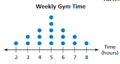
The dot plot shows the numbers of hours people spent at the gym last week. Describe the center and the variation of the data set.
Answer:
Most of the data values are on the right, clustered around 6, and the tail extends to the left. The distribution is skewed left, so the median and the interquartile range are the most appropriate measures to describe the center and the variation.
The median is 5 hours. The first quartile is 2, and the third quartile is 4.
So, the interquartile range is 4 – 2 = 2 hours
The data are centered around 5 hours. The middle half of the data varies by no more than 2 hours.
Self-Assessment for Concepts & Skills
Solve each exercise. Then rate your understanding of the success criteria in your journal.
Question 3.
OPEN-ENDED
Construct a dot plot for which the mean is the most appropriate measure to describe the center of the distribution.
Answer:
CHOOSING APPROPRIATE MEASURES
Choose the most appropriate measures to describe the center and the variation. Explain your reasoning. Then find the measures you chose.
Question 4.

Answer:
20, 28, 32, 32, 36, 36, 40, 40, 40, 40, 44, 44, 44, 48
Order your data set from lowest to highest values
Find the median. This is the second quartile Q2.
At Q2 split the ordered data set into two halves.
The lower quartile Q1 is the median of the lower half of the data.
Q1 = 32
The upper quartile Q3 is the median of the upper half of the data.
Q3 = 44
Median is the average of the data values.
So, the median, Q2 is 40.
Interquartile Range = Q3 – Q1
IQR = 44 – 32
IQR = 12
Question 5.

Answer:
8, 10, 10, 12, 12, 12, 14, 14, 14, 14, 16, 16, 16, 18, 18, 20
8, 10, 12, 14, 16, 18, 20
Order your data set from lowest to highest values
Find the median. This is the second quartile Q2.
At Q2 split the ordered data set into two halves.
The lower quartile Q1 is the median of the lower half of the data.
Q1 = 12
The upper quartile Q3 is the median of the upper half of the data.
Q3 = 16
Median is the average of the data values.
So, the median, Q2 is 14
Interquartile Range = Q3 – Q1
IQR = 16 – 12
IQR = 4
Question 6.
WRITING
Explain why the most appropriate measures to describe the center and the variation of a data set are determined by the shape of the distribution.
Answer:
You can use a measure of center and a measure of variation to describe the distribution of a data set. The shape of the distribution can help you choose which measures are the most appropriate to use. The dot plot shows the average number of hours students in a class sleep each night.
EXAMPLE 3
Modeling Real Life
Two baskets each have16 envelopes with money inside, as shown in the tables. How much does a typical envelope in each basket contain? Why might a person want to pick from Basket B instead of Basket A?
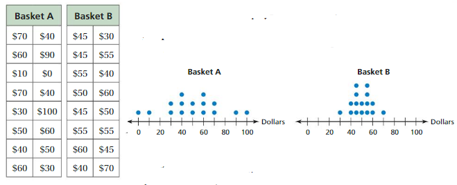
In each graph, the left side is a mirror image of the right side. Because both distributions are symmetric, the mean and the mean absolute deviation are the most appropriate measures to describe the center and the variation.
The mean of each data set is \(\frac{800}{16}\) = $50. The MAD of Basket A is \(\frac{320}{16}\) = $20, and the MAD of Basket B is \(\frac{120}{16}\) = $7.50. So, Basket A has more variability.
A typical envelope in each basket contains about $50. A person may choose from Basket B instead of Basket A because there is less variability. This means it is more likely to get an amount near $50 by choosing an envelope from Basket B than by choosing an envelope from Basket A.
Answer:
Self-Assessment for Problem Solving
Solve each exercise. Then rate your understanding of the success criteria in your journal.
Question 7.
Why might a person want to pick from Basket A instead of Basket B in Example 3? Explain your reasoning.
Answer:
Question 8.
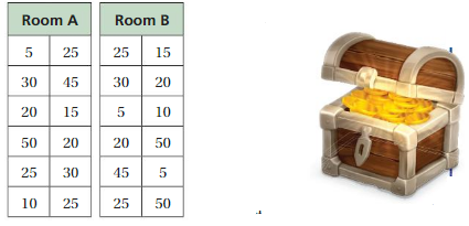
In a video game, two rooms each have 12 treasure chests containing gold coins. The tables show the numbers of coins in each chest. You pick one chest and are rewarded with the coins inside. From which room would you choose? Explain your reasoning.
Answer:
Question 9.
Create a dot plot of the numbers of pets that students in your class own. Describe the center and the variation of the data set.
Answer:
Choosing Appropriate Measures Homework & Practice 10.4
Review & Refresh
Describe the shape of the distribution.
Question 1.
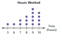
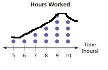
Answer:
Order the data
5, 6, 7, 7, 8, 8, 8, 9, 9, 9, 9, 9, 10, 10, 10, 10
The shape of the distribution for the above dot plot is
Question 2.
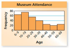
Answer:
Find the median, first quartile, third quartile, and interquartile range of the data.
Question 3.
68, 74, 67, 72, 63, 70, 78, 64, 76
Answer:
Order the data
63, 64, 67, 68, 70, 72, 74, 76, 78
The median is nothing but the average value of the data.
70 is the average of the data values.
Order your data set from lowest to highest values
Find the median. This is the second quartile Q2.
Thus the second quartile Q2 is 70.
At Q2 split the ordered data set into two halves.
The lower quartile Q1 is the median of the lower half of the data.
Thus Q1 is 65.5
The upper quartile Q3 is the median of the upper half of the data.
Q3 is 75
Interquartile Range IQR = 9.5
If the size of the data set is odd, do not include the median when finding the first and third quartiles.
If the size of the data set is even, the median is the average of the middle 2 values in the data set. Add those 2 values, and then divide by 2. The median splits the data set into lower and upper halves and is the value of the second quartile Q2.
Question 4.
39, 48, 33, 24, 30, 44, 36, 41, 28, 53
Answer:
Order the data
24, 28, 30, 33, 36, 39, 41, 44, 48, 53
If the size of the data set is even, the median is the average of the middle 2 values in the data set. Add those 2 values, and then divide by 2. The median splits the data set into lower and upper halves and is the value of the second quartile Q2.
Median is (36+39)/2 = 37.5
Order your data set from lowest to highest values
Find the median. This is the second quartile Q2.
Thus the second quartile Q2 is 37.5
At Q2 split the ordered data set into two halves.
The lower quartile Q1 is the median of the lower half of the data.
Thus Q1 is 30
The upper quartile Q3 is the median of the upper half of the data.
Q3 is 44
Interquartile Range IQR = 14
If the size of the data set is odd, do not include the median when finding the first and third quartiles.
Divide. Write the answer in simplest form.
Question 5.
4\(\frac{2}{5}\) ÷ 2
Answer: 2 \(\frac{1}{5}\)
Explanation:
Convert any mixed numbers to fractions.
4\(\frac{2}{5}\) = \(\frac{22}{5}\)
\(\frac{22}{5}\) × \(\frac{1}{2}\) = \(\frac{22}{10}\)
Now convert from improper fraction to the mixed fraction.
\(\frac{22}{10}\) = 2 \(\frac{1}{5}\)
Question 6.
5\(\frac{1}{8}\) ÷ \(\frac{7}{8}\)
Answer: 5 \(\frac{6}{7}\)
Explanation:
Convert any mixed numbers to fractions.
5\(\frac{1}{8}\) = \(\frac{41}{8}\)
\(\frac{41}{8}\) ÷ \(\frac{7}{8}\)
\(\frac{41}{8}\) × \(\frac{8}{7}\) = \(\frac{328}{56}\)
Now convert from improper fraction to the mixed fraction.
\(\frac{328}{56}\) = 5 \(\frac{6}{7}\)
Question 7.
2\(\frac{3}{7}\) ÷ 1\(\frac{1}{7}\)
Answer: 2 \(\frac{1}{8}\)
Explanation:
Convert any mixed numbers to fractions.
2\(\frac{3}{7}\) = \(\frac{17}{7}\)
1\(\frac{1}{7}\) = \(\frac{8}{7}\)
\(\frac{17}{7}\) ÷ \(\frac{8}{7}\) = \(\frac{119}{56}\)
Simplify the fraction
\(\frac{119}{56}\) = 2 \(\frac{1}{8}\)
Question 8.
\(\frac{4}{5}\) ÷ 7\(\frac{1}{2}\)
Answer: \(\frac{8}{75}\)
Explanation:
Convert any mixed numbers to fractions.
7\(\frac{1}{2}\) = \(\frac{15}{2}\)
\(\frac{4}{5}\) ÷ \(\frac{15}{2}\) = \(\frac{8}{75}\)
Concepts, Skills, & Problem Solving
USING SHAPES OF DISTRIBUTIONS
Find the mean and the median of the data set. Which measure of center best describes the data set? Explain your reasoning. (See Exploration 1, p. 477.)
Question 9.
9, 3, 7, 7, 9, 2, 8, 9, 6, 7, 8, 9
Answer:
Question 10.
24, 25, 27, 27, 23, 29, 26, 26, 26, 25, 28
Answer:
CHOOSING APPROPRIATE MEASURES
Choose the most appropriate measures to describe the center and the variation.
Question 11.
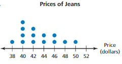
Answer:
Question 12.
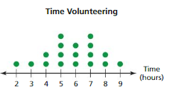
Answer:
Question 13.
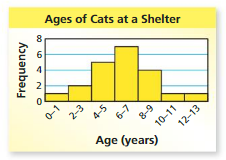
Answer:
Question 14.
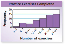
Answer:
Question 15.
DESCRIBING DATA SETS
Describe the centers and the variations of the data sets in Exercises 11 and 12.
Answer:
Question 16.
MODELING REAL LIFE
The frequency table shows the numbers of eggs laid by several octopi. What are the most appropriate measures to describe the center and the variation? Explain your reasoning.
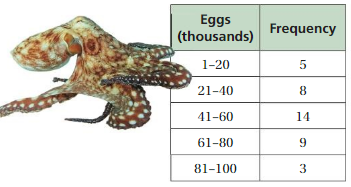
Answer:
Question 17.
MODELING REAL LIFE
The dot plot shows the vertical jump heights (in inches) of several professional athletes. Describe the center and the variation of the data set.
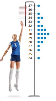
Answer:
Question 18.
OPEN-ENDED
Describe a real-life situation where the median and the interquartile range are likely the best measures of center and variation to describe the data. Explain your reasoning.
Answer:
Question 19.
PROBLEM SOLVING
You play a board game in which you draw from one of two piles of cards. Each card has a number that says how many spaces you will move your piece forward on the game board. The tables show the numbers on the cards in each pile. From which pile would you choose? Explain your reasoning.
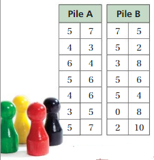
Answer:
Question 20.
DIG DEEPER!
The frequency table shows the numbers of words that several students can form in 1 minute using the letters P, S, E, D, A. What are the most appropriate measures to describe the center and variation? Can you find the exact values of the measures of center and variation for the data? Explain.

Answer:
Question 21.
REASONING
A bag contains 20 vouchers that can be redeemed for different numbers of tokens at an arcade, as shown in the table.
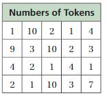
a. Find the most appropriate measure to describe the center of the data set.
b. You randomly select a voucher from the bag. How many tokens are you most likely to receive? Explain.
c. Are your answers in parts (a) and (b) the same? Explain why or why not.
Answer:
Lesson 10.5 Box-and-Whisker Plots
EXPLORATION 1
Drawing a Box-and-Whisker Plot
Work with a partner. Each student in a sixth-grade class is asked to choose a number from 1 to 20. The results are shown below.
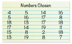
a. The box-and-whisker plot below represents the data set. Which part represents the box? the whiskers? Explain.

b. What does each of the five plotted points represent?
c. In your own words, describe what a box-and-whisker plot is and what it tells you about a data set.
d. Conduct a survey in your class. Have each student write a number from 1 to 20 on a piece of paper. Collect all of the data and draw a box-and-whisker plot that represents the data. Compare the data with the box-and-whisker plot in part(a).
Answer:
Key Idea
Box-and-Whisker Plot
A box-and-whisker plot represents a data set along a number line by using the least value, the greatest value, and the quartiles of the data. A box-and-whisker plot shows the variability of a data set.

The five numbers that make up the box-and-whisker plot are called the five-number summary of the data set.
EXAMPLE 1
Making a Box-and-Whisker Plot
Make a box-and-whisker plot for the ages(in years) of the spider monkeys at a zoo.
15, 20, 14, 38, 30, 36, 30, 30, 27, 26, 33, 35
Step 1: Order the data. Find the quartiles.

Step 2: Draw a number line that includes the least and greatest values. Graph points above the number line that represent the five-number summary.
Step 3: Draw a box using the quartiles. Draw a line through the median. Draw whiskers from the box to the least and the greatest values.

Answer:
Try It
Question 1.
A group of friends spent 1, 0, 2, 3, 4, 3, 6, 1, 0, 1, 2, and 2 hours online last night.Make a box-and-whisker plot for the data.
Answer:
The figure shows how data are distributed in a box-and-whisker plot.

EXAMPLE 2
Analyzing a Box-and-Whisker Plot
The box-and-whisker plot shows the body mass index (BMI) of a sixth-grade class.

a. What fraction of the students have a BMI of at least 22?
The right whisker represents students who have a BMI of at least 22.
So, about \(\frac{1}{4}\) of the students have a BMI of at least 22.
b. Are the data more spread out below the first quartile or above the third quartile? Explain.
The right whisker is longer than the left whisker.
So, the data are more spread out above the third quartile than below the first quartile.
c. Find and interpret the interquartile range of the data.
interquartile range = third quartile − first quartile
= 22 – 19 = 3
So, the middle half of the students’ BMIsvaries by no more than 3.
Try It
Question 2.
The box-and-whisker plot shows the heights of the roller coasters at an amusement park.
(a) What fraction of the roller coasters are between 120 feet tall and 220 feet tall?
(b) Are the data more spread out below or above the median? Explain.
(c) Find and interpret the interquartile range of the data.

Answer:
A box-and-whisker plot also shows the shape of a distribution.

EXAMPLE 3
Identifying Shapes of Distributions
The double box-and-whisker plot represents the life spans of crocodiles and alligators at a zoo. Identify the shape of the distribution of the lifespans of alligators.

For alligator life spans, the whisker lengths are equal. The median is in the middle of the box. The left side of the box-and-whisker plot is a mirror image of the right side of the box-and-whisker plot.
So, the distribution is symmetric.
Answer:
Try It
Question 3.
Identify the shape of the distribution of the life spans of crocodiles.
Answer:
Self-Assessment for Concepts & Skills
Solve each exercise. Then rate your understanding of the success criteria in your journal.
Question 4.
VOCABULARY
Explain how to find the five-number summary of a data set.
Answer:
MAKING A BOX-AND-WHISKER PLOT
Make a box-and-whisker plot for the data. Identify the shape of the distribution.
Question 5.
Ticket prices (dollars): 39, 42, 40, 47, 38, 39, 44, 55, 44, 58, 45
Answer:
Question 6.
Number of sit-ups: 20, 20, 23, 25, 25, 26, 27, 29, 30, 30, 32, 34, 37, 38
Answer:
Question 7.
NUMBER SENSE
In a box-and-whisker plot, what fraction of the data is greater than the first quartile?
Answer:
EXAMPLE 4
Modeling Real Life
The double box-and-whisker plot represents the prices of snowboards at two stores.
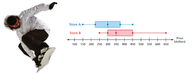
a. Which store’s prices are more spread out? Explain. Both boxes appear to be the same length. So, the interquartile range of each data set is equal. The range of the prices in Store B, however, is greater than the range of the prices in Store A.
So, the prices in Store B are more spread out.
b. Which store’s prices are generally higher? Explain.
For Store A,the distribution is symmetric with about one-half of the prices above $300.
For Store B, the distribution is skewed right with about three-fourths of the prices above $300.
So, the prices in Store B are generally higher.
Answer:
Self-Assessment for Problem Solving
Solve each exercise. Then rate your understanding of the success criteria in your journal.
Question 8.
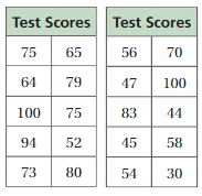
The tables at the left show the test scores of two sixth-grade achievement tests. The same group of students took both tests. The students took one test in the fall and the other in the spring.
a. Analyze each distribution. Then compare and contrast the test results.
b. Which table likely represents the results of which test? Explain your reasoning.
Answer:
Question 9.
Make a box-and-whisker plot that represents the heights of the boys in your class. Then make a box-and-whisker plot that represents the heights of the girls in your class. Compare and contrast the distributions.
Answer:
Box-and-Whisker Plots Homework & Practice 10.5
Review & Refresh
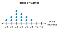
Choose the most appropriate measures to describe the center and the variation.
Question 1.
Answer:
Question 2.
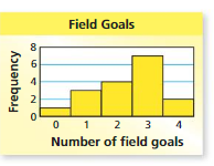
Answer:
Copy and complete the statement using < or >.
Question 3.

Answer: –\(\frac{2}{3}\) > –\(\frac{3}{4}\)
Explanation:
Compare fractions to find which fraction is larger and which is smaller.
The least common denominator (LCD) is 12
Rewriting as equivalent fractions with the LCD:
\(\frac{2}{3}\) = \(\frac{8}{12}\)
\(\frac{3}{4}\) = \(\frac{9}{12}\)
Now compare the fractions
–\(\frac{8}{12}\) >-\(\frac{9}{12}\)
Thus we can say that –\(\frac{2}{3}\) > –\(\frac{3}{4}\)
Question 4.

Answer: -2 \(\frac{1}{5}\) < -2 \(\frac{1}{6}\)
Explanation:
Compare fractions to find which fraction is larger and which is smaller.
Rewriting these inputs as fractions:
2 \(\frac{1}{5}\) = \(\frac{11}{5}\)
2 \(\frac{1}{6}\) = \(\frac{13}{6}\)
The LCM is 30
Rewriting as equivalent fractions with the LCD
\(\frac{11}{5}\) = \(\frac{66}{30}\)
\(\frac{13}{6}\) = \(\frac{65}{30}\)
– \(\frac{66}{30}\) < – \(\frac{65}{30}\)
-2 \(\frac{1}{5}\) < -2 \(\frac{1}{6}\)
Question 5.
![]()
Answer: -5.3 > -5.5
Explanation:
Compare fractions to find which fraction is larger and which is smaller.
The smallest number with the negative sign will be the greater number
Thus -5.3 > -5.5
Factor the expression using the GCF.
Question 6.
42 + 14
Answer
Question 7.
12x – 18
Answer:
Question 8.
28n + 20
Answer:
Question 9.
60g – 25h
Answer:
Concepts, Skills, & Problem Solving
COMPARING DATA Compare the data in the box-and-whisker plots. (See Exploration 1, p. 483.)
Question 10.
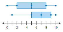
Answer:
Question 11.
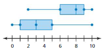
Answer:
MAKING A BOX-AND-WHISKER PLOT
Make a box-and-whisker plot for the data.
Question 12.
Ages of teachers (in years): 30, 62, 26, 35, 45, 22, 49, 32, 28, 50, 42, 35
Answer:
Question 13.
Quiz scores: 8, 12, 9, 10, 12, 8, 5, 9, 7, 10, 8, 9, 11
Answer:
Question 14.
Donations (in dollars): 10, 30, 5, 15, 50, 25, 5, 20, 15, 35, 10, 30, 20
Answer:
Question 15.
Science test scores: 85, 76, 99, 84, 92, 95, 68, 100, 93, 88, 87, 85
Answer:
Question 16.
Shoe sizes: 12, 8.5, 9, 10, 9, 11, 11.5, 9, 9, 10, 10, 10.5, 8
Answer:
Question 17.
Ski lengths (in centimeters): 180, 175, 205, 160, 210, 175, 190, 205, 190, 160, 165, 195
Answer:
Question 18.
YOU BE THE TEACHER
Your friend makes a box-and-whisker plot for the data shown. Is your friend correct? Explain your reasoning.
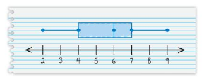
2, 6, 4, 3, 7, 4, 6, 9, 6, 8, 5, 7
Answer:
Question 19.
MODELING REAL LIFE
The numbers of days 12 friends went camping during the summer are 6, 2, 0, 10, 3, 6, 6, 4, 12, 0, 6, and 2. Make a box-and-whisker plot for the data. What is the range of the data?
Answer:
Question 20.
ANALYZING A BOX-AND-WHISKER PLOT
The box-and-whisker plot represents the numbers of gallons of water needed to fill different types of dunk tanks offered by a company.
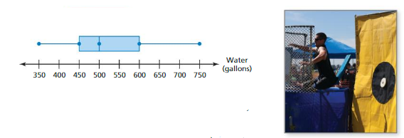
a. What fraction of the dunk tanks requires at least 500 gallons of water?
b. Are the data more spread out below the first quartile or above the third quartile? Explain.
c. Find and interpret the interquartile range of the data.
Answer:
Question 21.
MODELING REAL LIFE
The box-and-whisker plot represents the heights (in meters) of the tallest buildings in Chicago.
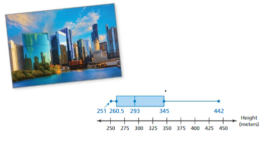
a. What percent of the buildings are no taller than 345 meters?
b. Is there more variability in the heights above 345 meters or below 260.5 meters? Explain.
c. Find and interpret the interquartile range of the data.
Answer:
Question 22.
CRITICAL THINKING
The numbers of spots on several frogs in a jungle are shown in the dot plot.

a. Make a box-and-whisker plot for the data.
b. Compare the dot plot and the box-and-whisker plot. Describe the advantages and disadvantages of each data display.
Answer:
SHAPES OF BOX-AND-WHISKER PLOTS
Identify the shape of the distribution. Explain.
Question 23.
![]()
Answer:
Question 24.
![]()
Answer:
Question 25.
![]()
Answer:
Question 26.
![]()
Answer:
Question 27.
MODELING REAL LIFE
The double box-and-whisker plot represents the start times of recess for classes at two schools.
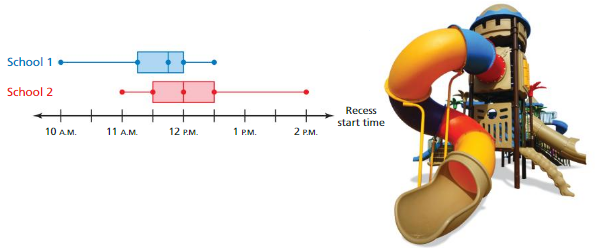
a. Identify the shape of each distribution.
b. Which school’s start times for recess are more spread out? Explain.
c. You randomly pick one class from each school. Which class is more likely to have recess before lunch? Explain.
Answer:
MAKING A BOX-AND-WHISKER PLOT
Make a box-and-whisker plot for the data.
Question 28.
Temperatures (in °C): 15, 11, 14, 10, 19, 10, 2, 15, 12, 14, 9, 20, 17, 5
Answer:
Question 29.
Checking account balances (in dollars): 30, 0, 50, 20, 90, −15, 40, 100, 45, −20, 70, 0
Answer:
Question 30.
REASONING
The data set in Exercise 28 has an outlier. Describe how removing the outlier affects the box-and-whisker plot.
Answer:
Question 31.
OPEN-ENDED
Write a data set with 12 values that has a symmetric box-and-whisker plot.
Answer:
Question 32.
CRITICAL THINKING
When does a box-and-whisker plot not have one or both whiskers?
Answer: A simpler formulation is this: no whisker will be visible if the lower quartile is equal to the minimum, or if the upper quartile is equal to the maximum.
Question 33.
STRUCTURE Draw a histogram that could represent the distribution shown in Exercise 25.
Answer:
Question 34
DIG DEEPER!
The double box-and-whisker plot represents the goals scored per game by two lacrosse teams during a 16-game season.
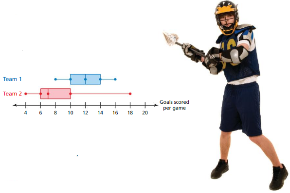
a. Which team is more consistent? Explain.
b. Team 1 played Team 2 once during the season. Which team do you think won? Explain.
c. Can you determine the number of games in which Team 2 scored 10 goals or less? Explain your reasoning.
Answer:
Question 35.
CHOOSE TOOLS
A market research company wants to summarize the variability of the SAT scores of graduating seniors in the United States. Should the company use a stem-and-leaf plot, a histogram, or a box-and-whisker plot? Explain.
Answer:
Data Displays Connecting Concepts
Using the Problem-Solving Plan
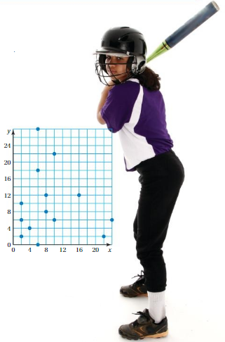
1. The locations of pitches in an at-bat are shown in the coordinate plane, where the coordinates are measured in inches. Describe the location of a typical pitch in the at-bat.
Understand the problem
You know the locations of the pitches. You are asked to find the location of a typical pitch in the at-bat.
Make a plan
First, use the coordinates of the pitches to create two data sets, one for the x-coordinates of the pitches and one for the y-coordinates of the pitches. Next, make a box-and-whisker plot for each data set. Then use the most appropriate measure of center for each data set to find the location of a typical pitch.
Solve and check
Use the plan to solve the problem. Then check your solution.
2. A set of 20 data values is described below. Sketch a histogram that could represent the data set. Explain.
• least value: 10
• first quartile: 25
• mean: 29
• third quartile: 34
• greatest value: 48
• MAD: 7
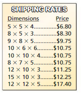
3. The chart shows the dimensions (in inches) of several flat-rate shipping boxes. Each box is in the shape of a rectangular prism. Describe the distribution of the volumes of the boxes. Then find the most appropriate measures to describe the center and the variation of the volumes.
Performance Task
Classifying Dog Breeds by Size
At the beginning of this chapter, you watched a STEAM Video called “Choosing a Dog.” You are now ready to complete the performance task related to this video, available at BigIdeasMath.com. Be sure to use the problem-solving plan as you work through the performance task.

Data Displays Chapter Review
Review Vocabulary
Write the definition and give an example of each vocabulary term.

Graphic Organizers
You can use an Information Frame to help you organize and remember concepts. Here is an example of an Information Frame for the vocabulary term histogram.
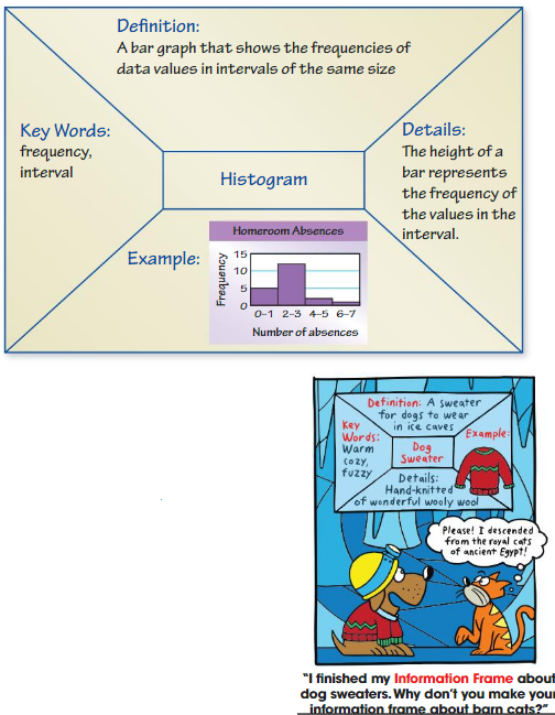
Choose and complete a graphic organizer to help you study the concept.
1. stem-and-leaf plot
2. frequency table
3. shapes of distributions
4. box-and-whisker plot
Answer:
Chapter Self-Assessment
As you complete the exercises, use the scale below to rate your understanding of the success criteria in your journal.

10.1 Stem-and-Leaf Plots
Learning Target: Display and interpret data in stem-and-leaf plots.
Make a stem-and-leaf plot of the data.
Question 1.
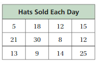
Answer:
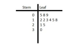
Question 2.
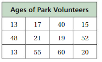
Answer:
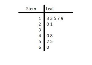
Question 3.
The stem-and-leaf plot shows the weights (in pounds) of yellowfin tuna caught during a fishing contest.
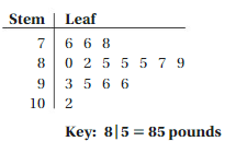
a. How many tuna weigh less than 90 pounds?
b. Find the mean, median, mode, range, and interquartile range of the data.
c. How are the data distributed?
Answer:
Question 4.
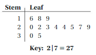
The stem-and-leaf plot shows the body mass index (BMI) for adults at a recreation center. Use the data to answer the question, “What is the typical BMI for an adult at the recreation center?” Explain.
Answer:
Question 5.
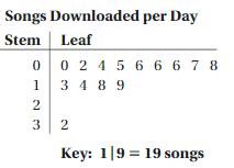
Write a statistical question that can be answered using the stem-and-leaf plot.
Answer:
10.2 Histograms (pp. 463-470)
Learning Target: Display and interpret data in histograms.
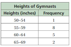
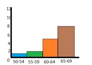
Display the data in a histogram.
Question 6.
Answer:
Question 7.
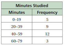
Answer:
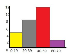
Question 8.
The histogram shows the number of crafts each member of a craft club made for a fundraiser.
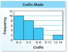
a. Which interval contains the most data values?
b. Frequency How many members made at least 6 crafts?
c. Can you use the histogram to determine the total number of crafts made? Explain.
Answer:
10.3 Shapes of Distributions (pp. 471–476)
Learning Target: Describe and compare shapes of distributions.
Question 9.
Describe the shape of the distribution.
Answer: The shape of a distribution is described by its number of peaks and by its possession of symmetry, its tendency to skew, or its uniformity.
Question 10.
The frequency table shows the math test scores for the same class of students as Exercise 9. Display the data in a histogram. Which test has higher scores?
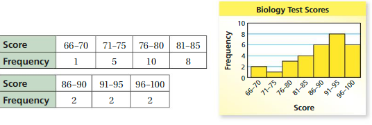
Answer:
Question 11.
The table shows the numbers of neutrons for several elements in the nonmetal group of the periodic table. Make a histogram of the data starting with the interval 0–9. Describe the shape of the distribution.

Answer:
10.4 Choosing Appropriate Measures (pp. 477–482)
Learning Target: Use the shape of the distribution of a data set to determine which measures of center and variation best describe the data.
Choose the most appropriate measures to describe the center and the variation. Students’ Heights
Question 12.
Answer:
Question 13.
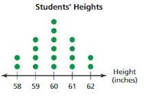
Answer:
Question 14.
Describe the center and the variation of the data set in Exercise 13.
Answer:
10.5 Box-and-Whisker Plots (pp. 483–490)
Learning Target: Display and interpret data in box-and-whisker plots.
Make a box-and-whisker plot for the data.
Question 15.
Ages of volunteers at a hospital:
14, 17, 20, 16, 17, 14, 21, 18
Answer:
Question 16.
Masses (in kilograms) of lions:
120, 200, 180, 150, 200, 200, 230, 160
Answer:
Question 17.
The box-and-whisker plot represents the lengths (in minutes) of movies being shown at a theater.

a. What percent of the movies are no longer than 120 minutes?
b. Is there more variability in the movie lengths longer than 130 minutes or shorter than 110 minutes? Explain.
c. Find and interpret the interquartile range of the data.
Answer:
Question 18.
The double box-and-whisker plot represents the heights of students in two math classes.
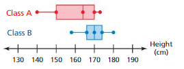
a. Identify the shape of each distribution.Height(cm)
b.Which class has heights that are more spread out? Explain.
c.You randomly pick one student from each class. Which student is more likely to be taller than 170 centimeters? Explain.
Answer:
Data Displays Practice Test
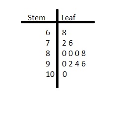
Make a stem-and-leaf plot of the data.
Question 1.
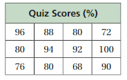
Answer:
Question 2.
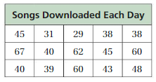
Answer:
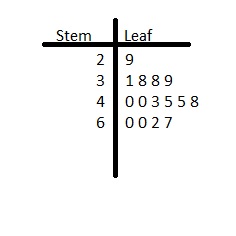
Question 3.
Find the mean, median, mode, range, and interquartile range of the data.
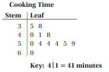
Answer:
Given data 35, 38, 40, 41, 48, 50, 54, 54, 54, 55, 59, 60
Mean:
The mean refers to an intermediate value between a discrete set of numbers, namely, the sum of all values in the data set, divided by the total number of values.
x̄ = (35+38+40+41+48+50+54+54+54+55+59+60)/12
x̄ = 49
Thus mean of the given data is 49.
Median:
Given data 35, 38, 40, 41, 48, 50, 54, 54, 54, 55, 59, 60
In the case where the total number of values in a data sample is odd, the median is simply the number in the middle of the list of all values. When the data sample contains an even number of values, the median is the mean of the two middle values.
Median = (50+54)/2 = 104/2 = 52
Thus the median of the given data is 52.
Mode:
The mode is the value in a data set that has the highest number of recurrences.
35, 38, 40, 41, 48, 50, 54, 54, 54, 55, 59, 60
Mode = 54 (repeated 3 times)
Question 4.
Display the data in a histogram. How many people watched less than 20 hours of television per week?
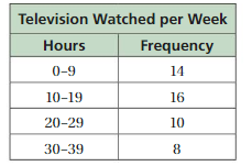
Answer:
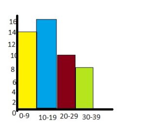
By seeing the above histogram we can find the number of people who watched less than 20 hours of television per week.
14 + 16 = 30
Therefore 30 people watched less than 20 hours per week.
Question 5.
The dot plot shows the numbers of glasses of water Water Consumed that the students in a class drink in one day.
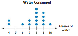
a. Describe the shape of the distribution.
b. Choose the most appropriate measures to describe the center and the variation. Find the measures you chose.
Answer:
Question 6.
Make a box-and-whisker plot for the lengths (in inches) of fish in a pond: 12, 13, 7, 8, 14, 6, 13, 10.
Answer:
Question 7.
The double box-and-whisker plot compares the battery lives (in hours) of two brands of cell phones.
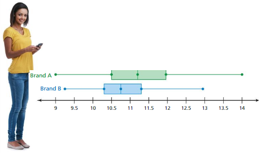
a. What is the range of the upper 75% of battery life for each brand of cell phone?
b. Which brand of cell phone typically has a longer battery life? Explain.
c. In the box-and-whisker plot, there are 190 cell phones of Brand A that have at most 10.5 hours of battery life. About how many cell phones are represented in the box-and-whisker plot for Brand A?
Answer:
Data Displays Cumulative Practice
Question 1.
Research scientists are measuring the numbers of days lettuce seeds take to germinate. In a study, 500 seeds were planted. Of these,473 seeds germinated. The box-and-whisker plot summarizes the numbers of days it took the seeds to germinate. What can you conclude from the box-and-whisker plot?
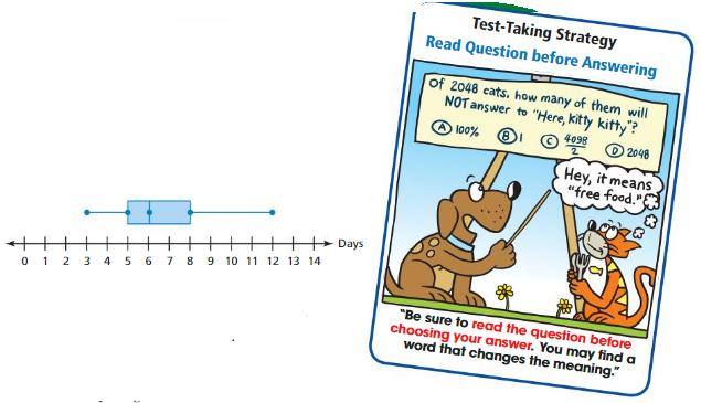
A. The median number of days for the seeds to germinate is 12.
B. 50% of the seeds took more than 8 days to germinate.
C. 50% of the seeds took less than 5 days to germinate.
D. The median number of days for the seeds to germinate was 6.
Answer:
Question 2.
Find the interquartile range of the data.
15 7 5 8 9 20 12 7 11 7 15
F. 8
G. 11
H. 12
I. 20
Answer: 8
Question 3.
There are seven different integers in a set. When they are listed from least to greatest, the middle integer is −1. Which statement below must be true?
A. There are three negative integers in the set.
B. There are three positive integers in the set.
C. There are four negative integers in the set.
D. The integer in the set after −1 is positive.
Answer:
Question 4.
What is the mean number of seats?
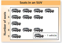
F. 2.4 seats
G. 5 seats
H. 6.5 seats
I. 7 seats5.
Answer:
Question 5.
On Wednesday, a town received 17 millimeters of rain. This was x millimeters more rain than the town received on Tuesday. Which expression represents the amount of rain, in millimeters, the town received on Tuesday?
A. 17x
B. 17 – x-c
C. x + 17
D. x – 17
Answer:
Question 6.
One of the leaves is missing in the stem-and-leaf plot.
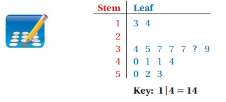
The median of the data set represented by the stem-and-leaf plot is 38. What is the value of the missing leaf?
Answer:
Question 7.
Which property is demonstrated by the equation?
723 + (y + 277) = 723 + (277 + y)
F. Associative Property of Addition
G. Commutative Property of Addition
H. Distributive Property
I. Addition Property of Zero
Answer: Associative Property of Addition
Explanation:
Associative property of addition: Changing the grouping of addends does not change the sum
Thus the correct answer is option F.
Question 8.
A student took five tests and had a mean score of 92. Her scores on the first 4 tests were 90, 96, 86, and 92. What was her score on the fifth test?
A. 92
B. 93
C. 96
D. 98
Answer: 86
Explanation:
Given that,
A student took five tests and had a mean score of 92.
Her scores on the first 4 tests were 90, 96, 86, and 92.
(90+96+86+92+s)/5=90
(364+s)/5=90
364+s=450
s=86
So she scored an 86 on the fifth test.
Question 9.
At the end of the school year, your teacher counted the number of absences for each student. The results are shown in the histogram. How many students had fewer than 10 absences?
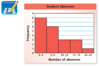
Answer:
Question 10.
The ages of the 16 members of a camera club are listed below.
40, 22, 24, 58, 30, 31, 37, 25, 62, 40, 39, 37, 28, 28, 51, 44


Part A Order the ages from youngest to oldest.
Part B Find the median of the ages.
Part C Make a box-and-whisker plot for the ages.
Answer:
Conclusion:
I wish the information prevailed in Big Ideas Math Answer Key Grade 6 Chapter 10 Data Displays is beneficial for all. Tap the links and kickstart your preparation. Share the Big Ideas Math Answers Grade 6 Chapter 10 Data Displays pdf to your friends and help them to overcome their difficulties. Stay tuned to our site to get the solutions of all Big Ideas Math Answers Grade 6 Chapters.