We included HMH Into Math Grade 8 Answer Key PDF Module 8 Lesson 2 Draw and Analyze Trend Lines to make students experts in learning maths.
HMH Into Math Grade 8 Module 8 Lesson 2 Answer Key Draw and Analyze Trend Lines
I Can draw a trend line and informally assess a trend line by judging the closeness of the data points to the line.
Spark Your Learning
Skyler collected data from several different types of cars. The scatter plot displays the relationship between the weight of each car and the average number of miles it can travel in the city on a single gallon of gas. What conclusions can you draw from the data?

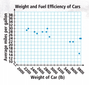
Answer:
Negative association,Nonlinear,
Explanation:
As weight of each car increases there is a decrease in average miles so it is a negative association and as it is not in a straight line so nonlinear.
Turn and Talk Estimate the average miles per gallon for a car weighing 3400 pounds. How did you determine your estimate?
Answer:
23 miles,
Explanation:
The average miles per gallon for a car weighing 3400 pounds is we take average data of 2900 pounds and 3580 pounds as 25 miles and 22 miles,
so we will have 25 + 22/2 = 47/2 = 23.5
approximately 23 miles.
Connect to Vocabulary
A trend line models the behavior of data displayed in a scatter plot. When a scatter plot shows a positive association, the trend line will have a positive slope. The trend line for data with a negative association will have a negative slope.
Build Understanding
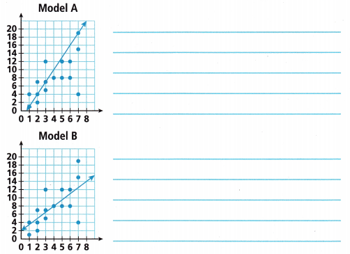
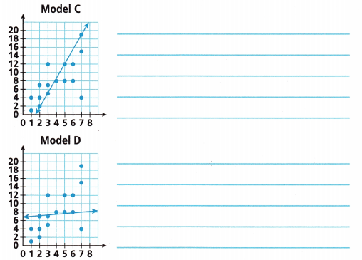
Question 1.
A class draws four different models, or trend lines, for the same data set. To evaluate each trend line, consider the following questions.
How many points lie above the trend line? How many points lie below? How many points does the trend line to touch or pass through? What is the greatest vertical distance between any point and the trend line?

Answer:
Explanation:
Given a class draws four different models, or trend lines, for the same data set. Evaluated each trend line, considering the following questions.
Number of points lie above the trend line,
Numbe of points lie below, Number of points does the trend line to touch or pass through
The greatest vertical distance between any point and the trend line, for Model A we have 3 points (1,4),(2,7) and (3,12) lie above, 9 points (2,2),(3,5),(4,8),(5,8),(5,12),(6,8), (6,12),(7,4),(7,15) lie below trend line, 4 points touch the trend line (1,1),(2,4),(3,7) and (7,19),
The greatest vertical distance between any point and the trend line is square root of (x2 – x1)2 + (y2 – y1)2 = square root of (7 – 1)2 + (19 – 1)2 = square root of (36) + (324) = square root of 360 almost 19.
For Model B we have 6 points (2,7),(3,12),(5,12),(6,12) (7,15) and (7,19) lie above, 7 points (1,1), (2,2),(2,4), (2,4),(3,5),(5,8),(6,8) and (7,4) lie above, 3 points (1,4),(3,7) and (4,8) touch the line, Greatest distance is
square root of (x2-x1)2 + (y2 -y1)2 = sqaure root of (4 – 1)2 + (8 – 4)2 = square root of (9) + (16) = square root of 25 almost 5.
For Model C we have 6 points (1,1),(1,4), (2,4),(2,7),(3,7),(3,12) lie above, 5 points (5,8),(6,8),(6,12),(7,4),(7,15) lie below,
5 points (2,2),(3,5),(4,8),(5,12) and (7,19) touch the line,
Greatest distance is square root of (x2-x1)2 + (y2 -y1)2 = sqaure root of (7 – 2)2 + (19 – 2)2 = square root of (25) + (289) = sqaure root of 314 = 17.72 almost 18.
For Model D we have 5 points (3,12),(5,12),(6,12),(7,15) (7,19) lie above, 6 points (1,1), (1,4),(2,2),(2,4),(3,5) and (7,4) lie below, 5 points (2,7),(3,7),(4,8),(5,8),(6,8) touch the line,
Greatest distance is square root of (x2-x1)2 + (y2 -y1)2 = sqaure root of (6 – 2)2 + (8 – 7)2 = square root of (16) + (1) = sqaure root of 17 = 4.1.
Turn and Talk Which trend line is the best model of the relationship? Explain.
Answer:
A linear trendline is a best-fit straight line that is used with simple linear data sets is the best model of the relationship,
A linear trendline is a best-fit straight line that is used with simple linear data sets is the best model of the relationship, Data is linear if the pattern in its data points resembles a line. A linear trendline usually shows that something is increasing or decreasing at a steady rate.
Step It Out
Question 2.
The scatter plot shows a negative linear association.
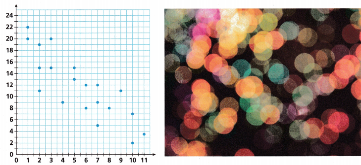
A. How many points are there in the data set? About how many points would an ideal trend line have above and below it?
Answer:
20 points, More than one,
Explanation:
There are 20 points in the data set,
The general rule in technical analysis is that it takes two points to draw a trend line and the third point confirms the validity.
More than one point would an ideal trend line have above and below it.
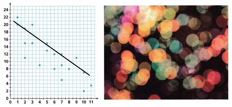
B. Use a ruler to sketch a trend line to model the association shown.
Answer:
Explanation:
Used a ruler to sketch a trend line to model the association as shown above.
C. How many points does your trend line touch or pass through?
Answer:
5 points,
Explanation:
5 points(1,20),(2,19),(5,15),(7,12) and (10,9) does my trend line touch or pass through.
D. How many points lie above your trend line? How many lie below your trend line?
Answer:
3 points lie above my trend line,
12 points lie below my trend line,
Explanation:
3 points (1,22), (3,20) and (9,11) lie above my trend line,
12 points (2,11), (2,15), (3,15), (4,9),(5,13),
(6,8), (6,12), (7,5),(7,9), (8,8), (10,2) and (11,3) lie below my trend line.
E. How many points have a vertical distance from the trend line of more than 3 units?
Answer:
2 points,
Explanation:
2 points (10,9), (7,12) and (5,15), (2,19) have a vertical distance from the trend line of more than 3 units.
F. What is the greatest vertical distance between any point and the trend line?
Answer:
Nearly 18 is the greatest vertical distance between any point and the trend line,
Explanation:
The greatest vertical distance between any point and the trend line is between (1,20) and (11,5) is square root of (x2-x1)2 + (y2 -y1)2 =
sqaure root of (11 – 1)2 + (5 – 20)2 = square root of (100) + (225) = sqaure root of 325 = 18.01 near to 18.
Turn and Talk Describe a real-world situation that could be modeled by this data.
Answer:
Real-world situation:
The scatter plot displays the relationship between “the number of tickets sold for movie from day 1 to day 11 is modeled by the data”,
Explanation:
A real-world situation that could be modeled by this data is “the number of tickets sold for movie from day 1 to day 11 is modeled by the data” as day 1 to day 11 on x axis and number of tickets from 0 to 24 on y axis, (1,20),(1,22),(2,11), (2,15),(2,19), (3,15),(3,20), (4,9),(5,13), (5,15), (6,8), (6,12), (7,5),(7,9), (7,12), (8,8), (9,11) ,(10,2),(10,9) and (11,3).
Question 3.
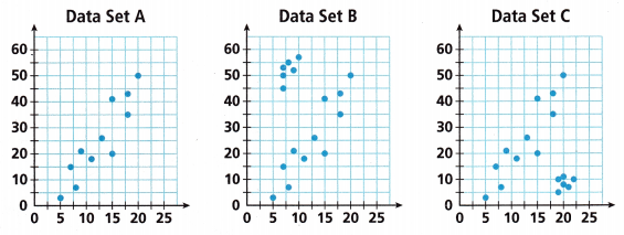
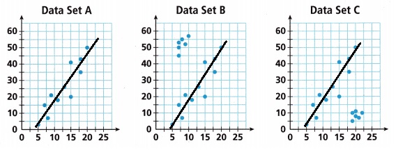
A. Analyze the scatter plots, and sketch a trend line for each.
Answer:
All three have positive linear association,
Explanation:
Data Set A:
It has total 11 points, It is positive linear association, 5 Points lie touch the trend line, 3 points are above, 3 points are below,
The greatest vertical distance between any point (5,3) and (20,50) trend line is square root of (x2 – x1)2 + (y2 – y1)2 =
sqaure root of (20 – 5)2 + (50 – 3)2 = square root of (225) + (2209) = sqaure root of 2434 almost 49.33.
Data Set B:
It has total 17 points, It is positive linear association,
5 Points lie touch the trend line,
9 points are above, 3 points are below,
The greatest vertical distance between any point (5,3) and (20,50) trend line is square root of (x2 – x1)2 + (y2 – y1)2 = sqaure root of (20 – 5)2 + (50 – 3)2 = square root of (225) + (2209) = sqaure root of 2434 almost 49.33.
Data Set C :
It has total 17 points, It is positive linear association,
5 Points lie touch the trend line,
3 points are above, 9 points are below the line.
The greatest vertical distance between any point (5,3) and
(20,50) trend line is square root of (x2 – x1)2 + (y2 – y1)2 = square root of (20 – 5)2 + (50 – 3)2 = square root of (225) + (2209) = square root of 2434 almost 49.33.
B. Compare the trend lines for data sets A, B, and C. How do the outliers influence the trend lines?

Answer:
The trend lines for data sets A, B, and C,
Outliers are observed far from the line,
No much influence or change in the trend lines,
Explanation:
In data sets, there are values (observed data points) called outliers.
Outliers are observed data points that are far from the line.
The trend lines for data sets A, B, and C,
Outliers are observed far from the line,
Therefore no much influence or change in the trend lines.
Check Understanding
Question 1.
What are key characteristics of a reasonable trend line for a scatter plot?
Answer:
It’s association,
Form: Is the association linear or nonlinear?
Direction: Is the association positive or negative?
Strength: Does the association appear to be strong, moderately strong, or weak?
Outliers: Do there appear to be any data points that are unusually far away from the general pattern?
based on the above we can say the trend line for a scatter plot is reasonable or not,
Explanation:
The scatter diagram graphs pairs of numerical data, with one variable on each axis, to look for a relationship between them. If the variables are correlated, the points will fall along a line or curve.
The better the correlation, the tighter the points will hug the line. The key characteristics of a reasonable trend line for a scatter plot is
Form: Is the association linear or nonlinear?
Direction: Is the association positive or negative?
Strength: Does the association appear to be strong, moderately strong, or weak?
Outliers: Do there appear to be any data points that are unusually far away from the general pattern?,
Therefore based on the above we can say the trend line for a scatter plot is reasonable or not.
Question 2.
Harold and Chloe each drew a trend line for the given data set.
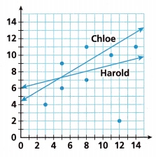
A. Whose trend line is a closer fit? Why?
Answer:
Harold,
Explanation:
Harold trend line is a closer fit, If we see we have
8 data points in that for Harold’s trend line
4 points lie above and 4 points lie below the trend line means the trend line is trying to touch the points equally,
Where as Chloe trend line only 2 data points lie above and 6 points lie below means the trend line is not that close to data points.
B. For the other line, analyze what mistake might have been made.
Answer:
Chole trend line only 2 points would have been in touch,
Explanation:
The mistake might be out of 8 data points
Chole trend line is trying to touch only 2 data points leaving other 6 data points.
On Your Own
Question 3.
Reason The Flan family enjoys making cat videos and posting them on social media sites. They construct the scatter plot shown.
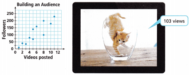
A. Is a trend line an appropriate way to model these data? Explain.
Answer:
Yes,
Explanation:
Yes a trend line is an appropriate way to model these data,
As there is a relationship between video posted and followers to build audience.
B. Sketch a reasonable trend line for this data and justify your choice.
Answer:
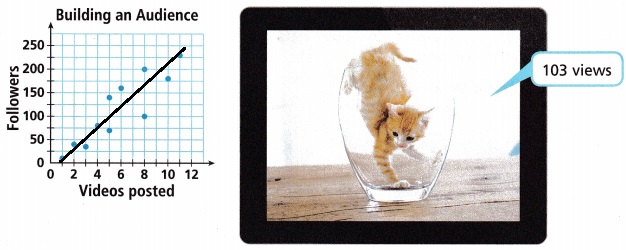
Trend line is linear,
Explanation:
Sketched a reasonable trend line for this data and it is linear.
C. Estimate the number of followers that the Flan family might expect when they have posted 20 videos.
Answer:
Approximately 350 to 400 followers,
Explanation:
As we data points of video posted from 0 to 12,
The number of followers are from 0 to 225,
so when they have posted 20 videos it will be 8 more, and we have for 0 to 8 followers as 100 to 200 so we can estimate the number of followers will be approximately 350 to 400 followers.
D. How did you make your estimate? What might cause your estimate to be incorrect?
Answer:
By take all data points into consideration,
If followers are not linearly increasing my estimate will be incorrect,
Explanation:
By taking all the data points into consideration from 1 to 12 videos posted and number of followers
I made my estimate, If the followers are not linearly increasing as I posted videos then my estimate will become incorrect.
Question 4.
When is it not appropriate to model the relationship in a scatter plot with a trend line?
Answer:
When videos are posted but followers are not increasing constantly it would be not appropriate,
Explanation:
When videos are posted but followers are not increasing constantly it would be not appropriate to model the relationship in a scatter plot with a trend line.
Question 5.
Open-Ended The trend line of a data set is shown. Plot a data set with at least 5 points on the graph that could result in the trend line shown.
Answer:
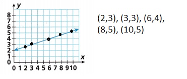
Explanation:
Given a trend line of a data set is shown.
Plotted a data set with at least 5 points on the graph that could result in the trend line shown as above with data points as (2,3), (3,3), (6,4), (8,5) and (10,5).
Question 6.
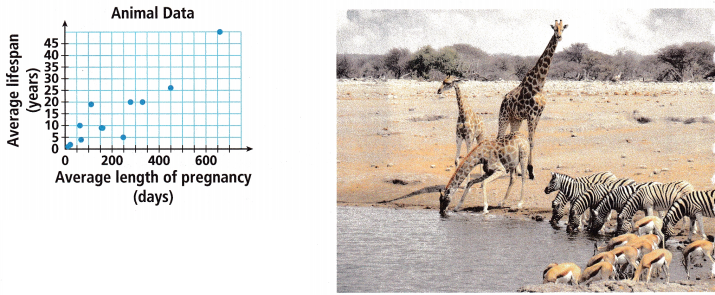
STEM The average length of an animal’s life is related to the average length of pregnancy for that type of animal. The scatter plot shows data for several different animals.
A. Sketch a trend line to model the data. Circle the outlier and explain how it influences your choice for the trend line.
Answer:
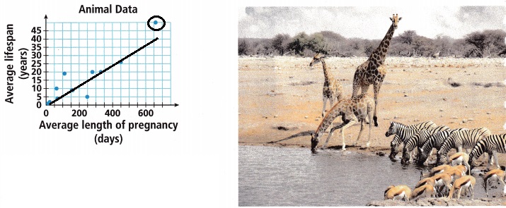
Outlier-(650,50)- Not much influence,
Explanation:
Sketched a trend line to model the data.
Circled the outlier at (650,50) and it will not influences my choice for the trend line as it is very far away from the trend line.
B. How would the trend line change if the outlier were removed?
Answer:
Not much change,
Explanation:
There will not be much change in the trend line if the outlier were removed as it is very far away from the trend line.
C. The average length of pregnancy for a polar bear is 240 days. Use the trend line to estimate the average length of a polar bear’s life.
Answer:
12 to 15 years,
Explanation:
Given the average length of pregnancy for a polar bear is 240 days, By using the trend line to estimate the average length of a polar bear’s life is as for 250 days to 340 days the average life span in years is between 5 to 20 years therefore for 240 days it will be approximately in between 5 + 20/2 = 12.5 to 15 years.
I’m in a Learning Mindset!
What types of decisions did I make when drawing and analyzing trend lines?
Answer:
It should be a straight line,
It may try to go through all points,
It may be positive or negative,
Explanation:
Decisions I make when drawing and analyzing trend lines are a trend line is a straight line that best represents the points on a scatterplot. The trend line may go through some points but need not go through them all.
The trend line is used to show the pattern of the data. This trend line may show a positive trend or a negative trend.
Lesson 8.2 More Practice/Homework
Question 1.
A. Construct Arguments Is the trend line shown on the scatter plot a good fit for the data? Explain. If the line is not a good fit, sketch a more appropriate trend line.

Answer:
No,
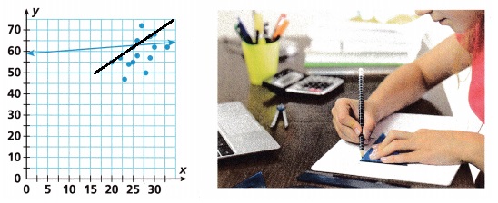
Explanation:
The trend line shown on the scatter plot is not a good fit for the data,As the line is not touching any of the points properly, So sketched a more appropriate trend line as shown above.
B. The point (25, 20) is added to the data set. How will its addition influence the trend line?
Answer:
No influence,
Explaantion:
If the point (25, 20) is added to the data set.
Its addition will not influence the trend line as it is far away from the trend line.
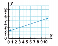
Question 2.
Open-Ended Plot at least 5 points to display a data set that has the trend line y = \(\frac{1}{2}\)x. Include the graph of the trend line in your sketch.
Answer:
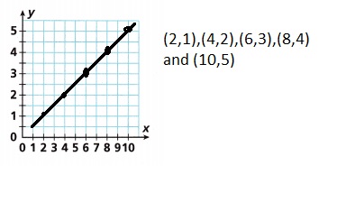
Explanation:
Plotted at least 5 points to display a data set
that has the trend line y = \(\frac{1}{2}\)x.
Included the graph of the trend line in my sketch as
if x = 2 then y = \(\frac{1}{2}\) X 2 = 1,(2,1),
if x = 4 then y = \(\frac{1}{2}\) X 4 = 2,(4,2),
if x = 6 then y = \(\frac{1}{2}\) X 6 = 3,(6,3),
if x = 8 then y = \(\frac{1}{2}\) X 8 = 4,(8,4),
if x = 10 then y = \(\frac{1}{2}\) X 10 = 5,(10,5)
shown above.
Question 3.
Critique Reasoning Mateo sketches a trend line to model a data set. Eight points lie above the trend line and three points lie below. Did Mateo make a mistake? Explain your reasoning.
Answer:
Yes, Mateo made a mistake,
Explanation:
Given Mateo sketches a trend line to model a data set.
Eight points lie above the trend line and three points lie below.
Mateo made a mistake as best fit trend line.
As he did not see that there are approximately the same number of data points on each side of the line and are they evenly distributed (that is, making sure that plots with a variety of x values are on top (and bottom)
of the line, not most above at the low end and most below at the high end).
Test Prep
Question 4.
Select all true statements about the scatter plot shown.
(A) There are equal numbers of points above the trend line and below it.
(B) The data set shows nonlinear association.
(C) The greatest vertical distance of any data point from the trend line is less than 1.
(D) The trend line touches most of the points in the data set.
(E) The data set shows negative linear association.
Answer:
(A) There are equal numbers of points above the trend line and below it.
(C) The greatest vertical distance of any data point from the trend line is less than 1.
(D) The trend line touches most of the points in the data set.
Explanation:
Selected all the true statements about the scatter plot shown as
(A) There are equal numbers of points above the trend line and below it because there is 1 point above and 1 point below the trend line
so equal number of points,
(C) The greatest vertical distance of any data point from the trend line is less than 1 as this is true if we see the vertical distance of any data point from the trend line it is less than 1,
(D) The trend line touches most of the points in the data set, yes there are 10 total points and the trend line touches 8 points.
Question 5.
Explain how adding outliers to a data set might not influence the data set.
Answer:
If the outliers are far away in distance,
Explanation:
By adding outliers to a data set might not influence the data set if they are added at far away distance.
Question 6.
Calhoun sketched a scatter plot comparing the numbers of hours studied to test scores for the latest test his class took. He found a trend line that was a good fit for the data. Which would you expect to be true? Select all that apply.
(A) There are data points above and below the trend line.
(B) The data have a linear association.
(C) The data points on the graph line up in a perfectly straight line.
(D) The slope of the trend line is positive.
(E) There are more data points that are outliers than data points that are not outliers.
Answer:
(A) There are data points above and below the trend line.
(B) The data have a linear association.
(C) The data points on the graph line up in a perfectly straight line.
(D) The slope of the trend line is positive,
Explanation:
Given Calhoun sketched a scatter plot comparing the numbers of hours studied to test scores for the latest test his class took. He found a trend line that was a good fit for the data. I would expect to be true with
(A) There are data points above and below the trend line.
(B) The data have a linear association.
(C) The data points on the graph line up in a perfectly straight line.
(D) The slope of the trend line is positive.
Spiral Review
Question 7.
Solve the equation 3(x – 7) = 2(x – 5).
Answer:
x = 11,
Explanation:
Given to solve 3(x – 7) = 2(x – 5) so
3x – 21 = 2x – 10,
3x – 2x = -10 + 21,
x = 11.
Question 8.
What is the solution to the system of equations?
2x – 6y = 10
-5x + 15y = 30
Answer:
No proper solution,
Explanation:
Given to find the solution to the system of equations
2x – 6y = 10 – equation (1),
-5x + 15y = 30 – equation (2),
Multiplying equation (1) by 5 and equation (2) by 2
then adding equation (1) and (2) we get
10x – 30y = 50
-10x + 30y = 60
0 + 0 = 110
Question 9.
Write an equation of a linear function with slope -2 that passes through the point (4, -5).
Answer:
The equation of the line is 2x + y = 3,
Explanation:
Given to find an equation of the line with a slope of -2 that passes through the point (4, -5). As we have formula
y – y1 = m (x – x1) where m is the slope so
y + 5 = -2(x – 4),
y + 5 = -2x + 8,
2x + y = 8 – 5, therefore the equation is 2x + y = 3.