Students can use the Spectrum Math Grade 8 Answer Key Chapter 6 Posttest as a quick guide to resolve any of their doubts
Spectrum Math Grade 8 Chapter 6 Posttest Answers Key
Check What You Learned
Answer the questions by interpreting data from the graph.
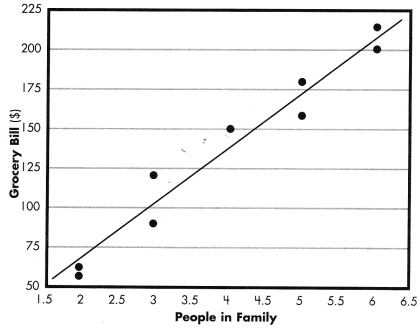
Question 1.
What two sets of data are being compared by this scatter plot?
Answer:
Grocery Bill and People in the Family.
Explanation:
A scatter plot shows the relationship between two sets of data.
It is made up of points, Grocery Bill and People in the Family.
So, the two sets of data are being compared by this scatter plot are the Grocery Bill and People in the Family.
Question 2.
Is the correlation positive or negative?
Answer:
Positive.
Explanation:
The above scatter plot shows the relationship between the Grocery Bill and People in the Family.
We observe a positive relationship as the Grocery Bill increases the number of People in the Family also increases.
Question 3.
Why might there be no outliers in this data?
Answer:
The cost of groceries per person is fairly consistent.
Explanation:
The above scatter plot shows the relationship between the Test scores and Hours of study.
Create a trend line by using a straight edge to draw a line across the points on a scatter plot.
To have the same number of points above and below the trend line while ignoring outliers.
But in the above given scatter plot there are no outliers,
the cost of groceries per person is fairly consistent.
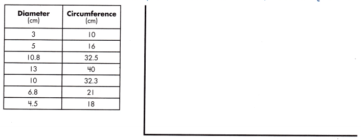
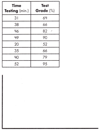
Use the data set below to create a scatter plot with a line of best fit. Then, answer the questions.
Question 4.
Answer:
Explanation:
With reference to the above given data set,
A scatter plot shows the relationship between two sets of data.
It is made up of points as centimeter and diameter.
The points are plotted by using the values from the two sets of data as coordinates.
This scatter plot shows the relationship between the centimeter and diameter.
As one value increases, the other appears to increase as well.
This indicates a positive relationship.
Question 5.
What two sets of data are being compared by this scatter plot?
Answer:
Diameter and Circumference.
Explanation:
As, we know that a scatter plot shows the relationship between two sets of data.
The two sets of data are being compared by the given scatter plot are the Diameter and Circumference.
Question 6.
Is the correlation between the data sets positive or negative?
Answer:
Positive.
Explanation:
The above scatter plot shows the relationship between the Diameter and Circumference. The trend line drawn between the Diameter increases the Circumference is increasing.
We observe a positive relationship as the Diameter increases the Circumference also increases.
Question 7.
Why might there be no outliers in this data?
Answer:
The Circumference of a shape is highly dependent on its diameter.
Explanation:
The above scatter plot shows the relationship between the Diameter and Circumference.
Create a trend line by using a straight edge to draw a line across the points on a scatter plot.
To have the same number of points above and below the trend line while ignoring outliers.
But there are no outliers in this data because the Circumference of a shape is highly dependent on its diameter.
Question 8.
If the diameter is 12, predict the circumference.
Answer:
36
Explanation:
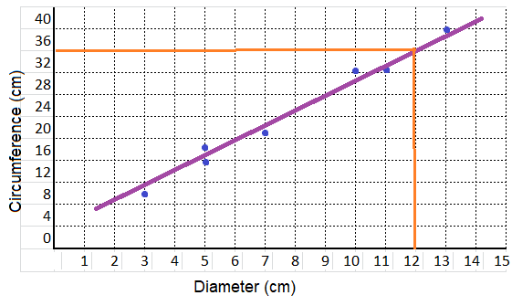
with reference to the above graph between the Diameter increases the Circumference,
at the the diameter is 12, the circumference is 32 cm.
Use each set of bivariate data to create a scatter plot, trend line, and an equation that approximates the data set.
Question 9.
a.
equation: ______________
Answer:
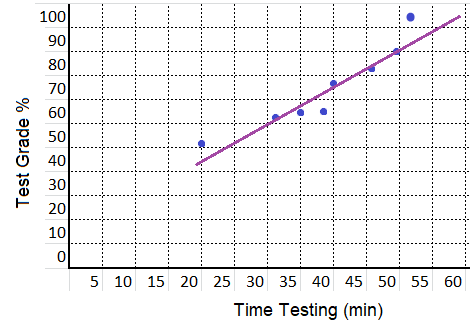
equation:
y = -8 x + 2
Explanation:
With reference to the above given data set,
m = \(\frac{95 – 79}{52 – 40}\) = \(\frac{16}{8}\) = 2
y = 2 x + b
90 = 2(49) + b
b = -8
y = mx + b
y = -8 x + 2
b.
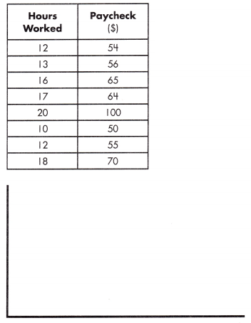
equation: ______________
Answer:
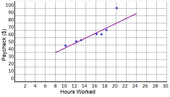
equation:
y = 2.5 x + 25
Explanation:
With reference to the above given data set,
m = \(\frac{70 – 55}{18 – 12}\) = \(\frac{15}{6}\) = 2.5
y = 2 x + b
70 = 2.5(18) + b
b = 25
y = mx + b
y = 2.5 x + 25
Use the data set to complete the frequency table and answer the questions.
The height of students is collected as follows: 70, 68, 60, 63, 73, 66, 71, 66, 72, 64, 68, 62, 70, 64, 67, 65, and 69.
Question 10.
Height Range: 60-63
Frequency: ________________
Cumulative Frequency: _______________
Relative Frequency: ______________
Answer:
Frequency: 3
Cumulative Frequency: 3
Relative Frequency: 17.6%
Explanation:
The below chart shows that the height of students.
The height of students ranged from the 60 – 75.

Frequency:
Frequency is the number of occurrences of a repeating event per unit of time.
The range of students height in 60 – 63 is 3 students.
So, the frequency is 3.
Cumulative Frequency:
cumulative frequency is the sum of all the frequencies before the size range.
0 + 3 = 3
Relative Frequency:
frequency of the given range ÷ total number of observations.
3/17 = 17.6%
Question 11.
Height Range: 64 – 67
Frequency: ________________
Cumulative Frequency: _______________
Relative Frequency: ______________
Answer:
Frequency: 6
Cumulative Frequency: 9
Relative Frequency: 35.3%
Explanation:
The below chart shows that the height of students.
The height of students ranged from the 60 – 75.
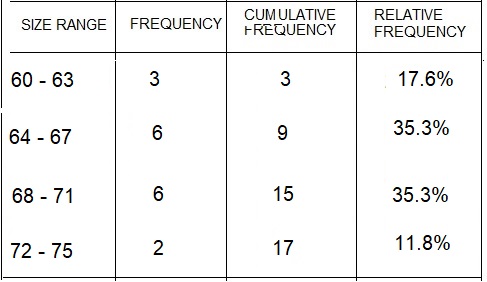
Frequency:
Frequency is the number of occurrences of a repeating event per unit of time.
The range of students height in 64 – 67 is 6 students.
So, the frequency is 6.
Cumulative Frequency:
cumulative frequency is the sum of all the frequencies before the size range.
3 + 6 = 9
Relative Frequency:
frequency of the given range ÷ total number of observations.
9/17 = 35.3%
Question 12.
Height Range: 68-71
Frequency: ________________
Cumulative Frequency: _______________
Relative Frequency: ______________
Answer:
Frequency: 6
Cumulative Frequency: 15
Relative Frequency: 35.3%
Explanation:
The below chart shows that the height of students.
The height of students ranged from the 60 – 75.
Frequency:
Frequency is the number of occurrences of a repeating event per unit of time.
The range of students height in 68 – 71 is 6 students.
So, the frequency is 6.
Cumulative Frequency:
cumulative frequency is the sum of all the frequencies before the size range.
9 + 6 = 15
Relative Frequency:
frequency of the given range ÷ total number of observations.
6/17 = 35.3%
Question 13.
Height Range: 72-75
Frequency: ________________
Cumulative Frequency: _______________
Relative Frequency: ______________
Answer:
Frequency: 2
Cumulative Frequency: 17
Relative Frequency: 11.8%
Explanation:
The below chart shows that the height of students.
The height of students ranged from the 60 – 75.
Frequency:
Frequency is the number of occurrences of a repeating event per unit of time.
The range of students height in 72 – 75 is 2 students.
So, the frequency is 3.
Cumulative Frequency:
cumulative frequency is the sum of all the frequencies before the size range.
15 + 2 = 17
Relative Frequency:
frequency of the given range ÷ total number of observations.
2/17 = 11.8%
Question 14.
How many students were included in the data set?
Answer:
17
Explanation:
The information given above shows the height of students.
The total number of students included in the data set are 17.
3 + 6 + 6 + 2 = 17
Question 15.
What are the most common height ranges for this set of students?
Answer:
64 – 67 and 68 – 71
Explanation:
The information given above shows the height of students.
The height of students ranged from the 60 – 75.
The most frequent height ranges for the set of students are from 64 – 67 and 68 – 71.
Question 16.
What is the least common height range for this set of students?
Answer:
72 – 75
Explanation:
The information given above shows the height of students.
The height of students ranged from the 60 – 75.
The least common height ranges the set of students are from 72 – 75.