We included HMH Into Math Grade 7 Answer Key PDF Module 13 Lesson 2 Compare Center and Spread of Data Displayed in Box Plots to make students experts in learning maths.
HMH Into Math Grade 7 Module 13 Lesson 2 Answer Key Compare Center and Spread of Data Displayed in Box Plots
I Can make box plots and draw inferences about populations based on displayed data.
Step It Out
Question 1.
The sixth- and seventh-grade students are having a reading contest. Their progress is shown.

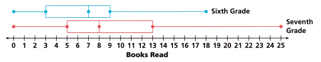
A. Describe the shapes of the box plots.
Answer:
The shapes of the box show the statistical data. The middle of the box is the median, Left to the median is the lower quartile, and Right to the median is the upper quartile, and it shows the minimum and the maximum values of the data.
B. Compare the centers of the box plots by comparing their medians.
Answer:
Given that,
The median of the sixth grade is 7.
The median of the seventh grade is 8.
The median of the seventh grade is greater than the sixth grade.
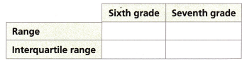
C. Find the ranges and the interquartile ranges. Complete the table.
Answer:
The range of the sixth grade = maximum value – minimum value = 18 – 0 = 18
The range of the Seventh grade is Maximum value – minimum value = 25 – 0 = 25
The interquartile range of the sixth grade = upper quartile – lower quartile = 9 – 3 = 6
The interquartile range of the seventh grade = upper quartile – lower quartile = 13 – 5 = 8
D. Why would the data sets appear to have similar spreads using interquartile range and very different spreads using the range?
Answer:
The range means the maximum – minimum.
The interquartile means the upper quartile – lower quartile.
The range gives the spreads of the whole data sets and the interquartile ranges gives the spread of the middle of the data.
E. Explain what the left whiskers of the box plots tell you about the data sets.
Answer:
The Whiskers are the lines outside the box that goes from the minimum to the lower quartile and the upper quartile to the maximum.
The whiskers of the box plots also give information about spreading the data.
So, the left whiskers of the box plots tell you about the data sets.
Turn and Talk Can you project the winner of the contest based on this data?
Answer: Yes you can project the winner of the contest based on the data.
Question 2.
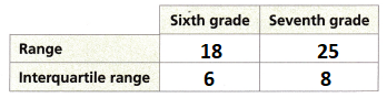
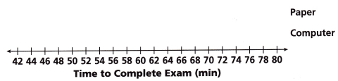
The times for students to take a test on paper and the same test on a computer are shown.
A. Find the five key values that describe the test scores collected from pencil-and-paper exams.
The minimum is ___________. The maximum is ____________.
The median, or middle value, is ____________.
The lower quartile is the median of values less than the median, Q1 = ______________.
The upper quartile is the median of the top half of the data, Q3 = _____________.
Answer:
The data of the paper is 42, 48, 52, 54, 59, 61, 61, 64, 65, 67, 68, 70, 72, 75, 80
The minimum is 42. The maximum is 80.
The median or the middle value is 64
The lower quartile is the median of values less than the median, Q1 = 54.
The upper quartile is the median of the top half of the data, Q3 = 70
B. Identify the five key values for the sample of computer exam scores.
Minimum: _____________
Median: _____________
Maximum: _____________
Q1: _____________
Q3: _____________
Answer:
The data of the computer is 46, 47, 48, 50, 52, 55, 58, 60,62, 64, 64, 64, 69, 73, 74.
Minimum of the data = 46
Median of the data = 60
Maximum of the data = 74
Lower quartile = Q1 = 50
Upper quartile = Q2 = 64
C. Sketch box plots to represent each sample.
Answer:
Minimum of the paper = 44
Median of the paper = 64
Maximum of the paper = 80
Lower quartile of the paper = Q1 = 54
Upper quartile of the paper = Q2 = 70
Minimum of the computer= 46
Median of the computer = 60
Maximum of the computer = 74
Lower quartile computer = Q1 = 50
Upper quartile computer = Q2 = 64
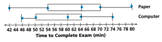
D. Compare the centers and spreads of the box plots. Which testing format takes students longer to complete?
Answer:
The center of the paper = 64
The center of the computer = 60
The spreads of the paper = 70 – 54 = 16
The spreads of the computer = 74 – 46 = 28
The spread testing format takes students longer to complete.
Check Understanding
Question 1.
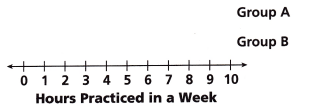
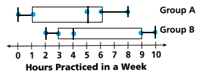
Two groups of 8 violin students kept track of the hours they practiced in a week. The results were:
A: 0, 1, 3, 5, 5, 6, 6, 8
B: 2, 3, 3, 3, 5, 6, 9, 10
Sketch box plots representing each data set. Draw one conclusion based on the plots.
Answer:
One conclusion based on the plots is the median.
The data of A = 0, 1, 3, 5, 5, 6, 6, 8
Median means the first arrange the numbers in the ascending order.
Then the middle number of the data is called the median if the middle numbers are two then add the two numbers and divided them by two.
The median of the A = 5 + 5/2 = 10/2 = 5
5 is the median of the A
Minimum of A is 0.
Maximum of A is 8.
Lower quartileof A = Q1 = 1
Upper quartile A= Q2 = 6
The data of B = 2, 3, 3, 3, 5, 6, 9, 10
Median means the first arrange the numbers in the ascending order.
Then the middle number of the data is called the median if the middle numbers are two then add the two numbers and divided them by two.
The median of the B = 3 + 5/2 = 8/2 = 4
4 is the median of the B.
Minimum of B is 2.
Maximum of B is 10.
Lower quartile of B = Q1 = 3
Upper quartile B= Q2 = 9
Question 2.
About how many data points fall below the median of a data set?
Answer:
In the A the data points below the median of the data set are 4.
In the B the data points below the median of the data set are 4.
Both A and B have the same data points.
On Your Own
Question 3.
The box plots below show the distribution of ages for players on two football teams.
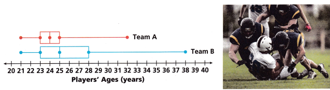
A. Use Structure How are the distributions alike?
Answer: In the box plots the distributions of team A and Team B shows the median, upper quartile, lower quartile, minimum, and maximum.
B. Which measure of spread would you choose to describe these data sets? Use it to compare the spread of the data in these sets.
Answer:
Spread means the range.
The spread of team A is 32 – 21 = 11.
The spread of team B is 38 – 21 = 17.
The spread of team B is greater than the spread of team A.
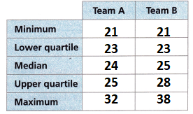
C. Use the box plots to complete the table.
Answer:
Minimum of team A is 21
Maximum of team A is 32
Median of team A is 24
Lower quartile of team A = Q1 = 23
Upper quartile team A= Q2 = 25
The minimum of the team B is 21
Maximum of team B is 38
Median of team B is 25
Lower quartile of team B = Q1 = 23
Upper quartile team B= Q2 = 28
D. Compare the centers of the box plots.
Answer:
The center of team A is 24.
The center of team B is 25.
The center of team B is greater than that of team A.
E. Explain the significance of the age 25 years in each box plot.
Answer:
F. Reason Where is the greatest difference in the box plots? Justify your choice.
Answer: The biggest difference in the box plot is the right whisker of team B.
Question 4.
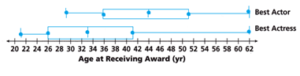
Each year the Academy Awards honor excellence in film, including awards for Best Actor and Best Actress. The data sets shown are random samples of the ages, in years, at which these awards have been won.
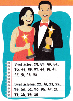
A. Find the five key values for each data set.
Answer:
The data of the best actor is 29, 53, 40, 62, 36, 49, 53, 37, 44, 31, 41, 49, 51, 48, 32.
Median means the first arrange the numbers in the ascending order.
29, 31, 32, 36, 37, 40, 41, 44, 48, 49, 49, 51, 53, 53, 62.
Then the middle number of the data is called the median if the middle numbers are two then add the two numbers and divided them by two.
Median of the best actor = 44
Minimum of the best actor = 29
Maximum of the best actor = 62
Lower quartile of best actor = Q1 = 36
Upper quartile best actor= Q2 = 51
The data of the best actress is 22, 41, 27, 22, 38, 60, 62, 30, 36, 49, 21, 33, 26, 38, 28.
Median means the first arrange the numbers in the ascending order.
21, 22, 22, 26, 27, 28, 30, 33, 36, 38, 38, 41, 49, 60, 62
Then the middle number of the data is called the median if the middle numbers are two then add the two numbers and divided them by two.
Median of the best actress = 33
Minimum of the best actress= 21
Maximum of the best actress = 62
Lower quartile of best actress = Q1 = 26
Upper quartile best actress= Q2 = 41
B. Sketch box plots to represent each sample.
Answer:
Median of the best actor = 44
Minimum of the best actor = 29
Maximum of the best actor = 62
Lower quartile of best actor = Q1 = 36
Upper quartile best actor = Q2 = 51
Median of the best actress = 33
Minimum of the best actress= 21
Maximum of the best actress = 62
Lower quartile of best actress = Q1 = 26
Upper quartile best actress = Q2 = 41
C. Compare the centers and spreads of the box plots.
Answer:
The center for the best actor is 44
The spread of best actor is 62 – 29 = 33
The center of the best actress is 33
The spread of best actress is 62 – 21 = 41
The center of the best actor is greater than the center of the best actress.
The Spread of the best actress is greater than the spread of the best actor.
D. Critique Reasoning After looking at the box plots, Tomas expresses surprise that most award-winning actresses are under the age of 40. Martha disagrees, pointing out that the right whisker is the longest part of the Best Actress box plot. Therefore, she argues, there are more winners from ages 41 to 62 than in the other intervals. Determine which friend is correct, and explain why.
Answer:
Tomas expresses surprise that most award-winning actresses are under the age of 40.
Martha argues, that there are more winners from ages 41 to 62 than in the other intervals.
Tomas is the correct answer. Because most of the award-winning best actresses are under the age of 40.
E. Reason What do the box plots for the samples tell you about the populations?
Answer: The box plots show the graphical representation of the data and also show the extreme values of the data it means the populations.
Lesson 13.2 More Practice/Homework
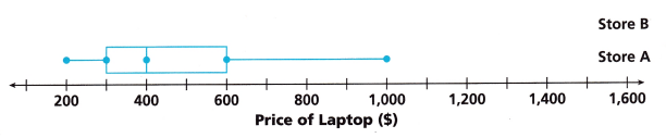
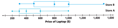
Ms. Horvat is investigating prices of laptop computers at her local stores. She visits two different stores and selects a random sample of computers, recording their prices.

Question 1.
The box plot representing the data from Store A is shown.
The five key values for the data from Store B are:
minimum = $300. Q1 = $500, median = $800, Q3 = $1,000, maximum = $1,500
A. Use the key values to sketch the box plot for Store B.
Answer:
Minimum of store B= $300.
Q1 = $500
Median = $800
Q3 = $1,000
Maximum = $1,500
B. Compare the centers and shapes of the box plots.
Answer:
The shape of the store B box is greater than the shape of the store A.
The center of Store B = 800.
The center of Store A = 400.
The shape and center of store B is greater than that of store A.
C. Compare the spreads of the box plots.
Answer:
The spreads of the Store B = maximum – minimum = 1500 – 300 = 1200.
The spreads of store A = maximum – minimum = 1000 – 200 = 800.
The spread of store B is greater than store A.
D. Use Structure The price $1000 Is a key value for each box plot. Explain the significance of this price for each store’s data.
Answer:
E. For each store, compare the spread of the lower half of the data with the upper half of the data.
Answer:
The lower half of the data means the lower quartile.
The upper half of the data means the upper quartile.
The lower quartile of Store B = $500.
The upper quartile of the Store B = $1000.
The lower quartile of Store A = 300.
The upper quartile of Store A = 600.
The lower and the upper quartile of Store B is greater than store A.
Test Prep
Question 2.
Which measures are used to make a box plot? Select all that apply.
(A) maximum
(B) mean
(C) median
(D) minimum
(E) mode
Answer: To make a box plot you can use maximum, medium, and minimum.
Options A, C, D are the correct answers.
Question 3.
When comparing two sets of data represented by box plots, compare the shape, ___________, and _____________.
Answer: When comparing two sets of data represented by box plots, compare the shape, lower quartile, and upper quartile.
Question 4.
Which is the preferred measure of spread for a data set with outliers?
(A) interquartile range
(B) mean
(C) median
(D) range
Answer:
The interquartile range is not affected by the outliers.
So, the Interquartile range is the answer.
Option A is the correct answer.
Question 5.
Moesha and Justin are competing in an online game to see who can solve puzzles in less time. The dot plots show the distribution of their times. Compare the centers and shapes of the box plots.
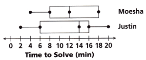
Answer:
The shape of the Moesha and the Justin box plot is the same.
The median of the Moesha is 12.
The median of the Justin is 14.
The median of the Justin is greater than the Median of Moesha.
Spiral Review
Question 6.
Describe the cross-section made from slicing the right triangular prism perpendicular to its base and the cross-section made from slicing the right prism parallel to its base.
Answer:
In the triangular prism, each cross-section is parallel to the base.
So, the cross-section made from slicing the right triangular prism is also parallel to its base.
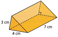
Question 7.
What is the volume of the right triangular prism shown?
Answer:
The formula for the volume of the right triangular prism = B x H x L/2
Breadth = 4cm
Length = 7cm
Height = 3cm
= 4 x 7 x 3/2
= 14/2
= 7 cubic cm.
Therefore the volume of the right triangular prism is 7 cubic cm.
Question 8.
How many triangles can you construct with side lengths 5 inches, 8 inches, and 20 inches?
Answer:
We have three different types of triangles based on the sides. They are equilateral triangles, Isosceles triangles, and scalene triangles.
In an equilateral triangle, all sides are equal.
In the Isosceles triangle, 2 sides are equal.
In the Scalene triangle, no side is equal.
Given that the side lengths are 5 inches, 8 inches, and 20 inches.
So, we can construct only one triangle which is the scalene triangle.