We included HMH Into Math Grade 7 Answer Key PDF Module 13 Lesson 1 Compare Center and Spread of Data Displayed in Dot Plots to make students experts in learning maths.
HMH Into Math Grade 7 Module 13 Lesson 1 Answer Key Compare Center and Spread of Data Displayed in Dot Plots
I Can compare important characteristics of data sets displayed in dot plots to draw conclusions based on data.
Step It Out
Question 1.
At the end of the first week of school, Mr. Parrish asked 15 freshman students how much time they spent studying that week. He also surveyed 15 sophomore students to investigate whether their habits were different.

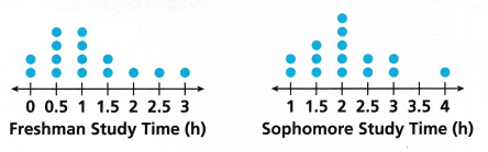
A. Compare the shapes of the dot plots by describing where the values are clustered in each plot.
Answer:
The clustered means in the dot plot that several data points occur within a small interval.
The clustered Freshman study time is 0 to 1.5.
The clustered Sophomore study time is 1 to 3.
B. Find the median and mean of each set of data.
Freshman: median = __________
Freshman: mean = ____________
Sophomore: median = ____________
Sophomore: mean = ______________
Answer:
The Data of the Freshman study time is 2,4,4,2,1,1,1.
For the Freshman median first, write the data in the ascending order.
The ascending order of the data is 1,1,1,2,2,4,4.
The median is the middle value of the data. If there are 2 middle values then the addition of two middle values is divided by two.
So, the median of the Freshman is 2.
Mean of the Freshman = sum of the data/how many numbers are there.
= 1 + 1 + 1 + 2 + 2 + 4 + 4/ 7
= 15/7
= 2.14
Therefore the mean of the Freshman is 2.14.
The Data for the Sophomore study time is 2,3,5,2,2,0,1
For the Freshman median first, write the data in the ascending order.
The ascending order of the data is 0,1,2,2,2,3,5.
The median is the middle value of the data. If there are 2 middle values then the addition of two middle values is divided by two.
So, the median of the Sophomore is 2.
Mean of the Sophomore = sum of the data/how many numbers are there.
= 0 + 1 + 2 + 2 + 2 + 3 + 5/7
= 15/7
Mean of the Sophomore = 2.14
C. Find the range of each set of data.
Freshman range: 3 – ____________ = ___________ hours
Sophomore range: 4 – ____________ = __________ hours
Both data sets have a range of ___________ hours.
Answer:
The range is the difference between the lowest and the highest value.
Freshman range = 4 – 1 = 3
Sophomore range = 5 – 0 = 5
D. What do the data tell you about study habits?
Answer: The mean and median of both the data are same but the range of the data is different.
Turn and Talk How does a dot plot help you look at trends in data?
Answer:
Question 2.
Bill grows oranges and Carla grows apples. Each farmer selected 13 trees at random and counted the pieces of fruit they produced to the nearest hundred.
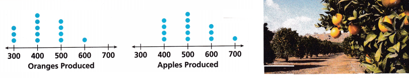
A. How are the shapes of the dot plots alike in terms of their peaks?
Answer:
The height value in the distribution is the Peaks.
The peak in the oranges produced is 5.
The peak in the apples produced is 5.
B. What is the median of each data set? Compare the medians of the plots.
Answer:
The Data of the oranges produced is 3,5,4,1,0
For the oranges produced median first, write the data in the ascending order.
The ascending order of the data is 0,1,3,4,5.
The median is the middle value of the data. If there are 2 middle values then the addition of two middle values is divided by two.
So, the median of the oranges produced is 3.
Mean of the oranges produced = sum of the data/how many numbers are there.
= 3 + 5 + 4 + 1 + 0/ 5
= 13/5
= 2.6
Therefore the mean of the apples produced is 2.6
The Data of the apples produced is 0,4,5,3,1.
For the apples produced median first, write the data in the ascending order.
The ascending order of the data is 0,1,3,4,5.
The median is the middle value of the data. If there are 2 middle values then the addition of two middle values is divided by two.
So, the median of the apples produced is 3.
Mean of the apples produced = sum of the data/how many numbers are there.
= 0 + 4 + 5 + 3 + 1/ 5
= 13/5
= 2.6
Therefore the mean of the apples produced is 2.6
C. Use the dot plots to compare the ranges of the data.
Answer:
The range is the difference between the lowest and the highest value.
The range of the oranges produced = 5 – 0 = 5
The range of the apples produced = 5 – 0 = 5
Turn and Talk What information can you find by comparing the ranges of two data sets? Explain.
Answer: The range of the two data sets is equal.
Check Understanding
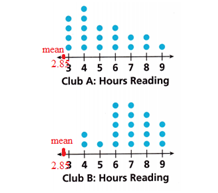
The members of two book clubs kept track of how many hours they spent reading over one weekend. Use the dot plots for Problems 1-3.
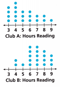
Question 1.
Compare the means of the data sets and draw one conclusion.
Answer:
The data of Club A is 4,5,3,3,2,2,1.
For the Club A median first, write the data in the ascending order.
The ascending order of the data is 1,2,2,3,3,4,5.
The median is the middle value of the data. If there are 2 middle values then the addition of two middle values is divided by two.
So, the median of Club A is 3.
Mean of the Club A = sum of the data/how many numbers are there.
= 1 + 2 + 2 + 3 + 3 + 4 + 5/ 7
= 20/7
= 2.85
Therefore the mean of the Cube A is 2.85
The data of Club B is 0,2,1,5,5,4,3
For the Club B median first, write the data in ascending order.
The ascending order of the data is 0,1,2,3,4,5,5.
The median is the middle value of the data. If there are 2 middle values then the addition of two middle values is divided by two.
So, the median of Club B is 3.
Mean of the Club B = sum of the data/how many numbers are there.
= 0 + 1 + 2 + 3 + 4 + 5 + 5/ 7
= 20/7
= 2.85
Therefore the mean of the Cube B is 2.85
Question 2.
Compare the ranges of the data sets and draw one conclusion.
Answer:
The range is the difference between the lowest and the highest value.
The range of the Cube A = 5 – 1 = 4
The range of the Cube B = 5 – 0 = 5
Question 3.
Draw one conclusion from the shape of the data distribution.
Answer:
The one conclusion is the mean
Mean of the Club A = sum of the data/how many numbers are there.
= 1 + 2 + 2 + 3 + 3 + 4 + 5/ 7
= 20/7
= 2.85
Mean of the Club B = sum of the data/how many numbers are there.
= 0 + 1 + 2 + 3 + 4 + 5 + 5/ 7
= 20/7
= 2.85
Therefore the mean of the Cube B is 2.85
On Your Own
Question 4.
The dot plots show recorded wait times for two food trucks.
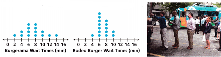
A. Use Structure Visually compare the spreads of the data sets.
Answer:
Spreads mean the range.
The data of the Burgerama Wait Times is 0, 1, 2, 4, 4,2,1,1,0.
The range of the Burgerama Wait Times is 4 – 0 = 4
The data of the Rodeo Burger is 0,0,1,7,5,2,0,0,0.
The range of the Rodeo Burger Wait Times is 7 – 0 = 7
B. Use Structure Visually compare the centers of the data sets.
Answer:
Centre means median
The data of the Burgeraman Wait Times is 0, 1, 2, 4, 4,2,1,1,0.
For the Salary median first, write the data in the ascending order.
The ascending order of the data is 0,0,1,1,1,2,2,4,4.
The median is the middle value of the data. If there are 2 middle values then the addition of two middle values is divided by two.
So, the medianBurgeraman Wait Times is 4.
The data of the Rodeo Burger is 0,0,1,7,5,2,0,0,0.
For the Salary median first, write the data in the ascending order.
The ascending order of the data is 0,0,0,0,0,1,2,5,7.
The median is the middle value of the data. If there are 2 middle values then the addition of two middle values is divided by two.
So, the median Rodeo Burger Wait Times is 0
C. Complete the table to verify your visual assessments.
Answer:
The number of observations is 9.
The median of the Burgerama is 4.
The median of the rodeo Burger is 0.
The range of the Burgerama is 4.
The range of the Rodeo Burger is 7.
D. Do you expect the means to be about the same or to be different for each data set? Explain your visual assessment.
Answer: The mean of the two data sets is the same.
E. Find the mean to the nearest tenth to check your visual assessment.
Burgerama mean: ___________
Rodeo Burger mean: ______________
Answer:
The data of the Burger Aman is 0, 1, 2, 4, 4,2,1,1,0.
Mean of the Burgerama = sum of the data/how many numbers are there.
= 0 + 1 + 2 + 4 + 4 + 2 + 1 + 1 + 0/ 9
= 15/9
= 1.66
Therefore the mean of the burgerama is 1.66
The data of the Rodeo Burger is 0,0,1,7,5,2,0,0,0.
Mean of the Rodeo Burger = sum of the data/how many numbers are there.
= 0 + 0 + 1 + 7 + 5 + 2 + 0 + 0 + 0/ 9
= 15/9
= 1.66
Therefore the mean of the Rodeo Burger is 1.66
F. Construct Arguments Based on the data, which food truck would have more predictable wait times? Explain.
Answer:
The range of the Burgerama is 4.
The range of the Rodeo Burger is 7.
Rodeo Burgerfood truck have more predictable wait times.
Question 5.
Fabulous Fashions selected employees at random to review salary distribution for the company.
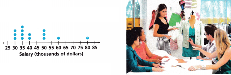
A. What is the median? Describe the shape of the data, including any clusters.
Answer:
The data of the Salary is 0,3,4,2,0,3,0,1,0,0,0,1,0.
For the Salary median first, write the data in the ascending order.
The ascending order of the data is 0,0,0,0,0,0,0,1,1,2,3,3,4.
The median is the middle value of the data. If there are 2 middle values then the addition of two middle values is divided by two.
So, the median Salary is 0.
Mean of the Salary = sum of the data/how many numbers are there.
= 0 + 0 + 0 + 0 + 0 + 0 + 0 + 1 + 1 + 2 + 3 + 3 + 4/ 7
= 14/13
= 1.07
Therefore the mean the Salary is 2.85
B. What is the range of the data?
Answer:
The range is the difference between the lowest and the highest value.
The range of the salary is 4 – 0 = 4
C. What do the data in the dot plot tell you about what most employees earn?
Answer: The data in the dot plot tells that most employees earn 35 thousand dollars.
Question 6.
The dot plots show the ages in years of the players for both the Wolves and the Jets basketball teams.
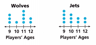
A. Compare the shapes of the set of data.
Answer:
Compare the shapes of the set of the data by the mean is
The data of the Wolves is 3,1,4,2.
Mean of the Wolves = sum of the data/how many numbers are there
= 10/4 = 5/2 = 2.5
The data of the Jets is 4,3,2,2.
Mean of the jets = sum of the data/how many numbers are there.
= 11/4 = 2.75
The mean of the jets is greater than the Mean of the Wolves.
B. Compare the modes and medians of the data sets.
Answer:
The data of the Wolves is 3,1,4,2
Mode is the number that appears the most number in the data.
There is no mode for the Wolves.
For the Wolves median first, write the data in the ascending order.
The ascending order of the data is 1,2,3,4.
The median is the middle value of the data. If there are 2 middle values then the addition of two middle values is divided by two.
So, the median of Wolves is 2 + 3 /2 = 5/2 = 2.5
The data of the Jets is 4,3,2,2.
Mode is the number that appears the most number in the data.
The mode is 2
For the jet’s median first, write the data in ascending order.
The ascending order of the data is 2,2,3,4.
The median is the middle value of the data. If there are 2 middle values then the addition of two middle values is divided by two.
So, the median of Jets is 2 + 3 /5 = 5/2 = 2.5
C. What is the range of each data set?
Answer:
The range is the difference between the lowest and the highest value.
The range of the Wolves is 4 – 1 = 3.
The range of the Jets = 4 – 2 = 2
D. Reason What do the dot plots tell you about the ages of the players on the two teams?
Answer:
The difference between the range of the ages is 3 – 2 = 1.
The difference between the medians of the ages is 2.5 – 2.5 = 0
The difference between the means of the ages are 2.75 – 2.5 = 0.25
The range and the mean of the Wolves are greater than the Jets.
Lesson 13.1 More Practice/Homework
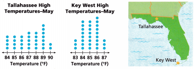
Tallahassee and Key West are at opposite ends of the state of Florida. The dot plots show high temperatures recorded in each city in May. Use this information for Problems 1-7.
Question 1.
Calculate the ranges of both sets of data.
Answer:
The range is the difference between the lowest and the highest value
The data of the Tallahassee High Temperatures- May is 4,4,4,5,5,7,2.
The range of the Tallahassee High Temperatures is 7 – 2 = 5.
The data of the Key West High Temperatures- May is 3,8,8,9,3.
The range of the Tallahassee High Temperatures is 9 – 3 = 6.
Question 2.
Which city’s temperatures have the greater spread?
Answer:
Spread means the range of the data.
The range of the Tallahassee High Temperatures is 7 – 2 = 5.
The range of the Tallahassee High Temperatures is 9 – 3 = 6.
Tallahassee High Temperatures have the greatest spread.
Question 3.
Calculate the medians of both sets of data.
Answer:
The data of the Tallahassee High Temperatures- May is 4,4,4,5,5,7,2.
For the Tallahassee High Temperatures- May median first, write the data in the ascending order.
The ascending order of the data is 4,4,4,5,5,7,2.
The median is the middle value of the data. If there are 2 middle values then the addition of two middle values is divided by two.
So, the median of Tallahassee High Temperatures- May is 5
The data of the Key West High Temperatures- May is 3,8,8,9,3.
For the Key West High Temperatures- May median first, writes the data in the ascending order.
The ascending order of the data is 3,3,8,8,9.
The median is the middle value of the data. If there are 2 middle values then the addition of two middle values is divided by two.
So, the median of Key West High Temperatures- May is 8.
Question 4.
Which city’s temperatures have the greater median?
Answer:
The median of Tallahassee High Temperatures- May is 5.
The median of Key West High Temperatures- May is 8.
Key West High Temperatures have the greatest temperature.
Question 5.
What was the mean high temperature in May for each city, rounded to the nearest degree?
Answer:
The data of the Tallahassee High Temperatures- May is 4,4,4,5,5,7,2.
Mean of the Tallahassee High Temperatures- May = sum of the data/how many numbers are there = 4 + 4 + 4 + 5 + 5 + 7 + 2/7
= 31/7
= 4.42
4.42 rounded to the nearest degree is 4
The data of the Key West High Temperatures- May is 3,8,8,9,3.
Mean of the Key West High Temperatures- May = sum of the data/how many numbers are there = 3 + 8 + 8 + 9 + 3/5
= 31/5
= 6.2
6.2 rounded to the nearest degree is 6.
Question 6.
What was the difference between the median and the mean for each city?
Answer:
Mean of the Tallahassee High Temperatures- May = 4.42
Mean of the Key West High Temperatures- May = 6.2
The median of Tallahassee High Temperatures- May is 5.
The median of Key West High Temperatures- May is 8.
The difference between the medians of Tallahassee High Temperatures- May and the Key West High Temperatures- May is 8 – 5 = 3.
The difference between the means of the Tallahassee High Temperatures and the Key West High Temperatures- May = 6.2 – 4.42 = 1.78
Question 7.
Geography What do you learn about the temperatures for May in these cities by comparing their dot plots?
Answer:
Mean of the Tallahassee High Temperatures- May = 4.42
Mean of the Key West High Temperatures- May = 6.2
Key West High Temperatures- May has the highest temperature than the Tallahassee High Temperatures- May.
Test Prep
Use the dot plots for Problems 8-11.
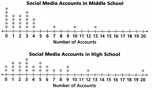
Question 8.
What is the median for the middle school set of data?
(A) 0
(B) 1
(C) 2
(D) 3
Answer:
The data for the middle school is 6,4,4,5,3,0,0,1,0,0,1,0,0,1,0,0,0,0,0,0,0.
For the middle school median first, write the data in ascending order.
The ascending order of the data is 0,0,0,0,0,0,0,0,0,0,0,0,0,1,1,1,3,4,4,5,6.
The median is the middle value of the data. If there are 2 middle values then the addition of two middle values is divided by two.
So, the median of the middle school is 0.
Option A is the correct answer.
Question 9.
What is the median for the high school set of data?
(A) 3
(B) 4
(C) 5
(D) 6
Answer:
The data for the high school is 2,3,3,4,2,3,2,1,1,2,0,0,1,0,0,0,0,0,0,0,1.
For the high school median first, write the data in ascending order.
The ascending order of the data is 0,0,0,0,0,0,0,0,0,1,1,1,1,2,2,2,2,3,3,3,4.
The median is the middle value of the data. If there are 2 middle values then the addition of two middle values is divided by two.
So, the median of the high school data is 1.
Question 10.
Which of the following best describes the shape of the data in the middle school dot plot?
(A) Most of the data points are less than 2.
(B) Most of the data points are 5 or more.
(C) Most of the data points are 4 or less.
(D) There are no outliers.
Answer:
Most of the data points are less than 2
Option A is the correct answer.
Question 11.
What can you conclude about the variations among populations represented in this survey?
Answer:
The population in the middle school is 25
The population in the high school is 25
We conclude that both the schools have the same population in this survey.
Spiral Review
Question 12.
Find the volume of the composite figure shown.
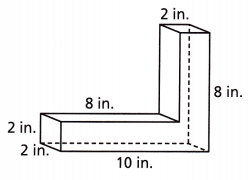
Answer:
volume of the composite figure = LWH + LWH
10 x 2 x 2 + 8 x 2 x 2 = 40 + 32
= 72 in.
The volume of the composite figure is 72 cubic in.
Question 13.
Find the surface area of the composite figure.
Answer:
The surface area of the composite figure = Ph + 2B.
= (10 + 10 + 2 + 2)2 + 2(8 x 2)
= 48 + 20
= 68 sq. inches.