We included HMH Into Math Grade 6 Answer Key PDF Module 16 Lesson 5 Describe Distributions to make students experts in learning maths.
HMH Into Math Grade 6 Module 16 Lesson 5 Answer Key Describe Distributions
I Can describe the shape, distribution, and range of a data set, and use the shape, measures of center, or variability to draw conclusions about the data.
Step It Out
Question 1.
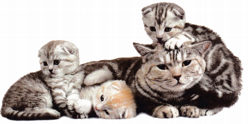
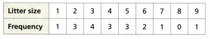
A veterinarian monitored 18 pregnant cats. The number of kittens per litter is summarized in the table.
A. What statistical question might these data have been collected to answer?
Answer:
The statistical question might these data have collected to answer is for shape, center, and spread in the distribution of the data.
B. Since the table shows exact data values, a ___________ is a good choice to display the data. Plot the data on the dot plot.
Answer:
Since the table shows exact data values, a dot plot is a good choice to display the data.
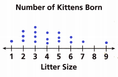
C. Describe the shape, distribution, and range of the data.
Answer:
The range is the difference between the highest and lowest values.
Given data
1, 3, 4, 3, 3, 2, 1, 0, 1
Arrange them in order
0, 1, 1, 1, 2, 3, 3, 3, 4
The lowest value is 0 and the highest value is 4
Range = 4 – 0 = 4
D. Find the mean, median, and mode of the data. Round to the tenths place if necessary.
Answer:
Given data is 0, 1, 1, 1, 2, 3, 3, 3, 4
Mean = sum of terms ÷ no of values
Sum of terms = 0 + 1 + 1 + 1 + 2 + 3 + 3 + 3 + 4
= 18
No of values = 9
Mean = sum of terms ÷ no of terms
= 18 ÷ 9
= 2
Median is called the middle value of the data.
Median = 2
Mode is the number that often repeats.
Therefore the number that often repeats itself is 2.
E. Looking at the shape of the data distribution in the dot plot, which of these measures of the center would best represent the data? Explain your reasoning.
Answer:
Mode is the best measure of the center that would best represent the data.
Turn and Talk Explain why the mode is the best measure of center for the data?
Answer:
Mode is the best measure of center for the data because it lets us know which values in the dataset are most common. And the mode is easy to understand and calculate.
Question 2.
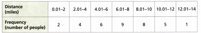
The table shows the distances some students at Valley Middle School live from a shopping mall.
A. What statistical question might these data have been collected to answer?
Answer:
The satistical question we might have to collect the data is for clusters, peaks, gaps and symmetry.
B. Complete the histogram.
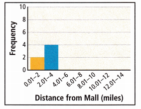
Answer:
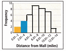
C. Describe the distribution of the data by identifying clusters, peaks, gaps, and symmetry.
Answer:
The peak is 6.01 – 8
There are no gaps in the given data set.
clusters: The distance 6.01 – 8, 8.01 – 10, and 10.01 – 12 are clusters.
Symmetry is 8.01 -10.
D. Draw one conclusion about the survey results based on a fact from Part C. Explain.
Answer:
Turn and Talk Suppose there were 15 students missing from the sample. Seven students lived 2.01-4 miles from the mall, three students lived 4.01-5 miles from the mall, and five students lived 10.1-12 miles from the mall. How might your summary statement change? Explain.
Answer:
Question 3.
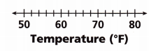
The table shows the average daily temperature in degrees Fahrenheit during Maria’s 8-day family vacation.
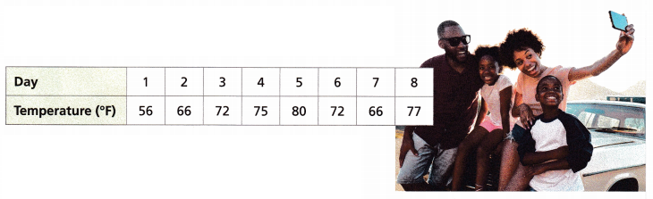
A. Since the table shows distinct data values that have a wide range of values and gaps between the data, a ___________ is a good choice for the data display.
Answer:
A histogram is a good choice for the data display.
B. Complete the box plot.
Answer:
C. The median of the data is ___________.
The lower quartile is ___________. The upper quartile is ___________.
The interquartile range is ___________ and the range is ___________.
Answer:
Median = 72, Lower quartile is 66, upper quartile is 77.
The interquartile range is 72 and Range is 24.
Explanation:
Median:
Arrange the given numbers in ascending order
56, 66, 66, 72, 72, 75, 77, 80
Now add the middle values and divide them by two
The middle values are 72 +72 = 144
144 ÷ 2
72
The values are 56, 66, 66, 72, 72, 75, 77, 80
56, 66, and 66 are the lower half of the data
The lower quartile is 66.
75, 77, and 80 in the upper half of the data
The upper quartile is 77.
The interquartile range is the middle half of the data set which is 72.
Range = 80 -56 = 24.
D. State one conclusion that can be drawn from the shape of the data and the range and one conclusion that can be drawn from the shape of the data and the interquartile range.
Answer:
Check Understanding
Draw one conclusion from the data. State whether you used a measure of center or fact about the shape or spread of the data to draw your conclusion.
Question 1.
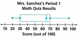
Answer:
Given,
The data set is 20, 30, 65, 70, 95
The Median is called the middle number of the data set
According to the given box plot, we know that the median is 65.
So we get that half of the students are about 65 or more and others are less than 65. The median which is a measure of the center was used to draw the conclusion.
Question 2.
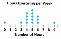
Answer:
Hours of exercising per week 1 0 0 1 4 5 3 0 0 1
Number of hours 0 1 2 3 4 5 6 7 8 9
The peak level is at 5 hours
The gap is at 1, 2, 7, and 8.
On Your Own
Question 3.
The table shows the numbers of hours spent engaged in physical activity each week for 50 sixth-grade students.
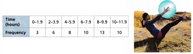
A. What statistical question might these data have been collected to answer?
Answer:
The statistical question might these data have been collected to answer is a range, interquartile range.
B. Why is a histogram a good way to show the data?
Answer:
By creating a histogram we can get a visual representation of data distribution for the larger sets. The median can be determined by the histogram.
C. Complete the histogram to display the data.
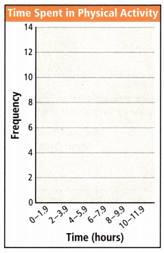
Answer:
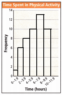
D. Describe the distribution of data based on your histogram.
Answer:
The distribution of data is median or mean.
Range and Interquartile range.
E. Open Ended What is a statement that summarizes the data? Did you use a measure of variability, a measure of center, or the shape of the display as the basis for your summary? Explain.
Answer:
Question 4.
The table shown summarizes the numbers of computers and phones in the households of some families.
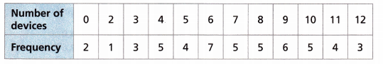
A. What statistical question might these data have been collected to answer?
Answer:
The statistical question might these data have been collected to answer is a range, interquartile range, and standard deviation.
B. Why is a dot plot a good way to display the data?
Answer:
The dot plot is useful for highlighting clusters, gaps, and outliers and this is suitable for small to moderate data sets.
C. Draw a dot plot to display the data.
Answer:
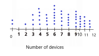
D. Describe the distribution of data based on your display in Part C.
Answer:
E. Use Repeated Reasoning Calculate the mean, median, and mode. Looking at the shape of the data distribution in the dot plot, which measure of center would best represent the data? Explain your reasoning. Round to the ones place if necessary.
Answer:
Given data
0, 2, 3, 4, 5, 6, 7 , 8, 9, 10, 11, 12
Mean = sum of terms ÷ no of terms
sum of terms = 0 + 2 + 3 + 4 + 5 + 6 + 7 + 8 + 9 + 10 + 11 + 12
= 77
No of terms = 11
Mean = 77 ÷ 11
= 7
Median = middle half of the value
Median = (6 + 7) ÷ 2
= 13.5
Mode is the value that repeats itself
Mode = 0, 2, 3, 4, 5, 6, 7 , 8, 9, 10, 11, 12
Question 5.
The table summarizes the grade point averages (GPA’s) for twelve students in the school band.
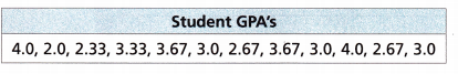
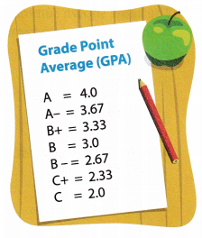
A. What statistical question might these data have been collected to answer?
Answer:
The statistical data collected to answer these questions are range, standard deviation and Interquartile range.
B. Why might a box plot be a good way to display data about grade point averages?
Answer:
Box plot is used to identify mean values and dispersion of data sets.
C. Attend to Precision Draw a box plot to display the data.
Answer:
D. Describe the distribution of data based on your dot plot.
Answer:
E. Write a statement using different measures of variability that could summarize the shape of the data. Explain.
Answer:
Lesson 16.5 More Practice/Homework
Question 1.
The dot plot shows the results of 36 rolls of two number cubes. Describe the distribution of the data. Which measure of center—mean, median, and mode—best describes the data?
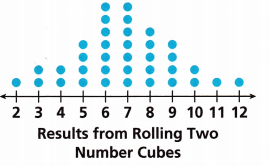
Answer:
Mean is given as the average of all the given terms
Mean = sum of terms ÷ number of terms
the sum of terms = 36
number of terms = 12
Mean = 36 ÷ 12
= 3
Now find the median
if the total number of terms given is odd then the formula is
(n + 1) ÷ 2
(7 + 1) ÷ 2 =
8 ÷ 2 = 4
Then the median is 4
Now we need to find a mode
To find the mode, we need to arrange the numbers in ascending or descending order and then count how often each number appears.
The number that appears often most is called mode.
1, 2, 2, 4, 7, 7, 5, 4, 2, 1
1, 1, 2, 2, 2, 4, 4, 5, 7, 7
So the number that most appeared is 2.
Question 2.
The histogram shows the age distribution for members in a small community band. Make a statement that best summarizes the data. State the occurrence of peaks or gaps.
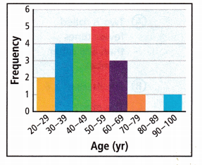
Answer:
From the given graph the peak stage occurred at the age of 50 – 59 yr.
Gaps are at the age 80 – 89 yr
Question 3.
Construct Arguments The box plot shows the annual snow depth for a ski resort over several winter seasons. Make a statement that best summarizes the data. Draw one conclusion from a measure of variability. Explain how you reached your conclusion.
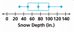
Answer:
The measure of variability is commonly measured with some statistics
Range: The difference between the highest and lowest values
The highest value in the given figure is 130 and the lowest value is 30
Difference is 130 – 30 = 100.
Interquartile range: The range of the middle half of the data set
That is 70
The interquartile range is the best measure of variability for the distribution of data sets. Because the values come from the middle half of the distribution.
Question 4.
Find the mean, median, and mode of the data shown in the dot plot. Which measure of center best describes the distribution? Explain.
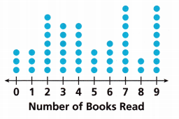
Answer:
Median = 4.5
Mode = 3
Mean = 4.8
Explanation:
Median:
Calculate the median by adding together the middle values and dividing them by two.
The middle values are 4 and 5
In 4 the number of books read are 6 and in 5 are 3.
By adding 6 + 3 = 9
\(\frac{9}{2}\) = 4.5
Mean \(\frac{48}{10}\) = 4.8
The number that appears most is called mode.
The number that appears most in the given data set is 3
3 3 7 6 6 3 4 8 2 8.
Test Prep
Question 5.
The box plots show the distributions of wristbands sold at two stores for a local team. Which statement best describes the distributions for each store?
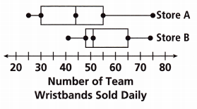
(A) Store A has a greater IQR than store B.
(B) Store A has a greater median than store B.
(C) Store A has a greater mean than store B.
(D) Store A has a range that is less than that of store B.
Answer:
Store A has a range that is less than that of store B.
Question 6.
The dot plot shows the results of rolling two number cubes 50 times. Select all the statements that are true.
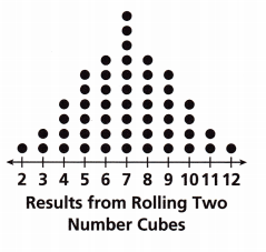
(A) Two is rolled fewer times than any other number.
(B) The median is 6.
(C) The mode is 7.
(D) The data are symmetric.
(E) The shape of the distribution suggests that most rolls are 8 or higher.
(F) 50% of the rolls are greater than 4 and less than 10.
(G) Most of the rolls are greater than 5 and less than 9.
Answer:
A. Two is rolled fewer times than any other number.
C. The mode is 7.
D. The data are symmetric.
F. 50% of the rolls are greater than 4 and less than 10.
G. Most of the rolls are greater than 5 and less than 9.
Spiral Review
Question 7.
What is the opposite of -6?
Answer:
6
Explanation:
The opposite of -6 is 6.
Question 8.
Write an equation that models the data in the table below.
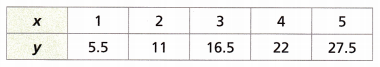
Answer:
Question 9.
A parallelogram has a base length of 17 centimeters. The area is 85 square centimeters. What is the height of the parallelogram?
Answer:
The height of the parallelogram is 5 cm.
Explanation:
Given,
Area = 85 square centimeters
b = 17 cm
The area of the parallelogram is b × h
85 = 17 × h
h = \(\frac{85}{17}\)
h = 5 cm