We included HMH Into Math Grade 6 Answer Key PDF Module 14 Review to make students experts in learning maths.
HMH Into Math Grade 6 Module 14 Review Answer Key
Vocabulary
Choose the correct term from the Vocabulary box.
Vocabulary
data
dot plot
frequency table
histogram
statistical question
Question 1.
a graph that has bars that represent frequencies of numeric data within equal measures _____________
Answer: histogram
– A histogram is a graphical representation of a grouped frequency distribution with continuous classes. It is an area diagram and can be defined as a set of rectangles with bases along with the intervals between class boundaries and with areas proportional to frequencies in the corresponding classes. (or)
– a histogram is a diagram involving rectangles whose area is proportional to the frequency of a variable and width is equal to the class interval.
Question 2.
a question that has many different, or variable answers ____________
Answer: statistical question
A statistical question has answers that will probably vary. Usually, a statistical question will ask about a population of multiple people, events or things.
Examples:
– What time did the students in this class get up this morning?
– How many votes did the winning candidate for the Presidents of the Student Body receive in each of the past 20 years?
– What were the high temperatures in all of the Latin American capitals today?
Question 3.
a set of information collected about people or things, often to draw conclusions about them ___________
Answer: data
Data is a collection of information gathered by observations, measurements, research or analysis. They may consist of facts, numbers, names, figures or even description of things. Data is organized in the form of graphs, charts or tables.
Question 4.
a graph in which each piece of data is represented by a dot above a number line ___________
Answer: dot plot
A dot plot is used to encode data in a dot or small circle. The dot plot is shown on a number line that displays the distribution of numerical variables where a value is defined by each dot. A dot plot is used to represent any data in the form of dots or small circles. It is similar to a simplified histogram or a bar graph as the height of the bar formed with dots represents the numerical value of each variable. Dot plots are used to represent small amounts of data.
Question 5.
a table that lists items together according to the number of times that the items occur ______________
Answer: frequency table
Frequency refers to the number of times an event or a value occurs. A frequency table is a table that lists items and shows the number of times the items occur. We represent the frequency by the English alphabet ‘f’.
Concepts and Skills
Question 6.
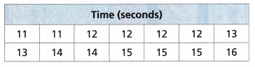
The times, in seconds, that it takes barrel racers to complete their barrel runs at a rodeo are shown.
A. What attribute is being measured by the data in a table?
Answer:
– Time is measured by the data in a table.
– This type of data is in raw form and is known as raw data. The difference between the measure of highest and lowest value in a collection of data is known as the range. Here, the range is:
|16 – 11| = 5
– When the number of observations increases, this type of representation is quite hectic, and the calculations could be quite complex. As statistics is about the presentation of data in an organized form, the data representation in tabular form is more convenient.
B. What is the unit of measurement for the data?
Answer:
A unit of measurement is a definite magnitude of a quantity that is used as a norm for measurement of the same form of quantity, specified and adopted by convention or law. It is possible to express some other quantity of that kind as a multiple of the measuring unit.
The unit of measurement for a time in seconds(s).
C. How many observations were made?
Answer:
Observations are measurements carried out in one or more individuals, based on one or more variables.
The above data can be represented in a tabular form.
The given data:11, 11, 12, 12, 12, 12, 13, 13, 14, 14, 15, 15, 15, 16
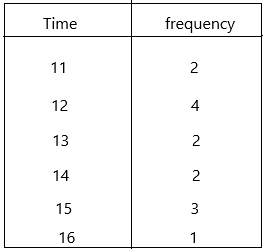
There are 6 observations. They are 11, 12, 13, 14, 15, 16.
and the frequencies that it takes barrel racers to complete their barrel runs at a rodeo.
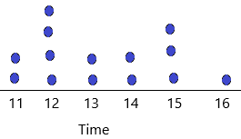
D. Use Tools State what strategy and tool you would use to make a dot plot of the data? Explain your choice.
Answer:
– In statistics, a dot plot is a visual representation of a numerical data set.
– Students create a dot plot of a given data set.
– Students summarize a given data set using equal length intervals and construct a frequency table.
– Based on a frequency table, students describe the distribution. This lesson described how to make a dot plot. This plot starts with a number line labelled from the smallest to the largest value.
Question 7.
The dot plot shows the amount each customer spent during a 1-hour period at a coffee shop. How many customers made a purchase at the coffee shop during that 1-hour period?
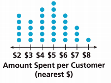
Answer:
The amount spent by the customers for $2 is 5
The amount spent by the customers for $3 is 4
The amount spent by the customers for $4 is 6
The amount spent by the customers for $5 is 7
The amount spent by the customers for $6 is 5
The amount spent by the customers for $7 is 3
The amount spent by the customers for $8 is 1
Now we have to find out the total customers who made a purchase at the coffee shop during that 1-hour period. Assume it as an X.
X = 5 + 4+ 6 + 7 + 5 + 3 + 1
X = 31
Therefore, there are 31 customers in total.
Question 8.
Which of the following is an example of a statistical question? Select all that apply.
(A) How many days are in the month of August?
(B) How many students, in each class, like watermelon?
(C) What is the temperature at 4:00 p.m. every Saturday?
(D) What is the time it took each student to read the same chapter?
(E) How many years did it take to build the oldest building in town?
Answer: Options B, C, and D are correct.
A statistical question has answers that will probably vary. Usually, a statistical question will ask about a population of multiple people, events or things.
Question 9.
Which histogram correctly represents the data from the frequency table?
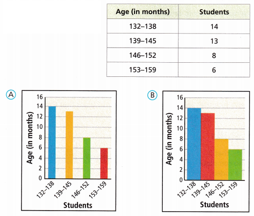
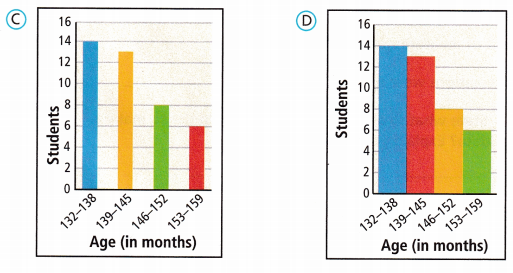
Answer: Option D is correct.
A frequency distribution shows how often each different value in a set of data occurs. A histogram is the most commonly used graph to show frequency distributions. It looks very much like a bar chart, but there are important differences between them.
– a histogram is a graphical representation of the distribution of data. The histogram is represented by a set of rectangles, adjacent to each other, where each bar represent a kind of data.
– According to the definition, option D is the histogram.
– Option C comes under the bar graph.