We included HMH Into Math Grade 3 Answer Key PDF Module 18 Lesson 4 Make Bar Graphs to make students experts in learning maths.
HMH Into Math Grade 3 Module 18 Lesson 4 Answer Key Make Bar Graphs
I Can draw a scaled bar graph to solve how many more and how many less problems.
Spark Your Learning
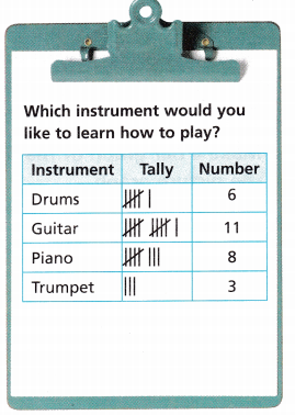
Mrs. Vern’s students collect the survey results shown in the tally chart.
Make a representation of the data.
Answer:
The pictorial representation of grouped data, in the form of vertical or horizontal rectangular bars, where the lengths of the bars are equivalent to the measure of data, are known as bar graphs or bar charts.
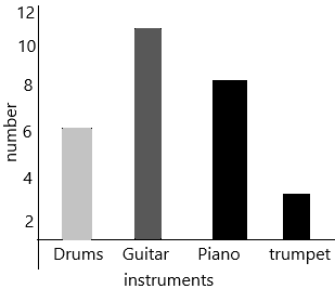
According to the above-given data bar graph had drawn.
Turn and Talk How are your representations alike and different?
Answer:
The given instruments are Drums, Piano, Guitar, and trumpet.
There is some survey conducted by the students.
The drums want to learn are 6 students.
The Guitar want to learn are 11 students.
The Piano wants to learn are 8 students.
The trumpet wants to learn are 3 students.
To each indifferent instrument, there are a different number of students who want to learn. And moreover, some students are like to learn two are more instruments in common.
Build Understanding
Question 1.
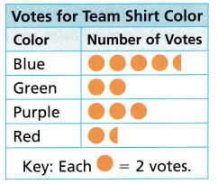
Nola surveys the players on her soccer team about choosing a color for the team shirt. She makes the picture graph shown.
Make a bar graph of the data shown in the picture graph.
A. What number do you count by on the scale?
Answer:
A bar graph (bar chart) is a graph that represents the categorical data using rectangular bars. The bar graph shows the comparison between discrete categories. The bar graph is used to compare the items between different groups over time. Bar graphs are used to measure the changes over a period of time. When the changes are larger, a bar graph is the best option to represent the data.
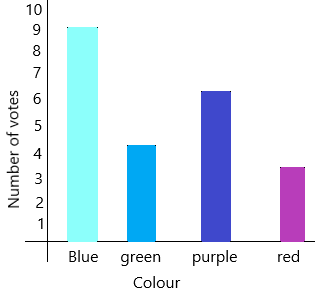
We can count the number 9 on a scale because blue is having a high number of votes compared to given colours.
B. How do you know the height to draw each bar?
Answer:
already given that each circle is equal is to 2 votes.
When we see one circle that count will be 2 votes.
The blue colour has 4 circles and a half-circle which is nothing but 9 votes.
The green colour has 2 circles which are nothing but 4 votes.
The purple colour has 3 circles which are nothing but 6 votes.
The red colour has 1 circle and a half-circle which is nothing but 3 votes.
According to the votes, we know the heights to draw each bar in a bar graph.

C. What equation can you write to find how many more votes blue receives than red?
Answer:
The blue colour has 4 circles and a half-circle which is nothing but 9 votes.
The red colour has 1 circle and a half-circle which is nothing but 3 votes.
The equation be X
X=blue colour votes-red colour votes.
X=9-3
X=6
therefore, 6 more votes blue receives than red.
Turn and Talk Compare your bar graph display with the picture graph display. How are the displays alike and how are they different?
Answer:
– The bar graphs are more useful when the information is categorical, whereas the picture graph is better for continuous data.
– The difference between a bar graph and a line graph is that the former is a graphic representation of data in the form of bars or columns, while the latter is a graphic representation of the data in the form of a line.
Step It Out
Question 2.
Choose a survey question. Include 3 or 4 answer choices for your question. Decide how you will record the answers. Take a survey of your classmates.

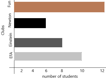
Answer: In college, some clubs are invented like Eco-friendly club, Einstein club, Newton club, fun club.
The students had conducted a survey and collected information that which club the students wants to join.
The number of students joining the eco-friendly club is 10
The number of students joining in Einstein club is 8
The number of students joining in newton club is 6
The number of students joining in the fun club is 12
this is the question and data collected in the survey.
Question 3.
You can make a horizontal bar graph to show the data that you collected.
A. Choose a title. Label the categories.
Answer:
the title is clubs and number of students.
When the grouped data are represented horizontally in a chart with the help of bars, then such graphs are called horizontal bar graphs, where the bars show the measure of data. The data is depicted here along the x-axis of the graph, and the length of the bars denote the values.
– Step 1: First, decide the title of the bar graph.
– Step 2: Draw the horizontal axis. (For example, clubs)
– Step 3: Now, label the vertical axis. (number of employees)
– Step 4: Write the names on the horizontal axis, number of employees 10, 8, 6, 12
– Step 5: Now, label the vertical axis. (For example, eco-friendly, einstein, newton, fun)
– Step 6: Finalise the scale range for the given data
– Step 7: Finally, draw the bar graph that should represent each category of the pet with their respective number
B. Choose a scale that is greater than 1. What number will you count by?
Answer:
The numbers should be greater than 1 so the numbers will be 2, 3, 4, 5, 6, 7, 8, 9, 10 and so on…
According to the number of students, we arrange in the bar graph.
C. Label your scale.
Answer:
According to my data, I arranged 2, 4, 6, 8, 10 and 12

D. Draw each bar.
Answer:
When the grouped data are represented horizontally in a chart with the help of bars, then such graphs are called horizontal bar graphs, where the bars show the measure of data. The data is depicted here along the x-axis of the graph, and the length of the bars denote the values.
– Step 1: First, decide the title of the bar graph.
– Step 2: Draw the horizontal axis. (For example, clubs)
– Step 3: Now, label the vertical axis. (number of employees)
– Step 4: Write the names on the horizontal axis, number of employees 10, 8, 6, 12
– Step 5: Now, label the vertical axis. (For example, eco-friendly, einstein, newton, fun)
– Step 6: Finalise the scale range for the given data
– Step 7: Finally, draw the bar graph that should represent each category of the pet with their respective number
Check Understanding
Use the bar graph you made to answer the questions.
Question 1.
If one classmate’s answer changes, how would your bars change?
Answer:
We change according to the survey. If one person changes the answer then the survey changes according to his option.
For example, first he joined in EFA club and we drew a bar graph according to that after that he told he wants to join in fun club and newtons club but not in EFA club. So we have to remove the person and need to add in fun and newtons club.
Question 2.
Write a how many fewer problems. Then solve your problem.
Answer:
Current survey:
The number of students joining the eco-friendly club is 10
The number of students joining in Einstein club is 8
The number of students joining in newton club is 6
The number of students joining the fun club is 12
But now one classmate wants to join in newton and fun club.
At first, he was in the EFA club.
Here removing and adding is the fewer problems because we need to draw from first onwards according to the survey.
Now the survey after changing:
The number of students joining the eco-friendly club is 9
The number of students joining in Einstein club is 8
The number of students joining in newton club is 7
The number of students joining the fun club is 13
Now for this survey, we draw a bar graph.
On Your Own
Attend to Precision Use the data in the tally chart for 3-6.
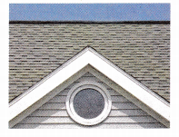
Kody collects data about the kind of shapes that he sees on buildings. His data is shown in the table.
Question 3.
Make a vertical bar graph that shows the data in the table. What number will you count by for the scale?
Answer:
When the grouped data are represented vertically in a graph or chart with the help of bars, where the bars denote the measure of data, such graphs are called vertical bar graphs. The data is represented along the y-axis of the graph, and the height of the bars shows the values.
Question 4.
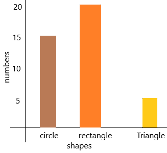
How many more rectangles does Kody see than triangles?
Answer:
The number of triangles is 3
The number of rectangles is 20
The number of more rectangles does Kody see than triangles=X
X=number of rectangles-number of triangles
X=20-3
X=17
therefore, 17 more rectangles Kody saw than triangles.
Question 5.
How many fewer triangles than circles does Kody see?
Answer:
the number of triangles=5
the number of circles=15
The number of fewer triangles than circles Kody see=X
X=number of circles-number of triangles
X=15-5
X=10
Therefore, 10 fewer triangles than circles Kody saw.
Question 6.
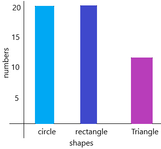
Reason Suppose Kody sees 5 more circles and 5 more triangles. How would the bars change? Explain.
Answer:
The given number of triangles=5
The number of circles=15
Now if we add 5 more circles then it becomes 20 circles (15+5=20)
And adding 5 more triangles then it becomes 10 triangles (5+5=10)
Now the bar graph will be:
I’m in a Learning Mindset!
How can I effectively give and receive feedback about making graphs?
Answer:
Visual representations help us to understand data quickly. When you show an effective graph or chart, your report or presentation gains clarity and authority, whether you’re comparing sales figures or highlighting a trend.
For better understanding, there are four types. They are line graphs, bar graphs, pie charts, and Venn diagrams.
– Line graphs simply use a line to connect the data points that you plot. They are most useful for showing trends and for identifying whether two variables relate to one another.
-Another type of graph that shows relationships between different data sets is the bar graph. In a bar graph, the height of the bar represents the measured value: the higher or longer the bar, the greater the value.
– A pie chart compares parts to a whole. As such, it shows a percentage distribution. The pie represents the total data set, and each segment of the pie is a particular category within the whole. To use a pie chart, the data you are measuring must depict a ratio or percentage relationship. Each segment must be calculated using the same unit of measurement, or the numbers will be meaningless.
– Venn diagrams show the overlaps between sets of data. Each set is represented by a circle. The degree of overlap between the sets is depicted by the amount of overlap between the circles. A Venn diagram is a good choice when you want to convey either the common factors or the differences between distinct groups.