Download Go Math Grade 7 Answer Key Chapter 11 Analyzing and Comparing Data pdf for free of cost. Go through the solutions for all the topics in HMH Go Math Grade 7 Answer Key Chapter 11 Analyzing and Comparing Data. This Go Math Answer Key Chapter 11 Analyzing and Comparing Data helps the students to score top in the exams. Check out the solutions in Go Math Grade 7 Answer Key Chapter 11 Analyzing and Comparing Data and start preparing now.
Go Math Grade 7 Answer Key Chapter 11 Analyzing and Comparing Data
Students can find the step by step explanation for each and every problem in Go Math 7th Grade Answer Key Chapter 11 Analyzing and Comparing Data. The 7th grade Go math answer key not only helps the students it also helps the teachers to find an easy method to teach the students. Know the different methods to solve the problems in Grade 7 Go Math Answer Key Chapter 11 Analyzing and Comparing Data.
Chapter 11 – Lesson: 1
Chapter 11 – Lesson: 2
Chapter 11 – Lesson: 3
Chapter 11 – Comparing Data Displayed in Dot Plots
- 11.1 Comparing Data Displayed in Dot Plots – Page No. 353
- Selected Response – Page No. 354EXERCISES – Page No. 356
- EXERCISES – Page No. 357
- Page No. 358
- Selected Response – Page No. 359
- Page No. 360
- Guided Practice – Page No. 371
Guided Practice – Page No. 338
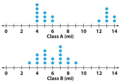
The dot plots show the number of miles run per week for two different classes. For 1–5, use the dot plots shown.
Question 1.
Compare the shapes of the dot plots.
Answer: In Class A the dot plot is clustered around two areas and in Class B the dot plot is clustered in the middle.
Question 2.
Compare the centers of the dot plots.
Answer: In Class A the data is centered around 4 miles and 13 miles and in Class B the data is centered around 7 miles.
Question 3.
Compare the spreads of the dot plots.
Answer: In class A the spread of the dot plot is 4 miles to 14 miles and in Class B the spread is 3 miles to 9 miles.
Question 4.
Calculate the medians of the dot plots.
Answer: The median or the dot plots for Class A and Class B is 6.
Explanation: For Class A median is 4,4,4,4,4,5,5,5,6,6,12,13,13,13,13,14,14
= 6.
For Class B median is 3,4,4,4,5,5,5,5,6,6,7,7,7,7,7,8,8,9
= (6+6)/2
= 12/2
= 6.
Question 5.
Calculate the ranges of the dot plots.
Answer: The range of the dot plot For Class A is 10 and Class B is 6.
Explanation: For Class A the range is 14-4= 10.
For Class B the range is 9-3= 6.
Essential Question Check-In
Question 6.
What do the medians and ranges of two dot plots tell you about the data?
Answer: The median of dot plots tells that the values of each dot plot are centered and we can get to know which dot plot has greater values. The range of the dot plot tells about the spread of each value in each plot. The smaller the range, the closer will be the values.
Independent Practice – Page No. 339
The dot plot shows the number of letters in the spellings of the 12 months. Use the dot plot for 7–10.

Question 7.
Describe the shape of the dot plot.
Answer: There is a slight increase in the number 8.
Question 8.
Describe the center of the dot plot.
Answer: The center of the dot plot is 6.
Question 9.
Describe the spread of the dot plot.
Answer: The spread of the dot plot is from 3 to 9
Question 10.
Calculate the mean, median, and range of the data in the dot plot.
Answer:
The mean of the dot plot is 6.17.
The median of the dot plot is 6.5.
The range of the dot plot is 6.
Explanation: 3,4,4,5,5,6,7,7,8,8,8,9
The mean of the dot plot is \(\frac{3+4+4+5+5+6+7+7+8+8+8+9}{12}
= \frac{74}{12}\)
= 6.17.
The medain of the dot plot is \(\frac{6+7}{2}
= \frac{13}{2}\)
= 6.5.
The range of the dot plot is 9-3= 6.
The dot plots show the mean number of days with rain per month for two cities.

Question 11.
Compare the shapes of the dot plots.
Answer: The most number of days with rain for Montgomery is greater than 8 days and in Lynchburg, the number of days of rain is 12 days or less.
Question 12.
Compare the centers of the dot plots.
Answer: In Montgomery, the center of the dot plot is around 9 days. And in Lynchburg, the center of the dot plot is around 10 days.
Question 13.
Compare the spreads of the dot plots.
Answer: In Montgomery, the spread of the dot plot is from 1 to 12 days and the outlier is 1. And in Lynchburg, the spread of the data plot is from 8 to 12 days.
Question 14.
What do the dot plots tell you about the two cities with respect to their average monthly rainfall?
Answer: As the center of Lynchburg is greater than the center of Montgomery, so average monthly rainfall for Lynchburg is greater than the average monthly rainfall of Montgomery.
Page No. 340
The dot plots show the shoe sizes of two different groups of people.

Question 15.
Compare the shapes of the dot plots.
Answer: In Group A the shoe sizes are mostly less than 9. And in group B all the shoe sizes are 11.5 or less.
Question 16.
Compare the medians of the dot plots.
Answer:
The median of Group A is 8.
The median of Group A is 9.5.
Explanation: 6.5,7,7,7.5,7.5,7.5,8,8,8,8,8,8.5,8.5,9,13
The median of Group A is 8.
8.5,9,9,9,9,9.5,9.5,9.5,9.5,10,10,10.5,10.5,10.5,11.5
The median of Group B is 9.5.
Question 17.
Compare the ranges of the dot plots (with and without the outliers).
Answer:
The range with the outlier is 13-6.5= 6.5.
The range without the outlier is 9-6.5= 2.5.
The range is 11.5-8.5= 3.
Explanation: The outlier in Group A is 13
The range with the outlier is 13-6.5= 6.5.
The range without the outlier is 9-6.5= 2.5.
There is no outlier in Group B, so the range is 11.5-8.5= 3.
Question 18.
Make A Conjecture
Provide a possible explanation for the results of the dot plots.
Answer: Group A is Girls and Group B is boys. Because boys have large feet than girls.
H.O.T.
Focus on Higher Order Thinking
Question 19.
Analyze Relationships
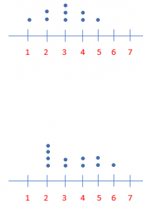
Can two dot plots have the same median and range but have completely different shapes? Justify your answer using examples.
Answer: Yes, it is possible to have the same median and range with different shapes.
Explanation: Yes, it is possible to have the same median and range with different shapes. The median and the range of the below image is
image 1 data – 1,2,2,3,3,3,4,4,5.
The median of image 1 is 3.
image 2 data is – 2,2,2,2,3,3,4,4,5,5,6.
The median of image 2 is 3.
The range of image 1 is 5-1= 4.
The range of image 2 is 6-2= 4.
Question 20.
Draw Conclusions
What value is most affected by an outlier, the median or the range? Explain. Can you see these effects in a dot plot?
Answer: The most affected by an outlier is range. The outlier increases the range as median values are in the middle, so the outlier will not mostly affect the median. Yes, in a dot plot we can see both range and median.
Guided Practice – Page No. 344
For 1–3, use the box plot Terrence created for his math test scores. Find each value.

Question 1.
Minimum = _____ ; Maximum = _____
Answer:
Minimum = 72.
Maximum = 88.
Explanation: The minimum value is the smallest value in the box plot, so the minimum value is 72, and the maximum value is the largest value in the box plot which is 88
Question 2.
Median = _____
Answer:
The Median is 79.
Explanation:
The data is 72,75,79,85,88
The Median is 79.
Question 3.
Range = _____ ; IQR = _____
Answer:
The range is 16.
The IQR is 10.
Explanation:
The range is 88-72= 16
IQR is the difference between upper quartiles and lower quartiles, so 85-75= 10.
For 4–7, use the box plots showing the distribution of the heights of hockey and volleyball players.

Question 4.
Which group has a greater median height?
_____
Answer:
The greater median height is Volleyball players with 74 in.
Explanation:
Hockey players data is 64,66,70,76,78.
The median height of hockey players is 70 in.
Volleyball players data is 67,68,74,78,85
The median height of the Volleyball player is 74 in.
Question 5.
Which group has the shortest player?
_____
Answer:
Hockey players have the shortest player with 64 in.
Explanation:
The minimum height of the hockey players is 64 in.
The minimum height of the Volleyball players is 67 in.
Question 6.
Which group has an interquartile range of about 10?
_____
Answer: The IQR for Hockey players and Volleyball players is 10.
Explanation:
The IQR for Hockey players is 76-66= 10.
The IQR for Volleyball players is 78-68= 10.
Essential Question Check-In
Question 7.
What information can you use to compare two box plots?
Answer: To compare two box plots we can use minimum, maximum values, ////////the median, the range, and the IQR.
Independent Practice – Page No. 345
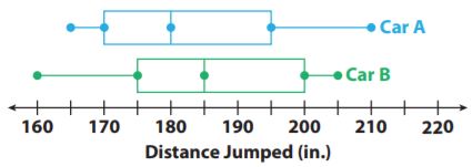
For 8–11, use the box plots of the distances traveled by two toy cars that were jumped from a ramp.
Question 8.
Compare the minimum, maximum, and median of the box plots.
Answer:
The data of Car A is 165,170,180,195,210.
The data of Car B is 160,175,185,200,205.
The minimum value of Car A is 165.
The minimum value of Car B is 165.
The maximum value of Car A is 210.
The maximum value of Car B is 205.
The median of Car A is 180.
The median of Car B is 185.
Explanation:
The data of Car A is 165,170,180,195,210.
The data of Car B is 160,175,185,200,205.
The minimum value of Car A is 165.
The minimum value of Car B is 165.
The maximum value of Car A is 210.
The maximum value of Car B is 205.
The median of Car A is 180.
The median of Car B is 185.
Question 9.
Compare the ranges and interquartile ranges of the data in box plots.
Answer:
The range of Car A is 45.
The range of Car B is 45.
The IQR of Car A is 25.
The IQR of Car B is 25.
Explanation:
The range of Car A is 210-165= 45.
The range of Car B is 205-160= 45.
The IQR of Car A is 195-170= 25.
The IQR of Car B is 200-175= 25.
Question 10.
What do the box plots tell you about the jump distances of two cars?
Answer: The box plot tells about the minimum and the maximum jump distance, the median jump distance, and the spread of the jump distance.
Question 11.
Critical Thinking
What do the whiskers tell you about the two data sets?
Answer: The whiskers tells about the spread of maximum and minimum values of the bottom and top 25% of data.
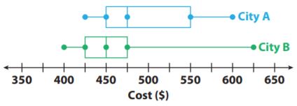
For 12–14, use the box plots to compare the costs of leasing cars in two different cities.
Question 12.
In which city could you spend the least amount of money to lease a car? The greatest?
______
Answer: The least and the greatest amount is spent by City B.
Explanation:
The data set of City A is $425,$450,$475,$550,$600.
The data set of City B is $400,$425,$450,$475,$625.
The minimum cost of City A is $425 and the maximum is $600.
The minimum cost of City B is $400 and the maximum is $625.
The least and the greatest amount is spent by City B.
Question 13.
Which city has a higher median price? How much higher is it?
______
Answer: The higher median price is City A with $475 and $50 higher.
Explanation:
The median of City A is $475 and the median of City B is $450.
So the difference is $475-$425= $50.
Question 14.
Make a Conjecture
In which city is it more likely to choose a car at random that leases for less than $450? Why?
______
Answer: 450 corresponds to the first quartile of City A, which means 25% of the cars cost less than $450. 450 corresponds to the median for City B which means 50% of the cars cost less than $450. So City B is more likely to have a car chosen randomly that costs less than $450.
Page No. 346
Question 15.
Summarize
Look back at the box plots for 12–14 on the previous page. What do the box plots tell you about the costs of leasing cars in those two cities?
Answer: City A has a smaller range than City B, but it has greater IQR. And City B has 4 key values of City A which means leasing a car is cheaper in City B.
H.O.T.
Focus on Higher Order Thinking
Question 16.
Draw Conclusions
Two box plots have the same median and equally long whiskers. If one box plot has a longer box than the other box plot, what does this tell you about the difference between the data sets?
Answer: If two box plots have the same median and equally long whiskers and one box is longer than the other, that means the box plot with the larger box has a greater range and IQR.
Question 17.
Communicate Mathematical Ideas
What you can learn about a data set from a box plot? How is this information different from a dot plot?
Answer: We can learn about the minimum and the maximum values, the median, the range, the IQR, and the range of 25% of the data.
and a data plot contains all data values. which a box plot doesn’t have.
Question 18.
Analyze Relationships
In mathematics, central tendency is the tendency of data values to cluster around some central value. What does a measure of variability tell you about the central tendency of a set of data? Explain.
Answer: If the range and IQR are small, the values are clustering around some central values.
Guided Practice – Page No. 350
The tables show the numbers of miles run by the students in two classes. Use the tables in 1–2.

Question 1.
For each class, what is the mean? What is the mean absolute deviation?
Class 1 mean: __________
Class 2 mean: __________
Class 1 MAD: __________
Class 2 MAD: __________
Answer:
Class 1 mean: 6
Class 2 mean: 11
Class 1 MAD: 3.067
Class 2 MAD: 3.067
Explanation:
The mean of Class 1 is \(\frac{12+6+1+10+1+2+3+10+3+8+3+9+8+6+8}{6}
= \frac{90}{15}\)
= 6
The mean of Class 2 is \(\frac{11+14+11+13+6+7+8+6+8+13+8+15+13+17+15}{15}
= \frac{165}{15}\)
= 11
The mean absolute deviation of Class 1 is
|12-6| = 6
|6-6| = 0
|1-6| = 5
|10-6| = 4
|1-6| = 5
|2-6| = 4
|3-6| = 3
|10-6| = 4
|3-6| = 3
|8-6| = 2
|3-6| = 3
|9-6| = 3
|8-6| = 2
|6-6| = 0
|8-6| = 2
The mean absolute deviation of Class 1 is \(\frac{6+0+5+4+5+4+3+4+3+2+3+3+2+0+2}{15}
= \frac{46}{15}\)
= 3.067
The mean absolute deviation of Class 2 is
|11-11| = 0
|14-11| = 3
|11-11| = 0
|13-11| = 2
|6-11| = 5
|7-11| = 4
|8-11| = 3
|6-11| = 5
|8-11| = 3
|13-11| = 2
|8-11| = 3
|15-11| = 4
|13-11| = 2
|17-11| = 6
|15-11| = 4
The mean absolute deviation of Class 2 is \(\frac{0+3+0+2+5+4+3+5+3+2+3+4+2+6+4}{15}
= \frac{46}{15}\)
= 3.067
Question 2.
The difference of the means is about _____ times the mean absolute deviations.
_____
Answer: 3, 1.67.
Explanation: The difference of the mean is 11-6=5, and the difference of the means is about 3 times the mean absolute deviations, so
5/3= 1.67.
Question 3.
Mark took 10 random samples of 10 students from two schools. He asked how many minutes they spend per day going to and from school. The tables show the medians and the means of the samples. Compare the travel times using distributions of the medians and means.

Answer:
Essential Question Check-In
Question 4.
Why is it a good idea to use multiple random samples when making comparative inferences about two populations?
Answer: It’s important to use multiple random samples, so you can draw more interferences about the populations. The more samples we use the more convincing arguments you can make about the distributions.
Independent Practice – Page No. 351
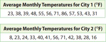
Josie recorded the average monthly temperatures for two cities in the state where she lives. Use the data for 5–7.
Question 5.
For City 1, what is the mean of the average monthly temperatures? What is the mean absolute deviation of the average monthly temperatures?
Mean: __________
MAD: __________
Answer:
Mean: 50 °F.
MAD: 13 °F.
Explanation:
The mean of city 1 is \(\frac{23+38+39+48+55+56+71+86+57+53+43+31}{12}
= \frac{600}{12}\)
= 50 °F.
|23-50|= 27
|38-50|= 12
|39-50|= 11
|48-50|= 2
|55-50|= 5
|56-50|= 6
|71-50|= 21
|86-50|= 36
|57-50|= 7
|53-50|= 3
|43-50|= 7
|31-50|= 19
The mean absolute deviation is \(\frac{27+12+11+2+5+6+21+36+7+3+7+19}{12}
= \frac{156}{12}\)
= 13 °F.
Question 6.
What is the difference between each average monthly temperature for City 1 and the corresponding temperature for City 2?
_______ °F
Answer: The difference between each average monthly temperature for City 1 and the corresponding temperature for City 2 is 15 °F
Explanation:
|23-8|= 15
|38-23|= 15
|39-24|= 15
|48-33|= 15
|55-40|= 15
|56-41|= 15
|71-56|= 15
|86-71|= 15
|57-42|= 15
|53-38|= 15
|43-28|= 15
|31-16|= 15
The difference between each average monthly temperature for City 1 and the corresponding temperature for City 2 is 15 °F
Question 7.
Draw Conclusions
Based on your answers to Exercises 5 and 6, what do you think the mean of the average monthly temperatures for City 2 is? What do you think the mean absolute deviation of the average monthly temperatures for City 2 is? Give your answers without actually calculating the mean and the mean absolute deviation. Explain your reasoning.
Mean = __________ °F
MAD __________ °F
Answer:
Mean =35 °F
MAD = 13°F
Explanation: As all the values of City 2 are 15 below the values of City 1, so the mean of the City 2 will be 50 less than the mean of City 1. Which means 50-15= 35. All of City 2’s values deviate from the mean the same way City 1’s values do which means that the mean absolute deviation is 13
Question 8.
What is the difference in the means as a multiple of the mean absolute deviations?
_______ (MAD)
Answer: 1.15.
Explanation:
(50-35)/13
= 15/13
= 1.15.
The difference in the means as a multiple of the mean absolute deviations 1.15.
Question 9.
Make a Conjecture
The box plots show the distributions of mean weights of 10 samples of 10 football players from each of two leagues, A and B. What can you say about any comparison of the weights of the two populations? Explain.

Answer: As both leagues have a lot of variability since the ranges and IQR’s are both very large. The middle halves overlap entirely. The variation and overlap in the distributions make it hard to make any convincing comparison.
Page No. 352
Question 10.
Justify Reasoning
Statistical measures are shown for the ages of middle school and high school teachers in two states.
State A: Mean age of middle school teachers = 38, mean age of high school teachers = 48, mean absolute deviation for both = 6
State B: Mean age of middle school teachers = 42, mean age of high school teachers = 50, mean absolute deviation for both = 4
In which state is the difference in ages between members of the two groups more significant? Support your answer.
_____________
Answer: State B has a difference in ages between members of the two groups more significant.
Explanation:
For State A the difference in the mean as a multiple of the mean absolute deviation is (48-38)/6
= 10/6
= 1.67.
So for State B, (50-42)/4
= 8/4
= 2.
As State B has a larger multiple, the differences in ages between members of the two groups are more significant.
Question 11.
Analyze Relationships
The tables show the heights in inches of all the adult grandchildren of two sets of grandparents, the Smiths and the Thompsons. What is the difference in the medians as a multiple of the ranges?

______ x range
Answer: The difference in the median is 1.75.
Explanation:
Smith: 64,65,65,66,66,67,68,68,69,70.
The Median is (66+67)/2
= 133/2
= 66.5.
The range is 70-64= 6.
Thompsons: 74,75,75,76,77,77,78,79,79,80.
The Median is (77+77)/2
= (154)/2
= 77.
The range is 80-74= 6.
The difference in the median is (77-66.5)/6
= 10.5/6
= 1.75.
H.O.T.
Focus on Higher Order Thinking
Question 12.
Critical Thinking
Jill took many samples of 10 tosses of a standard number cube. What might she reasonably expect the median of the medians of the samples to be? Why?
Median of the medians: ______
Answer:
Median of the medians: 3.5.
Explanation: The possible outcome of a number cube is 1,2,3,4,5,6. So median is
= (3+4)/2
= 7/2
= 3.5
The median of the medians should be close to the median of the populations, so it will also be about 3.5.
Question 13.
Analyze Relationships
Elly and Ramon are both conducting surveys to compare the average numbers of hours per month that men and women spend shopping. Elly plans to take many samples of size 10 from both populations and compare the distributions of both the medians and the means. Ramon will do the same, but will use a sample size of 100. Whose results will probably produce more reliable inferences? Explain.
_____________
Answer: The larger the sample size, the less variability there should be in the distributions of the medians and means. And Ramon will most likely produce more reliable inferences since he will be using a much larger sample size.
Question 14.
Counterexamples
Seth believes that it is always possible to compare two populations of numerical values by finding the difference in the means of the populations as a multiple of the mean absolute deviations. Describe a situation that explains why Seth is incorrect.
Answer: In order to compare two populations by finding the difference in the means of the populations as a multiple of the mean absolute deviations, so the mean absolute deviations of both populations need to be about the same. So if the mean absolute deviations are significantly different, like 5 and 10 and we cannot compare the populations this way.
11.1 Comparing Data Displayed in Dot Plots – Page No. 353
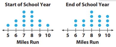
The two dot plots show the number of miles run by 14 students at the start and at the end of the school year. Compare each measure for the two dot plots. Use the data for 1–3.
Question 1.
Means
Start: _________
End: _________
Answer:
Mean
Start: 7.5 miles.
End: 8.2 miles.
Explanation:
The data for the start of the school year is 5,6,6,7,7,7,7,8,8,8,8,9,9,10.
The mean is \(\frac{5+6+6+7+7+7+7+8+8+8+8+9+9+10}{14}
= \frac{105}{14}\)
= 7.5 miles.
The data for the end of the school year is 6,6,7,7,8,8,8,8,9,9,9,10,10,10.
The mean is \(\frac{6+6+7+7+8+8+8+8+9+9+9+10+10+10}{14}
= \frac{115}{14}\)
= 8.2 miles.
Question 2.
Medians
Start: _________
End: _________
Answer:
Median
Start: 7.5 miles.
End: 8 miles.
Explanation:
The median for the start of the school year is
= (7+8)/2
= 15/2
= 7.5 miles.
The median for the end of the school year is
= (8+8)/2
= 16/2
= 8 miles.
Question 3.
Ranges
Start: _________
End: _________
Answer:
Ranges
Start: 5 miles.
End: 4 miles.
Explanation:
The range for the Start of the school year is 10-5= 5 miles.
The range for the end of the school year is 10-6= 4 miles.
11.2 Comparing Data Displayed in Box Plots
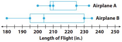
The box plots show lengths of flights in inches flown by two model airplanes. Use the data for 4–5.
Question 4.
Which has a greater median flight length?
_____________
Answer:
The greater median flight length is Airplane A which is 210 in.
Explanation:
The median of Airplane A is 210 in and the median of Airplane B is 204 in. So greater median flight length is Airplane A which is 210 in.
Question 5.
Which has a greater interquartile range?
_____________
Answer: The greater IQR is Airplane B with 35 in.
Explanation:
The IQR for Airplane A is 225-208= 17 in and The IQR for Airplane B is 230-195= 35 in. So the greater IQR is Airplane B.
11.3 Using Statistical Measures to Compare Populations
Question 6.
Roberta grows pea plants, some in shade and some in sun. She picks 8 plants of each type at random and records the heights.

Express the difference in the means as a multiple of their ranges.
______
Answer: The difference in the means as a multiple of their ranges is 2.4 in.
Explanation:
The mean of Shade plant heights is \(\frac{7+11+11+12+9+12+8+10}{8}
= \frac{80}{8}\)
= 10 in.
The range of Shade plant heights is 12-7= 5 in.
The mean of Sun plant heights is \(\frac{21+24+19+19+22+23+24+24}{8}
= \frac{176}{8}\)
= 22 in.
The range of Sun plant heights is 24-19= 5 in.
The difference in the means as a multiple of their ranges is (22-10)/5
= 12/5
= 2.4 in.
Essential Question
Question 7.
How can you use and compare data to solve real-world problems?
Answer: We can use and compare data to solve real-world problems by determining if one set is larger than the other set in terms of values, means, and medians.
Selected Response – Page No. 354
Question 1.
Which statement about the data is true?

Options:
a. The difference between the medians is about 4 times the range.
b. The difference between the medians is about 4 times the IQR.
c. The difference between the medians is about 2 times the range.
d. The difference between the medians is about 2 times the IQR.
Answer: b is true.
Explanation:
Set 1 median is 60 and Set 2 median is 76
The range of Set 1 is 68-55= 13
The range of Set 2 is 80-65= 15
The IQR of Set 1 is 63-59= 4
The IQR of Set 2 is 77-73= 4
The difference in medians is 76-60= 16, So the difference between the medians is about 4 times the IQR.
Question 2.
Which is a true statement based on the box plots below?
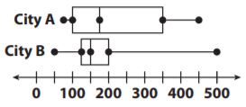
Options:
a. The data for City A has a greater range.
b. The data for City B is more symmetric.
c. The data for City A has a greater interquartile range.
d. The data for City B has a greater median.
Answer: C is true.
Explanation: The length of the box for City A is much larger than for City B, so IQR for City A is greater.
Question 3.
What is −3 \(\frac{1}{2}\) written as a decimal?
Options:
a. -3.5
b. -3.05
c. -0.35
d. -0.035
Answer: a.
Explanation: −3 \(\frac{1}{2}\)
= \(\frac{-7}{2}\)
= -3.5.
Question 4.
Which is a true statement based on the dot plots below?

Options:
a. Set A has the lesser range
b. Set B has a greater median.
c. Set A has the greater mean.
d. Set B is less symmetric than Set A.
Answer: c is a true statement.
Explanation:
The median of Set A is 30 and the median of Set B is 40, so Set A has the greater mean.
Mini-Task
Question 5.
The dot plots show the lengths of a random sample of words in a fourth-grade book and a seventh-grade book.

a. Compare the shapes of the plots.
Answer:
For Fourth grade, most of the words have a length of 6 or less and with two outliers 9 and 10.
For Seventh grade, most of the words have a length of 8 or less with 5 exceptions.
Question 5.
b. Compare the ranges of the plots. Explain what your answer means in terms of the situation.
Answer:
The Seventh grade has a larger range, so it has more variability.
Explanation:
The range for the fourth grade is 10-1=9.
The range for the seventh grade 14-2= 12.
As the Seventh grade has a larger range it has more variability.
EXERCISES – Page No. 356
Question 1.
Molly uses the school directory to select, at random, 25 students from her school for a survey on which sports people like to watch on television. She calls the students and asks them, “Do you think basketball is the best sport to watch on television?”
a. Did Molly survey a random sample or a biased sample of the students at her school?
_____________
Answer: Yes, Molly surveyed a random sample. As she selected 25 students from a school directory of the entire student’s population in her school.
Question 1.
b. Was the question she asked an unbiased question? Explain your answer.
_____________
Answer: No, the question is not unbiased. The question is biased because it assumes the person watches basketball on television.
Question 2.
There are 2,300 licensed dogs in Clarkson. A random sample of 50 of the dogs in Clarkson shows that 8 have ID microchips implanted. How many dogs in Clarkson are likely to have ID microchips implanted?
______ dogs
Answer: 368 dogs.
Explanation: Let the dogs in Clarkson to have ID microchips be X, so
X/2300 = 8/50
X= (8×2300)/50
X= 18,400/50
X= 368.
Question 3.
A store gets a shipment of 500 MP3 players. Twenty-five of the players are defective, and the rest are working. A graphing calculator is used to generate 20 random numbers to simulate a random sample of the players.
A list of 20 randomly generated numbers representing MP3 players is :

a. Let numbers 1 to 25 represent players that are _____
_____________
Answer: As there are twenty-five defective players, let the numbers 1 to 25 represent players that are defective.
Question 3.
b. Let numbers 26 to 500 represent players that are _____
_____________
Answer: Let the numbers 26 to 500 represent players that are working.
Question 3.
c. How many players in this sample are expected to be defective?
______ players
Answer: As there are 2 numbers in from 1 and 25 which are 5 and 9 are the players in the sample are expected to be defective.
Question 3.
d. If 300 players are chosen at random from the shipment, how many are expected to be defective based on the sample? Does the sample provide a reasonable inference? Explain.
______ players
Answer: 30 players.
Explanation:
X/300 = 2/20
X = (2×300)/20
X = 600/20
X = 30.
We may expect 25 out of 500 or 5% of the 300 players to be defective, which is only 15 players because the sample doesn’t provide a reasonable inference.
EXERCISES – Page No. 357
The dot plots show the number of hours a group of students spends online each week, and how many hours they spend reading. Compare the dot plots visually.
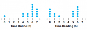
Question 1.
Compare the shapes, centers, and spreads of the dot plots.
Answer:
Shape:
Time spent online- Most of the students spend 4 hours are more.
Time spent reading- The students spent a maximum of 6 hours.
Centers:,6
The no.of hours spent online is centered around 6 hours.
The no.of hours spent reading is centered around 5 hours.
Spread:
The range for time spent online is 7-0=7.
The range for time spent reading is 6-0=6.
Question 2.
Calculate the medians of the dot plots.
Time online: __________
Time reading: __________
Answer:
Time online: 6 hours.
Time reading: 5 hours.
Explanation:
The data of time online is 0,4,4,5,5,6,6,6,6,6,6,7,7,7,7
The Median is 6 hours.
The data of time reading is 0,0,0,0,1,1,2,5,5,5,6,6,6,6,6
The Median is 5 hours.
Question 3.
Calculate the ranges of the dot plots.
Time online: __________
Time reading: __________
Answer:
Time online: 7 hours.
Time reading: 6 hours.
Explanation:
The range of time online is 7-0= 7.
The range of time reading is 6-0= 6.
Page No. 358
Question 4.
The average times (in minutes) a group of students spend studying and watching TV per school day are given.
Studying: 25, 30, 35, 45, 60, 60, 70, 75
Watching TV: 0, 35, 35, 45, 50, 50, 70, 75
a. Find the mean times for studying and for watching TV.
Studying: __________
Watching TV: __________
Answer:
Studying: 50.
Watching TV: 40.
Explanation:
The mean for studying is \(\frac{25+30+35+45+60+60+0+75}{8}
= \frac{400}{8}\)
= 50.
The mean for watching TV is \(\frac{0+35+35+45+50+50+70+75}{8}
= \frac{360}{8}\)
= 45.
Question 4.
b. Find the mean absolute deviations (MADs) for each data set.
Studying: __________
Watching TV: __________
Answer:
Studying: 16.25
Watching TV: 16.25
Explanation:
|25-50|= 25
|30-50|= 20
|35-50|= 15
|45-50|= 5
|60-50|= 10
|60-50|= 10
|70-50|= 20
|75-50|= 25
The mean absolute deviation is \(\frac{25+20+15+5+10+10+20+25}{8}
= \frac{130}{8}\)
= 16.25.
|0-45|= 45
|35-45|= 10
|35-45|= 10
|45-45|= 0
|50-45|= 5
|50-45|= 5
|70-45|= 25
|75-45|= 30
The mean absolute deviation is \(\frac{45+10+10+0+5+5+25+30}{8}
= \frac{130}{8}\)
= 16.25.
Question 4.
c. Find the difference of the means as a multiple of the MAD, to two decimal places.
_____
Answer: 0.31.
Explanation: (50-45)/16.25 = 5/16.25
= 0.31.
Unit 5 Performance Tasks
Question 5.
Entomologist
An entomologist is studying how two different types of flowers appeal to butterflies. The box-and-whisker plots show the number of butterflies that visited one of two different types of flowers in a field. The data were collected over a two-week period, for one hour each day.
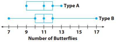
a. Find the median, range, and interquartile range for each data set.
Answer:
Type A:
The median is 11.5
The range is 4
The IQR is 3
Type B:
The median is 11
The range is 10
The IQR is 2
Explanation:
Type A:
The median is (11+12)/2
= 23/2
= 11.5
The range is 13-9= 4
The IQR is 12-9= 3
Type B:
The median is 11
The range is 17-7= 10
The IQR is 12-10= 2
Question 5.
b. Which measure makes it appear that flower type A had a more consistent number of butterfly visits? Which measure makes it appear that flower type B did? If you had to choose one flower as having the more consistent visits, which would you choose? Explain your reasoning.
Answer: As type A has a smaller range, the range makes it appear as if type A has a more consistent number of butterflies visits. And type B had a smaller IQR, the IQR makes it appear as if type A has a more consistent number of butterflies visits. We would choose type A has to have a more consistent number of butterflies visits and it has a much smaller range. The range of the fourth quartile for type Bis larger than the range for the entire data set of type A.
Selected Response – Page No. 359
Question 1.
Which is a true statement based on the dot plots below?
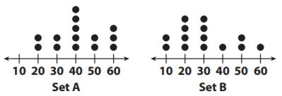
Options:
a. Set B has a greater range.
b. Set B has a greater median.
c. Set B has the greater mean.
d. Set A is less symmetric than Set B.
Answer: a
Explanation:
Set A has a range of 60-20= 40
Set B has a range of 60-10= 50.
So Set B has a greater range.
Question 2.
Which is a solution to the equation 7g − 2 = 47?
Options:
a. g = 5
b. g = 6
c. g = 7
d. g = 8
Answer: c
Explanation:
7g-2= 47
7g= 47+2
7g= 49
g= 49/7
g= 7.
Question 3.
Which is a true statement based on the box plots below?
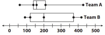
Options:
a. The data for Team B has a greater range.
b. The data for Team A is more symmetric.
c. The data for Team B has a greater interquartile range.
d. The data for Team A has a greater median.
Answer: c
Explanation: The box of Team B is much larger than the box of Team A, so the data for Team B have the greater interquartile range.
Question 4.
Which is the best way to choose a random sample of people from a sold-out movie audience for a survey?
Options:
a. Survey all audience members who visit the restroom during the movie.
b. Assign each seat a number, write each number on a slip of paper, and then draw several slips from a hat. Survey the people in those seats.
c. Survey all of the audience members who sit in the first or last row of seats in the movie theater.
d. Before the movie begins, ask for volunteers to participate in a survey. Survey the first twenty people who volunteer.
Answer: b
Explanation:
A is not random because the people are being chosen are being surveyed in one place.
B is random as all members of the population can be chosen and each member has an equal chance of being selected.
C is may not assign every member of the population an equal chance of being chosen since the number of seats in the first or last rows may have more or fewer seats than the other rows.
D is not random because participants are self selecting to do the survey.
Question 5.
Find the percent change from 84 to 63.
Options:
a. 30% decrease
b. 30% increase
c. 25% decrease
d. 25% increase
Answer: c
Explanation:
(84-63)/84 = 21/84
= 0.25
= 25% decrease
Question 6.
A survey asked 100 students in a school to name the temperature at which they feel most comfortable. The box plot below shows the results for temperatures in degrees Fahrenheit. Which could you infer based on the box plot below?

Options:
a. Most students prefer a temperature less than 65 degrees.
b. Most students prefer a temperature of at least 70 degrees.
c. Almost no students prefer a temperature of fewer than 75 degrees.
d. Almost no students prefer a temperature of more than 65 degrees.
Answer: b.
Explanation: The last half of the data is about 73-85 which means 50% prefer a temperature above 73. This means that the most prefer a temperature of at least 70 degrees since more than 50% of the box plot is 70 degrees are more.
Page No. 360
Question 7.
The box plots below show data from a survey of students under 14 years old. They were asked on how many days in a month they read and draw. Based on the box plots, which is a true statement about students?
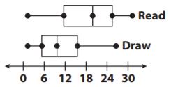
Options:
a. Most students draw at least 12 days a month.
b. Most students read less than 12 days a month.
c. Most students read more often than they draw.
d. Most students draw more often than they read.
Answer: c
Explanation: As 4 out of 5 key values for reading are greater than the corresponding values for drawing which means most of the students read more often than they draw.
Question 8.
Which describes the relationship between ∠NOM and ∠JOK in the diagram?
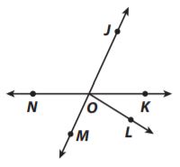
Options:
a. adjacent angles
b. complementary angles
c. supplementary angles
d. vertical angles
Answer: d
Explanation: ∠NOM and ∠JOK are vertical angles.
Question 9.
The tables show the typical number of minutes spent exercising each week for a group of fourth-grade students and a group of seventh-grade students.
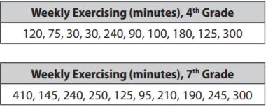
a. What is the mean number of minutes spent exercising for fourth graders? For seventh graders?
4th grade: __________
7th grade: __________
Answer:
4th grade: 129
7th grade: 221
Explanation:
The mean for fourth grade is \(\frac{120+75+30+30+240+90+100+180+125+300}{10}
= \frac{1290}{10}\)
= 129
The mean for fourth grade is \(\frac{410+145+240+250+125+95+210+190+245+300}{10}
= \frac{2210}{10}\)
= 221
Question 9.
b. What is the mean absolute deviation of each data set?
4th grade: __________
7th grade: __________
Answer:
4th grade: 66.6
7th grade: 68
Explanation:
|120-129|= 9
|75-129|= 54
|30-129|= 99
|30-129|= 99
|240-129|=111
|90-129|= 39
|100-129|= 29
|180-129|= 51
|125-129|= 4
|300-129|= 171
The mean absolute deviation for fourth grade is \(\frac{9+54+99+99+111+39+29+51+4+171}{10}
= \frac{666}{10}\)
= 66.6
|410-221|= 189
|145-221|= 76
|240-221|= 19
|250-221|= 29
|125-221|= 96
|95-221|= 126
|210-221|= 11
|190-221|= 31
|245-221|= 24
|300-221|= 79
The mean absolute deviation for fourth grade is \(\frac{189+76+19+29+96+126+11+31+24+79}{10}
= \frac{680}{10}\)
= 68
Question 9.
c. Compare the two data sets with respect to their measures of center and their measures of variability.
Answer: The center of the fourth grade is much smaller than the center for 7th grade. The range is much smaller for a fourth grade than 7th grade which means that fourth graders spend less time exercising and have less variability in the number of minutes that they exercise.
Explanation:
The data of fourth grade is 30,30,75,90,100,120,125,180,240,300
Median is (100+120)/2
= 220/2
= 110
The range is 300-30= 270
The data of seventh grade is 95,125,145,190,210,240,245,250,300,410
Median is (210+240)/2
= 450/2
= 225
The range is 410-95= 315.
The center of the fourth grade is much smaller than the center for 7th grade. The range is much smaller for a fourth grade than 7th grade which means that fourth graders spend less time exercising and have less variability in the number of minutes that they exercise.
Question 9.
d. How many times the MADs is the difference between the means, to the nearest tenth?
_______
Answer: As the MADs are not the same we will find the average of them and then find the difference of the mean and divide by the average of the MADs.
Explanation:
(66.6+68)/2
= 134.6/2
= 67.3
(221-129)/67.3
= 92/67.3
= 1.37
Guided Practice – Page No. 371
Question 1.
In a hat, you have index cards with the numbers 1 through 10 written on them. Order the events from least likely to happen (1) to most likely to happen (8) when you pick one card at random. In the boxes, write a number from 1 to 8 to order the eight different events.
You pick a number greater than 0. __________
You pick an even number. __________
You pick a number that is at least 2. __________
You pick a number that is at most 0. __________
You pick a number divisible by 3. __________
You pick a number divisible by 5. __________
You pick a prime number. __________
You pick a number less than the greatest prime number. __________
Answer: 8,5,7,1,3,24,6.
Explanation:
As there are 10 numbers from 1 to 10 and thus there will be 10 possible outcomes. So,
The number greater than 0 is 1,2,3,4,5,6,7,8,9,10.
Even numbers are 2,4,6,8,10.
The number at least 2 is 2,3,4,5,6,7,8,9,10.
The number that is at most 0: as none of the integers are from 1 to 10 are at most 0.
The number divisible by 3 is 3,6,9.
The number divisible by 5 is 5,10.
The prime numbers are 2,3,5,7.
The number less than the greatest prime numbers are 1,2,3,4,5,6 as 7 is the greatest prime number from the numbers 1 to 10.
The more favorable outcomes correspond with an event, the more likely the events happen. Thus the number is at most 0 is the least likely and the greater than 0 is the most likely.
The number of events from the least likely to the most likely is
The number greater than 0 is 8
Even numbers are 5
The number at least 2 is 7
The number that is at most 0: 1
The number divisible by 3 is 3
The number divisible by 5 is 2
The prime numbers are 4
The number less than the greatest prime number is 6.
Final Words:
In addition to the exercise problems, students can also find solutions for homework exercises. Thus the Go Math Grade 7 Answer Key Chapter 11 helps to complete the homework in time. We wish the pdf helped you a lot in scoring marks in the exams. Keep in touch with us to get the latest information regarding all chapters in grade 7.
