Engage NY Eureka Math Grade 6 Module 6 Lesson 14 Answer Key
Eureka Math Grade 6 Module 6 Lesson 14 Example Answer Key
Example 1: Time to Get to School
Consider the statistical question, “What is the typical amount of time it takes for a person in your class to get to school?” The amount of time it takes to get to school in the morning varies for the students in your class. Take a minute to answer the following questions. Your class will use this information to create a dot plot.
Write your name and an estimate of the number of minutes it took you to get to school today on a sticky note.
Answer:
Answers will vary
What were some of the things you had to think about when you made your estimate?
Answer:
Answers will vary. Some examples include: Does it count when you have to wait in the car for your sister? I usually walk, but today I got a ride. Does it matter that we had to go a different way because the road was closed? The bus was late.
Exercises 1 – 4:
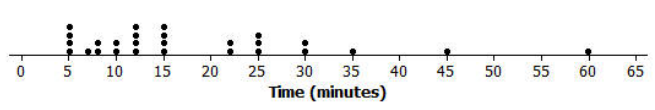
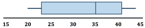
Here is a dot plot of the estimates of the times it took students in Mr. S’s class to get to school one morning.
Mr. S’s Class
Mr. S’s Class
Exercise 1.
Put a line on the dot plot that you think separates the times Into two groups – one group representing the longer times and the other group representing the shorter times.
Answer:
Answers may vary. Some might put the dividing line between 15 and 20.
Exercise 2.
Put another line on the dot plot that separates out the times for students who live really close to the school. Add another line that separates out the times for students who take a very long time to get to school.
Answer:
Responses will be different. Some might put a line at 30 and a line at 10.
Exercise 3.
Your dot plot should now be divided into four sections. Record the number of data values in each of the four sections.
Answer:
Answers will vary. Depending on the divisions, 7 or 8 in the lower one, 9 in the next, 5 in the next, and 5 in the upper section.
Exercise 4.
Share your marked-up dot plot with some of your classmates. Compare how each of you divided the dot plot into four sections.
Answer:
Different responses; students should recognize that the divisions might be close but that some are different.
Exercises 5 – 7: Time to Get to School
The times (in minutes) for the students in Mr. S’s class have been put in order from smallest to largest and are shown below.
5 5 5 5 7 8 8 10 10 12 12 12 12 15 15 15 15 22 22 25 25 25 30 30 35 45 60
Exercise 5.
What is the value of the median time to get to school for students in Mr. S’s class?
Answer:
There are 27 times in the data set, so the median is the 14th value in the ordered list. The median is 15.
Exercise 6.
What is the value of the lower quartile? The upper quartile?
Answer:
The lower quartile is the 7th value in the ordered list, and the upper quartile is the 21st value in the ordered list. The lower quartile is 8, and the upper quartile is 25.
Exercise 7.
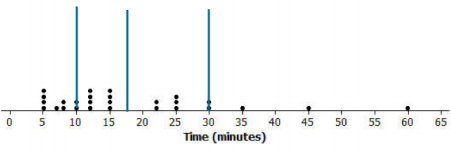
The lines on the dot plot below indicate the location of the median, the lower quartile, and the upper quartile. These lines divide the data set into four parts. About what fraction of the data values are in each part?
Mr. S’s Class
Answer:
There are about \(\frac{3}{4}\) of the data values in each part.
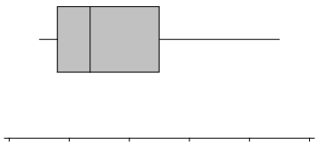
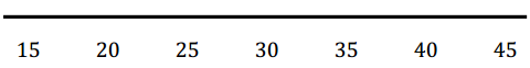
Example 2: Making a Box Plot
A box plot is a graph made using the following five numbers: the smallest value in the data set, the lower quartile, the median, the upper quartile, and the largest value in the data set.
To make a box plot:
• Find the median of all of the data.
• Find Q1, the median of the bottom half of the data, and Q3, the median of the top half of the data.
• Draw a number line, and then draw a box that goes from Q1 to Q3.
• Draw a vertical line in the box at the value of the median.
• Draw a line segment connecting the minimum value to the box and a line segment that connects the maximum value to the box.
You will end up with a graph that looks something like this:
Now, use the given number line to make a box plot of the data below.
20, 21, 25, 31, 35, 38, 40, 42, 44
Min=
Q1=
Median =
Q3=
Max =
Answer:
The five-number summary is as follows:
Min = 20
Q1 = 23
Median = 35
Q3 = 41
Max = 44
Exercises 8 – 11: A Human Box Plot
Consider again the sticky note that you used to write down the number of minutes it takes you to get to school. If possible, you and your classmates will form a human box plot of the number of minutes it takes students in your class to get to school.
Exercise 8.
Find the median of the group. Does someone represent the median? If not, who is the closest to the median?
Answer:
Answers will vary depending on the data.
Exercise 9.
Find the maximum and minimum of the group. Who are they?
Answer:
Answers will vary depending on the data.
Exercise 10.
Find Q1 and Q3 of the group. Does anyone represent Q1 or Q3? If not, who is the closest to Q1? Who is the closest to Q3?
Answer:
Answers will vary depending on the data.
Exercise 11.
Sketch the box plot for this data set.
Answer:
Answers will vary depending on the data.
Eureka Math Grade 6 Module 6 Lesson 14 Problem Set Answer Key
Question 1.
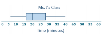
Dot plots for the amount of time it took students in Mr. S’s and Ms. J’s classes to get to school are below.
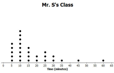
a. Make a box plot of the times for each class.
Answer:
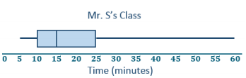
Mr. S’s five-number summary: 5, 10, 15, 25, 60
Ms. J’s five-number summary: 5, 16, 20, 28, 40
b. What is one thing you can see in the dot plot that you cannot see in the box plot? What is something that is easier to see In the box plot than in the dot plot?
Answer:
The dot plot shows individual times, which you cannot see in the box plot. The box plot shows the location of the median and of the lower and upper quartiles.
Question 2.
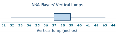
The dot plot below shows the vertical jump of some NBA players. A vertical jump is how high a player can jump from a standstill. Draw a box plot of the heights for the vertical jumps of the NBA players above the dot plot.
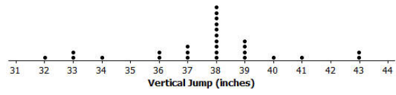
Answer:
Question 3.
The mean daily temperatures in degrees Fahrenheit for the month of February for a certain city are as follows:
4, 11, 14, 15, 17, 20, 30, 23, 20, 35, 35, 31, 34, 23, 15, 19, 39, 22, 15, 15, 19, 39, 22, 23, 29, 26, 29, 29
a. Make a box plot of the temperatures.
Answer:
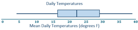
Five number summary: 4, 16, 22.5, 29.5, 39
b. Make a prediction about the part of the United States you think the city might be located in. Explain your reasoning.
Answer:
Answers will vary. The city was probably somewhere in the northern states, either in the Midwest or Northeast, maybe Montana or Wyoming, because the temperatures are typically pretty cold in those regions.
c. Describe the temperature data distribution. Include a description of the center and spread.
Answer:
The IQR is 29. 5°F – 16°F, or 13.5°F. Half of the temperatures were near the middle between 16°F and 29.5°F. The median is 22.5°F. A quarter of the temperatures are less than 16°F but greater than or equal to 4°F. A quarter of the temperatures are greater than 29.5°F and less than or equal to 3 9°F.
Question 4.
The box plot below summarizes data from a survey of households about the number of dogs they have. Identify each of the following statements is true or false. Explain your reasoning in each case.
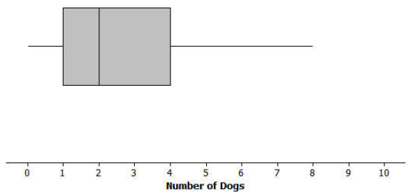
a. The maximum number of dogs per house is 8.
Ans;
True, because the line segment at the top goes to 8.
b. At least of the houses have 2 or more dogs.
Answer:
True, because 2 is the median.
c. All of the houses have dogs.
Answer:
False, because the lower line segment starts at 0, so at least one household does not have a dog as a pet.
d. Half of the houses surveyed have between 2 and 4 dogs.
Answer:
False, because only about 25% of the houses would have between 2 and 4 dogs.
e. Most of the houses surveyed have no dogs.
Answer:
False, because at least \(\frac{3}{4}\) of those surveyed had 1 or more dogs.
Eureka Math Grade 6 Module 6 Lesson 14 Exit Ticket Answer Key
Question 1.
Sulee explained how to make a box plot to her sister as follows:
“First, you find the smallest and largest values and put a mark halfway between them, and then put a mark halfway between that mark and each end. So, if 10 is the smallest value and 30 is the largest value, you would put a mark at 20. Then, another mark belongs halfway between 20 and 10, which would be at 15.
And then one more mark belongs halfway between 20 and 30, which would be at 25. Now, you put a box around the three middle marks, and draw lines from the box to the smallest and largest values.” Here is her box plot. What would you say to Sulee?
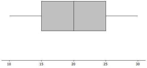
Answer:
Sulee is wrong. This is not the correct way to create a box plot. Sulee did not find the median or the quartiles using the data values; she just divided up the length between the smallest and largest numbers into four equal sections. For a box plot, the sections will not always have the same length, but there will be the same number of observations in the sections.
Teacher note: This Exit Ticket problem addresses a very common student misconception about box plots. Make sure students understand how the median and quartiles are used to create the four sections of the box plot.