Engage NY Eureka Math Algebra 1 Module 2 Lesson 12 Answer Key
Eureka Math Algebra 1 Module 2 Lesson 12 Example Answer Key
Example 1.
Looking for Patterns in a Scatter Plot
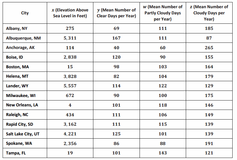
The National Climate Data Center collects data on weather conditions at various locations. They classify each day as clear, partly cloudy, or cloudy. Using data taken over a number of years, they provide data on the following variables.
x represents elevation above sea level (in feet).
y represents mean number of clear days per year.
w represents mean number of partly cloudy days per year.
z represents mean number of cloudy days per year.
The table below shows data for 14 U.S. cities.
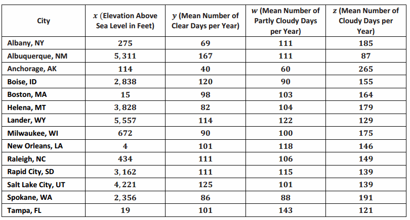
Here is a scatter plot of the data on elevation and mean number of clear days.
Data Source: www.ncdc.noaa.gov
Eureka Math Algebra 1 Module 2 Lesson 12 Exercise Answer Key
Exercises 1–3
Exercise 1.
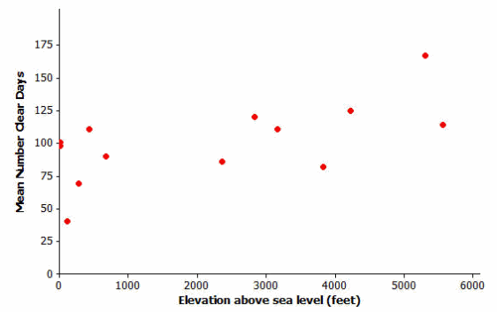
Do you see a pattern in the scatter plot, or does it look like the data points are scattered?
Answer:
The scatter plot does not have a strong pattern. Students may respond that it looks like the data points are randomly scattered. If students look carefully, however, there is a pattern that suggests as elevation increases, the number of clear days also appears to increase. Motivate the discussion by looking at various data points, with several at lower elevations, and several others at higher elevations to indicate the possible relationship.
Exercise 2.
How would you describe the relationship between elevation and mean number of clear days for these 14 cities? That is, does the mean number of clear days tend to increase as elevation increases, or does the mean number of clear days tend to decrease as elevation increases?
Answer:
As the elevation increases, the number of clear days generally increases.
Exercise 3.
Do you think that a straight line would be a good way to describe the relationship between the mean number of clear days and elevation? Why do you think this?
Answer:
Although the pattern is not strong, a straight line would describe the general pattern that was observed in the discussion of the first two exercises.
Exercises 4–7: Thinking about Linear Relationships
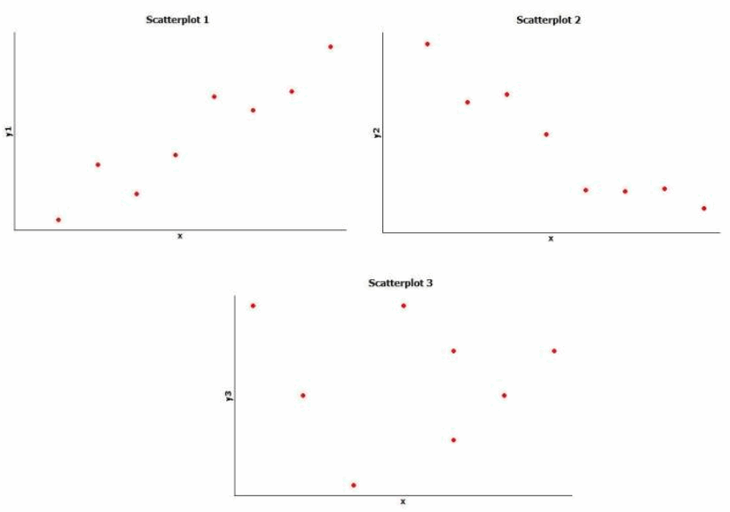
Below are three scatter plots. Each one represents a data set with eight observations.
The scales on the x- and y-axes have been left off these plots on purpose, so you have to think carefully about the relationships.
Exercise 4.
If one of these scatter plots represents the relationship between height and weight for eight adults, which scatter plot do you think it is and why?
Answer:
Scatter Plot 1—weight or height could be assigned to either axis, as height increases so does weight.
Scatter Plot 3—weight or height could be assigned to either axis. There is no relationship.
We expect the relationship to follow Scatter Plot 1. While a large population would likely show a relationship between height and weight, it is possible that in a small sample size, no clear pattern would emerge.
Exercise 5.
If one of these scatter plots represents the relationship between height and SAT math score for eight high school seniors, which scatter plot do you think it is and why?
Answer:
Scatter Plot 3—weight or score could be assigned to either axis, there is no relationship.
Exercise 6.
If one of these scatter plots represents the relationship between the weight of a car and fuel efficiency for eight cars, which scatter plot do you think it is and why?
Answer:
Scatter Plot 2—weight or fuel efficiency could be assigned to either axis, as weight increases, fuel efficiency decreases.
Exercise 7.
Which of these three scatter plots does not appear to represent a linear relationship? Explain the reasoning behind your choice.
Answer:
Scatter Plot 3 indicates that there is no relationship between the variables that could reasonably be described by a line.
Exercises 8–13: Not Every Relationship Is Linear
When a straight line provides a reasonable summary of the relationship between two numerical variables, we say that the two variables are linearly related or that there is a linear relationship between the two variables.
Take a look at the scatter plots below, and answer the questions that follow.
Exercise 8.
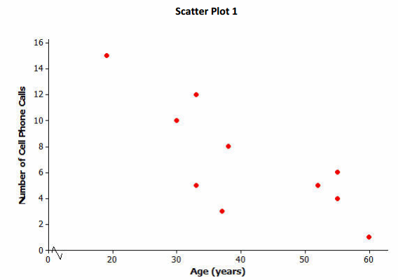
Is there a relationship between the number of cell phone calls and age, or does it look like the data points are scattered?
Answer:
There is a relationship.
Exercise 9.
If there is a relationship between the number of cell phone calls and age, does the relationship appear to be linear?
Answer:
The pattern is linear—as age increases, the number of cell phone calls decrease.
Exercise 10.
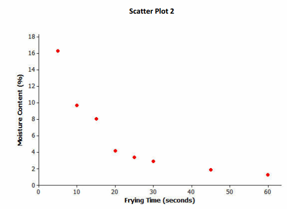
Is there a relationship between moisture content and frying time, or do the data points look scattered?
Answer:
There is a relationship.
Exercise 11.
If there is a relationship between moisture content and frying time, does the relationship look linear?
Answer:
As the frying time increases, the moisture content decreases. It is not linear.
→ Have you seen this shape before?
→ Exponential curve
Data Source: www.consumerreports.org/health
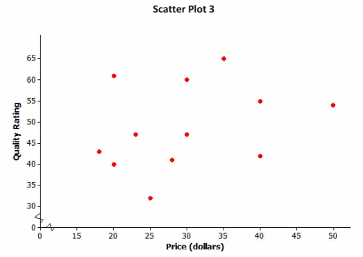
Exercise 12.
Scatter Plot 3 shows data for the prices of bike helmets and the quality ratings of the helmets (based on a scale that estimates helmet quality). Is there a relationship between quality rating and price, or are the data points scattered?
Answer:
There is no relationship; the points are scattered.
Exercise 13.
If there is a relationship between quality rating and price for bike helmets, does the relationship appear to be linear?
Answer:
Because there does not appear to be a relationship between quality rating and price, it does not make sense to say the relationship is either linear or not linear.
→ What does this tell us about rating and price?
→ There is no relationship between rating and price that we can summarize.
→ Is an expensive helmet going to provide the best protection?
→ Based on data, an expensive helmet may not necessarily provide the best protection.
Eureka Math Algebra 1 Module 2 Lesson 12 Problem Set Answer Key
Question 1.
Construct a scatter plot that displays the data for x (elevation above sea level in feet) and w (mean number of partly cloudy days per year).
Answer:
Provide students with graph paper or have students construct the scatter plot using a graphing calculator or graphing software. The following represents the scatter plot.
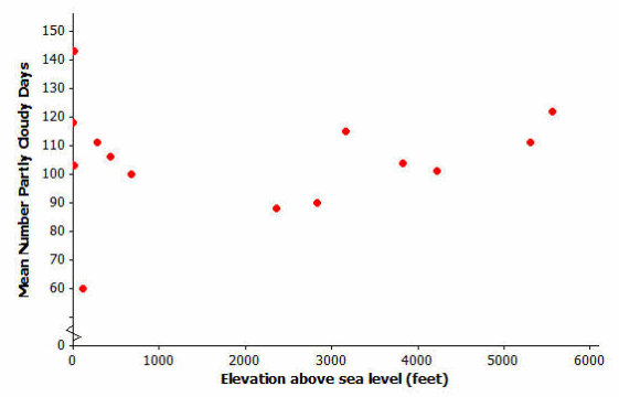
Question 2.
Based on the scatter plot you constructed in Problem 1, is there a relationship between elevation and the mean number of partly cloudy days per year? If so, how would you describe the relationship? Explain your reasoning.
Answer:
There appears to be a relationship. As the elevation increases, the number of partly cloudy days tends to decrease from approximately 0 to 3,000 ft. above sea level. Then at approximately 3,000 ft. above sea level, as the elevation increases, the number of partly cloudy days also appears to increase. This pattern suggests a quadratic model. Some cities, however, do not follow this pattern. (Students should discuss the overall pattern.)
Consider the following scatter plot for Problems 3 and 4.
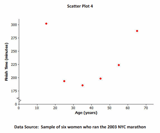
Question 3.
Is there a relationship between finish time and age, or are the data points scattered?
Answer:
At 35 years old, the finish time begins to increase.
Question 4.
Do you think there is a relationship between finish time and age? If so, does it look linear?
Answer:
The pattern does not look linear.
Consider the following scatter plot for Problems 5 and 6.
Data Source: Elissa Z. Cameron, Kevin J. Stafford, Wayne L. Linklater, and Clare J. Veltman, “Suckling behaviour does not measure milk intake in horses, equus caballus,” Animal Behaviour, 57 (1999): 673.
Question 5.
A mare is a female horse, and a foal is a baby horse. Is there a relationship between a foal’s birth weight and a mare’s weight, or are the data points scattered?
Answer:
There is a relationship.
Question 6.
If there is a relationship between baby birth weight and mother’s weight, does the relationship look linear?
Answer:
The relationship does look linear. As the mare’s weight increases, the foal birth weight tends to increase.
Note to teacher: The next lesson is a continuation of the objectives of this lesson. Lesson 13 connects specific modeling equations to several of the scatter plots used in this lesson.
Eureka Math Algebra 1 Module 2 Lesson 12 Exit Ticket Answer Key
Consider providing the data set from the student lesson.
Question 1.
You are traveling around the United States with friends. After spending a day in a town that is 2,000 ft. above sea level, you plan to spend the next several days in a town that is 5,000 ft. above sea level. Is this town likely to have more or fewer clear days per year than the town that is 2,000 ft. above sea level? Explain your answer.
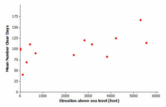
Answer:
I would expect the number of clear days per year to increase. The relationship between elevation above sea level and the mean number of clear days per year appears to be linear. The scatter plot indicates that as the elevation increases, the number of clear days per year also generally increases.
Question 2.
You plan to buy a bike helmet. Based on data presented in this lesson, will buying the most expensive bike helmet give you a helmet with the highest quality rating? Explain your answer.
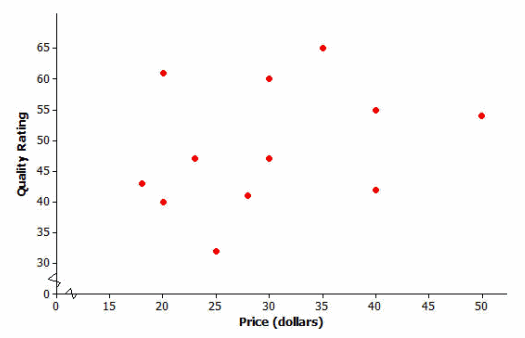
Data Source: www.consumerreports.org/health
Answer:
I think there is a good chance I would not be buying the bike helmet with the highest price. The scatter plot indicates that there is no relationship between price and quality rating.