Finding more possibilities to seek the homework help for solving Chapter 11 Data Analysis and Displays Questions? Then, here is the best solution. Explore Big Ideas Math Algebra 1 Answers Chapter 11 Data Analysis and Displays deeply to understand and get help in practicing all topics of ch 11. You can discover 11.1 to 11.5 Exercises Questions, Practice Tests, Cumulative Assessment, Review Tests, Quiz, etc. in the Big Ideas Math Book Algebra 1 Chapter 11 Data Analysis and Displays Answer Key. So, learn all topics thoroughly and enhance your problem-solving skills to become a Pro in Maths. Go ahead and check out the quick links of BIM Ch 11 Algebra 1 Solutions.
Big Ideas Math Book Algebra 1 Answer Key Chapter 11 Data Analysis and Displays
By referring to the ultimate material of Big Ideas Math Algebra 1 Answers Chapter 11 Data Analysis and Displays, every students and learner get deep knowledge about the topic and become top in any examinations. Because each and every solution involved in this BIM Algebra 1 Ch 11 Data Analysis and Displays Solution Key is explained by the subject experts based on the Common Core Curriculum. Practice more and improve your math proficiency by simply tapping on the below link of respective Big Ideas Math Algebra 1 Answers of Chapter 11 & attempt all Data Analysis and Displays problems effectively.
- Data Analysis and Displays Maintaining Mathematical Proficiency – Page 583
- Data Analysis and Displays Mathematical Practices – Page 584
- Lesson 11.1 Measures of Center and Variation – Page(586-592)
- Measures of Center and Variation 11.1 Exercises – Page(590-592)
- Lesson 11.2 Box-and-Whisker Plots – Page(594-598)
- Box-and-Whisker Plots 11.2 Exercises – Page(597-598)
- Lesson 11.3 Shapes of Distributions – Page(600-606)
- Shapes of Distributions 11.3 Exercises – Page(604-606)
- Data Analysis and Displays Study Skills: Studying for Finals – Page 607
- Data Analysis and Displays 11.1–11.3 Quiz – Page 608
- Lesson 11.4 Two-Way Tables – Page(610-616)
- Two-Way Tables 11.4 Exercises – Page(614-616)
- Lesson 11.5 Choosing a Data Display – Page(618-622)
- Choosing a Data Display 11.5 Exercises – Page(621-622)
- Data Analysis and Displays Performance Task: College Students Study Time – Page – 623
- Data Analysis and Displays Chapter Review – Page(624-626)
- Data Analysis and Displays Chapter Test – Page 627
- Data Analysis and Displays Cumulative Assessment – Page (628-630)
Data Analysis and Displays Maintaining Mathematical Proficiency
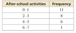
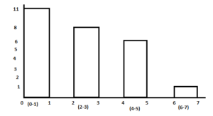
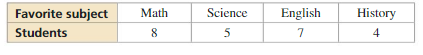
The table shows the results of a survey. Display the data in a histogram.
Question 1.
Answer:
Use the tables given above we can display the data in a histogram.
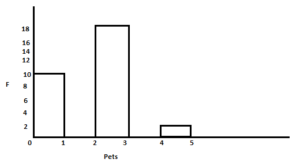
Question 2.
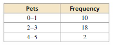
Answer:
Use the table given above we can display the data in a histogram.
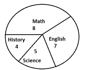
The table shows the results of a survey. Display the data in a circle graph.
Question 3.
Answer:
Number of students choose math as favorite subject = 8
Number of students choose science as favorite subject = 5
Number of students choose English as favorite subject = 7
Number of students choose history as favorite subject = 4
Question 4.
ABSTRACT REASONING
Twenty people respond “yes” or “no” to a survey question. Let a and b represent the frequencies of the responses. What must be true about the sum of a and b? What must be true about the sum when “maybe” is an option for the response?
Answer:
Data Analysis and Displays Mathematical Practices
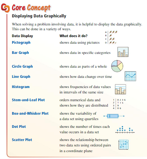
Mathematically proficient students use diagrams and graphs to show relationships between data. They also analyze data to draw conclusions.
Using Data Displays
Monitoring Progress
Question 1.
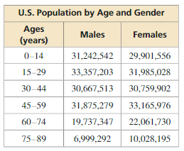
The table shows the estimated populations of males and females by age in the United States in 2012. Use a spreadsheet, graphing calculator, or some other form of technology to make two different displays for the data.
Answer:
Question 2.
Explain why you chose each type of data display in Monitoring Progress Question 1. What conclusions can you draw from your data displays?
Answer:
Lesson 11.1 Measures of Center and Variation
Essential Question
How can you describe the variation of a data set?
EXPLORATION 1
Describing the Variation of Data
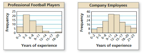
Work with a partner. The graphs show the weights of the players on a professional football team and a professional baseball team.
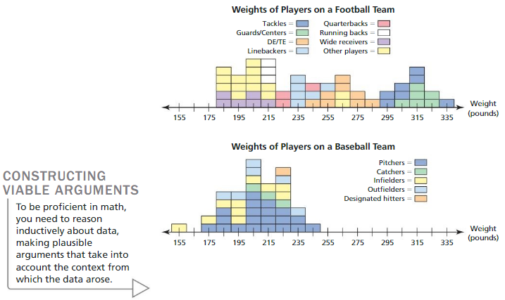
a. Describe the data in each graph in terms of how much the weights vary from the mean. Explain your reasoning.
b. Compare how much the weights of the players on the football team vary from the mean to how much the weights of the players on the baseball team vary from the mean.
c. Does there appear to be a correlation between the body weights and the positions of players in professional football? in professional baseball? Explain.
Answer:
EXPLORATION 2
Describing the Variation of Data
Work with a partner. The weights (in pounds) of the players on a professional basketball team by position are as follows.
Power forwards: 235, 255, 295, 245; small forwards: 235, 235;
centers: 255, 245, 325; point guards: 205, 185, 205; shooting guards: 205, 215, 185
Make a graph that represents the weights and positions of the players. Does there appear to be a correlation between the body weights and the positions of players in professional basketball? Explain your reasoning.
Answer:
Communicate Your Answer
Question 3.
How can you describe the variation of a data set?
Answer: The most commonly used measure of variability in a data set include Variance, Range, Standard deviation, Inter-quartile range.
Monitoring Progress
Question 1.
WHAT IF?
The park hires another student at an hourly wage of $8.45. (a) How does this additional value affect the mean, median, and mode? Explain. (b) Which measure of center best represents the data? Explain.
Answer:
a. Mean = 9.51, median = 8.65, mode = 8.25, 8.45
b. The median best represents the data. The mode is less than most of the data and the mean is greater than most of the data.
Explanation:
a. Mean = \(\frac { 8.45 + 16.5 + 8.75 + 8.65 + 9.10 + 8.25 + 8.45 + 8.25 + 9.25 }{ 9 } \)
= 9.51
Order the data
8.25, 8.25, 8.45, 8.45, 8.65, 8.75 9.10, 9.25, 16.50
Median = 8.65
Mode = 8.25, 8.45
Question 2.
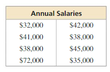
The table shows the annual salaries of the employees of an auto repair service. (a) Identify the outlier. How does the outlier affect the mean, median, and mode? (b) Describe one possible explanation for the outlier.
Answer:
a. When you remove the outlier, the mean decreases 49000 – 38714 = 10286, the median decreases 39500 – 38000 = 1500 and the mode remains the same.
Explanation:
The outlier is 72,000
Find mean, median and mode without outlier
Mean = \(\frac { 32000 + 41000 + 38000 + 45000 + 42000 + 38000 + 35000 }{ 7 } \)
= 38714
arrange the data 32000, 35000, 38000, 38000, 41000, 42000, 45000
Median = 38000
Mode = 38000
When you remove the outlier, mean decreases 49000 – 38714 = 10286, the median decreases 39500 – 38000 = 1500 and mode remains the same.
Question 3.
After the first week, the 25-year-old is voted off Show A and the 48-year-old is voted off Show B. How does this affect the range of the ages of the remaining contestants on each show in Example 3? Explain.
Answer:
It does not show any effect on the ages of the remaining contestants on each show in Example 3
Explanation
Order the data
Show A: 19, 20, 20, 21, 22, 25, 25, 27, 27, 29, 29, 30, 31
So, the range 31 – 19 = 12 years
Show B: 19, 20, 21, 22, 22, 24, 25, 25, 27, 27, 32, 48, 48
So, the range 48 – 19 = 29 years
Question 4.
Find the standard deviation of the ages for Show B in Example 3. Interpret your result.
Answer:
The standard deviation is about 7.47. This means that the typical age of a contestant on show b differs from the mean about 7.47 years.
Explanation:
| x | μ | x – μ | (x – μ)² |
|---|---|---|---|
| 25 | 26 | -1 | 1 |
| 20 | 26 | -6 | 36 |
| 22 | 26 | -4 | 16 |
| 27 | 26 | 1 | 1 |
| 48 | 26 | 22 | 484 |
| 32 | 26 | 6 | 36 |
| 19 | 26 | -7 | 49 |
| 27 | 26 | 1 | 1 |
| 25 | 26 | -1 | 1 |
| 22 | 26 | -4 | 16 |
| 21 | 26 | -5 | 25 |
| 24 | 26 | -2 | 4 |
Variance = \(\frac { 1 + 36 + 16 + 1 + 484 + 36 + 49 + 1 + 1 + 16 + 25 + 4 }{ 12 } \)
= 55.833
Standard deviation = √55.833 = 7.47
The standard deviation is about 7.47. This means that the typical age of a contestant on show b differs from the mean of about 7.47 years.
Question 5.
Compare the standard deviations for Show A and Show B. What can you conclude?
Answer:
Show A standard deviation is 4.2 years and show b standard deviation is 7.47
Question 6.
Find the mean, median, mode, range, and standard deviation of the altitudes of the airplanes when each altitude increases by \(\frac{1}{2}\) miles.
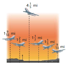
Answer:
Mean = 3.35, Median = 2.95, Threre is no mode
Range = 3.3
Standard deviation = 1.85
Explanation:
The airplanes are 19/10, 7/5, 21/5, 3/2, 6/5, 9/10
Mean = 1.85 + 3/2 = 3.35
Arrange the data 9/10, 6/5, 7/5, 3/2, 19/10, 21/5
Median = 1.45 + 3/2 = 2.95
Threre is no mode
Range = 21/5 – 9/10 = 3.3
| x | μ | x – μ | (x – μ)² |
|---|---|---|---|
| 19/10 | 3.35 | -1.45 | 2.102 |
| 7/5 | 3.35 | -1.95 | 3.802 |
| 21/5 | 3.35 | 0.85 | 0.7225 |
| 3/2 | 3.35 | -1.85 | 3.422 |
| 6/5 | 3.35 | -2.15 | 4.622 |
| 9/10 | 3.35 | -2.45 | 6 |
Variance = \(\frac { 2.102 + 3.802 + 0.7225 + 3.422 + 4.622 + 6 }{ 6 } \)
= 3.44
standard deviation = 1.85
Measures of Center and Variation 11.1 Exercises
Vocabulary and Core Concept Check
Question 1.
VOCABULARY
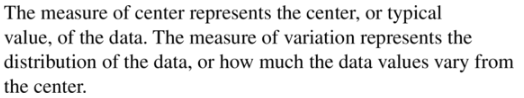
In a data set, what does a measure of center represent? What does a measure of variation describe?
Answer:
Question 2.
WRITING
Describe how removing an outlier from a data set affects the mean of the data set.
Answer: An outliner is an extreme value in a set of data that is much higher or lower than the other numbers. outliners affect the mean value of the data but have little effect on the median or mode of the given set of data.
Question 3.
OPEN-ENDED
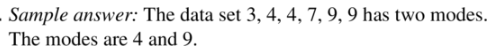
Create a data set that has more than one mode.
Answer:
Question 4.
REASONING
What is an advantage of using the range to describe a data set? Why do you think the standard deviation is considered a more reliable measure of variation than the range?
Answer:
An advantage of using the range is that it is wasy to calculate.
Range = Difference between highest and lowest observed values
The disadvantage of using the range is that it uses only two values of the data set.
The standard deviation is more reliable measure of variation because it uses all the values of data set.
Monitoring Progress and Modeling with Mathematics
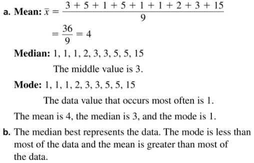
In Exercises 5–8, (a) Find the mean, median, and mode of the data set and (b) determine which measure of center best represents the data. Explain. (See Example 1.)
Question 5.
3, 5, 1, 5, 1, 1, 2, 3, 15
Answer:
Question 6.
12, 9, 17, 15, 10
Answer:
Mean = 12.6, median = 12, no mode
b. Median represents the best data.
Explanation:
Mean = \(\frac { 12 + 9 + 17 + 15 + 10 }{ 5 } \)
= 12.6
Arrange the data 9, 10, 12, 15, 17
Median = 12
There is no mode.
b. Median represents the best data.
Question 7.
13, 30, 16, 19, 20, 22, 25, 31
Answer:
Mean = 22, median = 21, no mode
b. Median represents the best data.
Explanation:
Mean = \(\frac { 13 + 30 + 16 + 19 + 20 + 22 + 25 + 31 }{ 8 } \)
= 22
Arrange the data 13, 16, 19, 20, 22, 25, 30, 31
Median = 20 + 22/2 = 21
There is no mode.
b. Median represents the best data.
Question 8.
14, 15, 3, 15, 14, 14, 18, 15, 8, 16
Answer:
Mean = 13.2, median = 14.5, mode = 14 and 15
Explanation:
Mean = \(\frac { 14 + 15 + 3 + 15 + 14 + 14 + 18 + 15 + 8 + 16 }{ 10 } \)
= 13.2
Arrange the data 3, 8, 14, 14, 14, 15, 15, 15, 16, 18
Median = 14 + 15/2 = 14.5
Mode = 14, 15
b. Median represents the best data.
Question 9.
ANALYZING DATA
The table shows the lengths of nine movies.
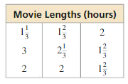
a. Find the mean, median, and mode of the lengths.
b. Which measure of center best represents the data? Explain.
Answer:
Question 10.
ANALYZING DATA
The table shows the daily changes in the value of a stock over 12 days.
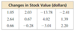
a. Find the mean, median, and mode of the changes in stock value.
b. Which measure of center best represents the data? Explain.
c. On the 13th day, the value of the stock increases by $4.28. How does this additional value affect the mean, median, and mode? Explain.
Answer:
a. Mean = -0.4016, median = 0.86 and no mode
b. median best represents the data.
c. The mean increases -0.4016 + 0.0414 = -0.3602, median increases by 0.19.
Explanation:
a. Mean = \(\frac { 1.05 + 2.64 + 0.66 + 2.03 + 0.67 – 0.28 – 13.78 + 4.02 – 3.01 – 2.41 + 1.39 + 2.20 }{ 12 } \)
= -0.4016
Arrange the data -13.78, -3.01, -2.41, -0.28, 0.66, 0.67, 1.05, 1.39, 2.03, 2.20, 2.64, 4.02
Median = 0.67 + 1.05/2 = 0.86
There is no mode
b. median best represents the data.
c. Mean = \(\frac { 1.05 + 2.64 + 0.66 + 2.03 + 0.67 – 0.28 – 13.78 + 4.02 – 3.01 – 2.41 + 1.39 + 2.20 + 4.28 }{ 13 } \)
= -0.0414
Arrange the data -13.78, -3.01, -2.41, -0.28, 0.66, 0.67, 1.05, 1.39, 2.03, 2.20, 2.64, 4.02, 4.28
Median = 1.05
No mode
In Exercises 11–14, find the value of x.
Question 11.
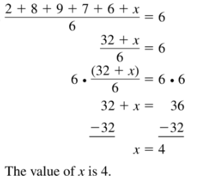
2, 8, 9, 7, 6, x; The mean is 6.
Answer:
Question 12.
12.5, -10, -7.5, x; The mean is 11.5.
Answer:
x = 51
Explanation:
Mean = \(\frac { 12.5 – 10 – 7.5 + x }{ 4 } \)
4 x 11.5 = -5 + x
46 + 5 = x
x = 51
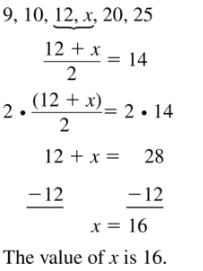
Question 13.
9, 10, 12, x, 20, 25; The median is 14.
Answer:
x = 16
Explanation:
Arrange the data
9, 10, 12, x, 20, 25
Median = 14 = \(\frac { 12 + x }{ 2 } \)
28 = 12 + x
x = 16
Question 14.
30, 45, x, 100; The median is 51.
Answer:
x = 57
Explanation:
Median = 51 = \(\frac { 45 + x }{ 2 } \)
102 = 45 + x
x = 57
Question 15.
ANALYZING DATA
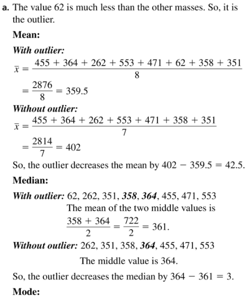
The table shows the masses of eight polar bears. (See Example 2.)
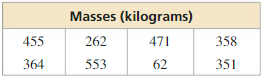
a. Identify the outlier. How does the outlier affect the mean, median, and mode?
b. Describe one possible explanation for the outlier.
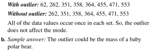
Answer:
Question 16.
ANALYZING DATA
The sizes of emails (in kilobytes) in your inbox are 2, 3, 5, 2, 1, 46, 3, 7, 2, and 1.
a. Identify the outlier. How does the outlier affect the mean, median, and mode?
b. Describe one possible explanation for the outlier.
Answer:
a. Outlier increases mean and median but has no effect on the mode
b. One possible explanation for having 46 kilobyte email is it may have an attachments such as photos, videos or large documents.
Explanation:
The outlier is 46
Mean with outlier = \(\frac { 2 + 3 + 5 + 2 + 1 + 46 + 3 + 7 + 2 + 1 }{ 10 } \)
= 7.2
Mean without outlier = \(\frac { 2 + 3 + 5 + 2 + 1 + 3 + 7 + 2 + 1 }{ 9 } \) = 2.89
The difference of two means = 2.89 – 7.2 = -4.31
Hence the outlier increases the mean because by removing it, mean decreases by -4.31 kilobytes
Order the data
1, 1, 2, 2, 2, 3, 3, 5, 7, 46
Median with outlier = 2 + 3/2 = 2.5
Median without outlier = 2
The difference of medians = 2 – 2.5 = -0.5
Therefore, the outlier increases median because by removing it, the median decreases by -0.5 kilobytes.
Mode = 2
Question 17.
ANALYZING DATA
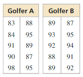
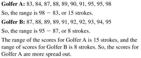
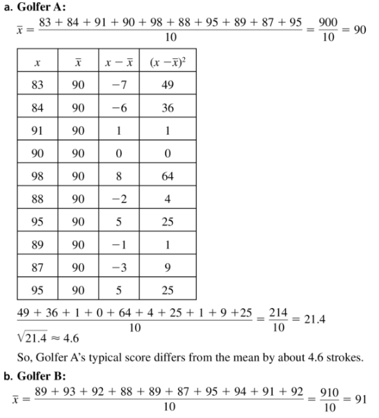
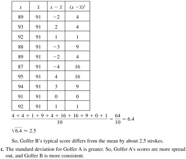
The scores of two golfers are shown. Find the range of the scores for each golfer. Compare your results. (See Example 3.)
Answer:
Question 18.
ANALYZING DATA
The graph shows a player’s monthly home run totals in two seasons. Find the range of the number of home runs for each season. Compare your results.
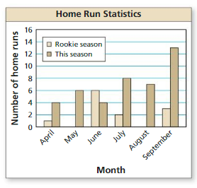
Answer:
The ranges of months in an order are june, april, may, july, august and september.
Explanation:
Range of april = 4 – 1 = 3
Range of May = 6 – 0 = 6
Range of June = 6 – 4 = 2
Range of July = 8 – 2 = 6
Range of August = 7 – 0 = 7
Range of September = 13 – 3 = 10
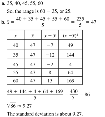
In Exercises 19–22, find (a) the range and (b) the standard deviation of the data set.
Question 19.
40, 35, 45, 55, 60
Answer:
Question 20.
141, 116, 117, 135, 126, 121
Answer:
Range = 19
Standard deviation = 9.237
Explanation:
Range = 135 – 116 = 19
Mean = \(\frac { 141 + 116 + 117 + 135 + 126 + 121 }{ 6 } \)
= 126
| x | μ | x – μ | (x – μ)² |
|---|---|---|---|
| 141 | 126 | 15 | 225 |
| 116 | 126 | -10 | 100 |
| 117 | 126 | -9 | 81 |
| 135 | 126 | 9 | 81 |
| 126 | 126 | 0 | 0 |
| 121 | 126 | -5 | 25 |
Variance = \(\frac { 225 + 100 + 81 + 81 + 0 + 25 }{ 6 } \) = 85.33
Standard deviation = 9.237
Question 21.
0.5, 2.0, 2.5, 1.5, 1.0, 1.5
Answer:
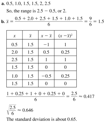
Question 22.
8.2, 10.1, 2.6, 4.8, 2.4, 5.6, 7.0, 3.3
Answer:
Range = 7.7
Standard deviation = 9.58
Explanation:
Range = 10.1 – 2.4 = 7.7
Mean = \(\frac { 8.2 + 10.1 + 2.6 + 4.8 + 2.4 + 5.6 + 7.0 + 3.3 }{ 8 } \)
= 14.725
| x | μ | x – μ | (x – μ)² |
|---|---|---|---|
| 8.2 | 14.725 | 6.525 | 42.575 |
| 10.1 | 14.725 | -4.625 | 21.39 |
| 2.6 | 14.725 | -12.125 | 147.015 |
| 4.8 | 14.725 | -9.925 | 98.505 |
| 2.4 | 14.725 | -12.325 | 151.905 |
| 5.6 | 14.725 | -9.125 | 83.265 |
| 7 | 14.725 | -7.725 | 59.675 |
| 3.3 | 14.725 | -11.425 | 130.53 |
Variance = \(\frac { 42.575 + 21.39 + 147.015 + 98.505 + 151.905 + 83.265 + 59.675 + 130.53 }{ 8 } \) = 91.8575
Standard deviation = 9.58
Question 23.
ANALYZING DATA
Consider the data in Exercise 17.
a. Find the standard deviation of the scores of Golfer A. Interpret your result.
b. Find the standard deviation of the scores of Golfer B. Interpret your result.
c. Compare the standard deviations for Golfer A and Golfer B. What can you conclude?
Answer:
Question 24.
ANALYZING DATA
Consider the data in Exercise 18.
a. Find the standard deviation of the monthly home run totals in the player’s rookie season. Interpret your result.
b. Find the standard deviation of the monthly home run totals in this season. Interpret your result.
c. Compare the standard deviations for the rookie season and this season. What can you conclude?
Answer:
a. SD = 1.87
b. SD = 3.05
c. This season has more standard deviation when compared with player’s rookie season.
Explanation:
a. Mean = \(\frac { 1 + 6 + 2 + 3 }{ 4 } \) = 3
| x | μ | x – μ | (x – μ)² |
|---|---|---|---|
| 1 | 3 | -2 | 4 |
| 6 | 3 | 3 | 9 |
| 2 | 3 | -1 | 1 |
| 3 | 3 | 0 | 0 |
Variance = \(\frac { 4 + 9 + 1 + 0 }{ 4 } \) = 3.5
Standard deviation = 1.87
b. Mean = \(\frac { 4 + 6 + 4 + 8 + 7 + 13 }{ 6 } \) = 7
| x | μ | x – μ | (x – μ)² |
|---|---|---|---|
| 4 | 7 | -3 | 9 |
| 6 | 7 | -1 | 1 |
| 4 | 7 | -3 | 9 |
| 8 | 7 | 1 | 1 |
| 7 | 7 | 0 | 0 |
| 13 | 7 | 6 | 36 |
Variance = \(\frac { 9 + 1 + 9 + 1 + 0 + 36 }{ 6 } \) = 9.33
Standard deviation = 3.05
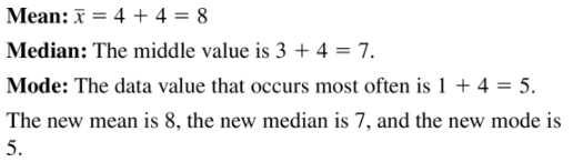
In Exercises 25 and 26, find the mean, median, and mode of the data set after the given transformation.
Question 25.
In Exercise 5, each data value increases by 4.
Answer:
Question 26.
In Exercise 6, each data value increases by 20%.
Answer:
Mean = 15.12, medan = 14.4 and no mode
Explanation:
The data values are 12, 9, 17, 15, 10
The new data values are 14.4, 10.8, 20.4, 18, 12
Mean = \(\frac { 14.4 + 10.8 + 20.4 + 18 + 12 }{ 5 } \)
= 15.12
10.8, 12, 14.4, 18, 20.4
Median = 14.4
There is no mode
Question 27.
TRANSFORMING DATA
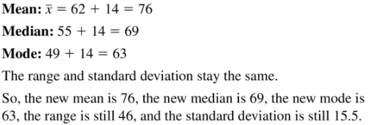
Find the values of the measures shown when each value in the data set increases by 14.
Mean: 62
Median: 55
Mode: 49
Range: 46
Standard deviation: 15.5
Answer:
Question 28.
TRANSFORMING DATA
Find the values of the measures shown when each value in the data set is multiplied by 0.5.
Mean: 320
Median: 300
Mode: none
Range: 210
Standard deviation: 70.6
Answer:
Mean = 160
Median = 150
Mode = none
Range = 210
Standard deviation = 70.6
Explanation:
Mean = 320 x 0.5 = 160
Median = 300 x 0.5 = 150
Mode = none
Range = 210
Standard deviation = 70.6
Question 29.
ERROR ANALYSIS
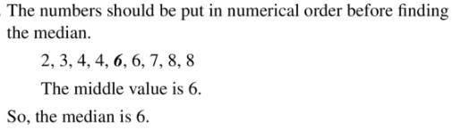
Describe and correct the error in finding the median of the data set.
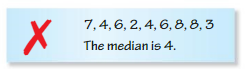
Answer:
Question 30.
ERROR ANALYSIS
Describe and correct the error in finding the range of the data set after the given transformation.
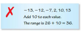
Answer:
Range = 23 + 23 = 46
Question 31.
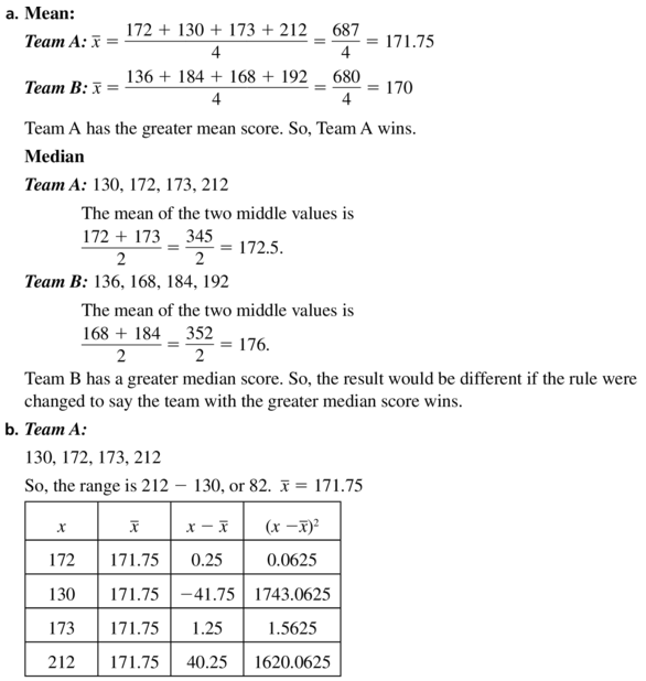
PROBLEM SOLVING
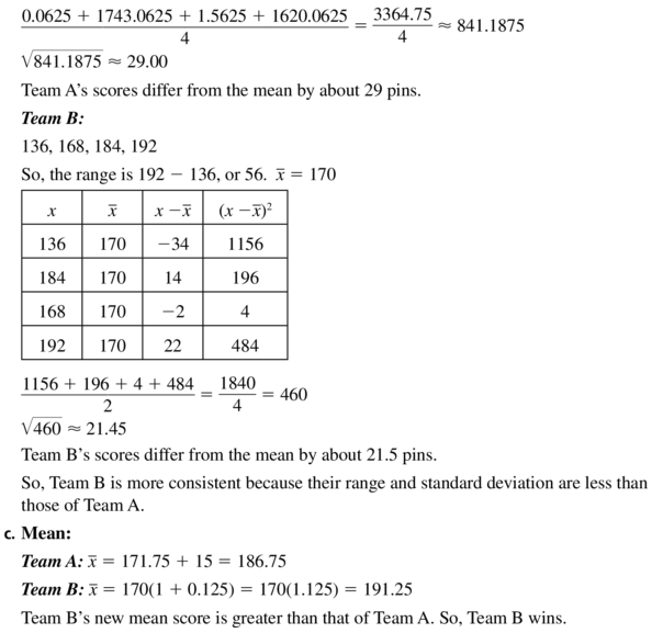
In a bowling match, the team with the greater mean score wins. The scores of the members of two bowling teams are shown.
Team A: 172, 130, 173, 212
Team B: 136, 184, 168, 192

a. Which team wins the match? If the team with the greater median score wins, is the result the same? Explain.
b. Which team is more consistent? Explain.
c. In another match between the two teams, all the members of Team A increase their scores by 15 and all the members of Team B increase their scores by 12.5%. Which team wins this match? Explain.
Answer:
Question 32.
MAKING AN ARGUMENT
Your friend says that when two data sets have the same range, you can assume the data sets have the same standard deviation, because both range and standard deviation are measures of variation. Is your friend correct? Explain.
Answer:
No, you cannot assume that two sets that have the same range have also the same standard deviation.
Explanation:
Let two data samples are
A = 1, 2, 3, 4, 5
B = 1, 3, 3, 4, 5
Range of A = 5 – 1 = 4
Range of B = 5 – 1 = 4
Mean of A = 3
Mean of B = 3.2
Standard deviation of A = 1.83
Standard deviation of B = 1.68
Question 33.
ANALYZING DATA
The table shows the results of a survey that asked 12 students about their favorite meal. Which measure of center (mean, median, or mode) can be used to describe the data? Explain.
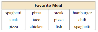
Answer:
Question 34.
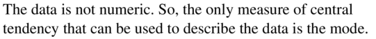
HOW DO YOU SEE IT?
The dot plots show the ages of the members of three different adventure clubs. Without performing calculations, which data set has the greatest standard deviation? Which has the least standard deviation? Explain your reasoning.
Answer: Option C has greatest standard deviation and and A has least standard deviation.
Question 35.
REASONING
A data set is described by the measures shown.
Mean: 27
Median: 32
Mode: 18
Range: 41
Standard deviation: 9
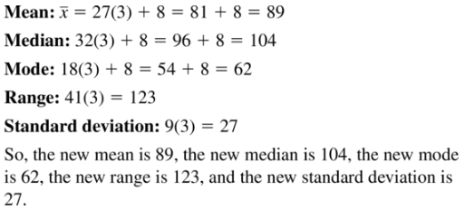
Find the mean, median, mode, range, and standard deviation of the data set when each data value is multiplied by 3 and then increased by 8.
Answer:
Question 36.
CRITICAL THINKING
Can the standard deviation of a data set be 0? Can it be negative? Explain.
Answer:
The standard deviation of a data set can never be negative.
Question 37.
USING TOOLS
Measure the heights (in inches) of the students in your class.
a. Find the mean, median, mode, range, and standard deviation of the heights.
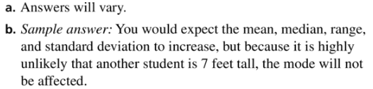
b. A new student who is 7 feet tall joins your class. How would you expect this student’s height to affect the measures in part (a)? Verify your answer.
Answer:
Question 38.
THOUGHT PROVOKING
To find the arithmetic mean of n numbers, divide the sum of the numbers by n. To find the geometric mean of n numbers a1, a2, a3, . . . , an, take the nth root of the product of the numbers.
geometric mean = \(\sqrt[n]{a_{1} \cdot a_{2} \cdot a_{3} \cdot \ldots \cdot a_{n}}\)
Compare the arithmetic mean to the geometric mean of n numbers.
Answer:
Let us take the data values 3, 8, 14, 14, 14, 15, 15, 15, 16, 18
Remove 10% of the lowest and highest value
Therefore, the trimmed data set is 8, 14, 14, 14, 15, 15, 15, 16
Trimmed mean = 13.875
Difference of trimmed and arithmetic mean = 13.875 – 13.2 = 0.675
The trimmed mean is greater than the arithmetic means by 0.675. the trimmed mean is useful because it can estimate the effects of outliers.
Question 39.
PROBLEM SOLVING
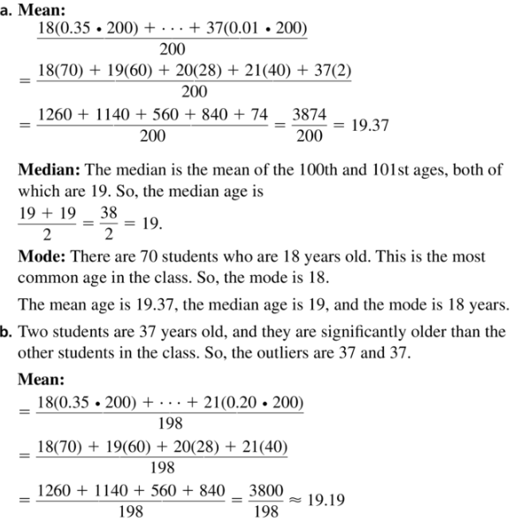
The circle graph shows the distribution of the ages of 200 students in a college Psychology I class.
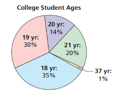
a. Find the mean, median, and mode of the students’ ages.
b. Identify the outliers. How do the outliers affect the mean, median, and mode?
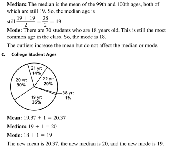
c. Suppose all 200 students take the same Psychology II class exactly 1 year later. Draw a new circle graph that shows the distribution of the ages of this class and find the mean, median, and mode of the students’ ages.
Answer:
Maintaining Mathematical Proficiency
Solve the inequality.(Section 2.4)
Question 40.
6x + 1 ≤ 4x – 9
Answer:
x ≤ -5
Explanation:
6x – 4x ≤ -9 – 1
2x ≤ -10
x ≤ -5
Question 41.
-3(3y – 2) < 1 – 9y
Answer:
Question 42.
2(5c – 4) ≥ 5(2c + 8)
Answer:
The inequality has no solution.
Explanation:
2(5c – 4) ≥ 5(2c + 8)
10c – 8 ≥ 10c + 40
10c – 10 ≥ 40 + 8
0 ≥ 48
Question 43.
4(3 – w) > 3(4w – 4)
Answer:
Evaluate the function for the given value of x.(Section 6.3)
Question 44.
f(x) = 4x; x = 3
Answer:
f(3) = 64
Explanation:
f(x) = 4x
f(3) = 4³
f(3) = 64
Question 45.
f(x) = 7x; x = -2
Answer:
Question 46.
f(x) = 5(2)x; x = 6
Answer:
f(6) = 320
Explanation:
f(x) = 5(2)x
f(6) = 5(2)6
f(6) = 5 x 64 = 320
Question 47.
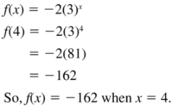
f(x) = -2(3)x; x = 4
Answer:
Lesson 11.2 Box-and-Whisker Plots
Essential Question How can you use a box-and-whisker plot to describe a data set?
EXPLORATION 1
Drawing a Box-and-Whisker Plot
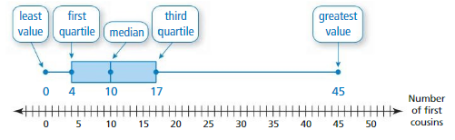
Work with a partner. The numbers of first cousins of the students in a ninth-grade class are shown. A box-and-whisker plot is one way to represent the data visually.
a. Order the data on a strip of grid paper with 24 equally spaced boxes. Fold the paper in half to find the median.
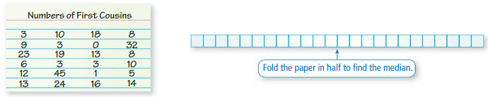
b. Fold the paper in half again to divide the data into four groups. Because there are 24 numbers in the data set, each group should have 6 numbers. Find the least value, the greatest value, the first quartile, and the third quartile.
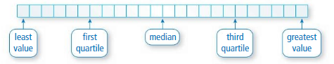
c. Explain how the box-and-whisker plot shown represents the data set.
Answer:
CommunicateYour Answer
Question 2.
How can you use a box-and-whisker plot to describe a data set?
Answer:
This plot gives the variability of data using a number line, the least value, the greatest value, and the quartiles of the data. In the box-and-whisker plot, the data is divided into 4 segments. The middle value of arranged data is called the median and it divides the data into two equal parts. The median of the left part is called the first quartile and the median of the right part is called the third quartile.
Question 3.
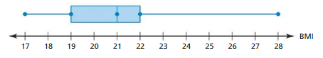
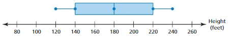
Interpret each box-and-whisker plot.
a. body mass indices (BMI) of students in a ninth-grade class
b. heights of roller coasters at an amusement park
Answer:
Monitoring Progress
Question 1.
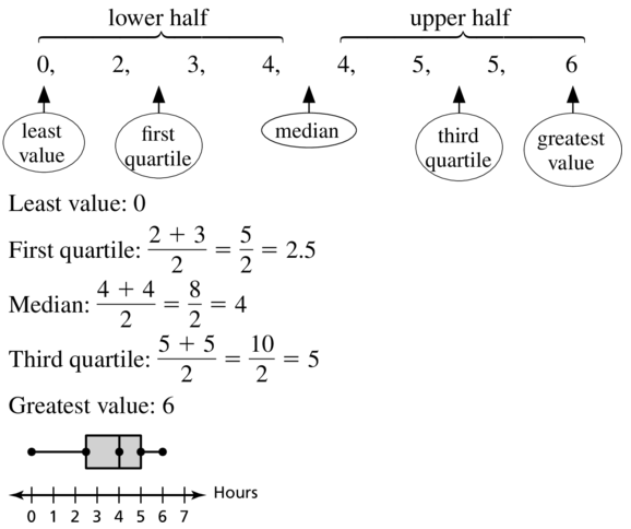
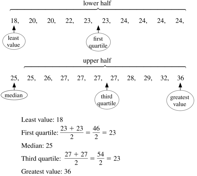
A basketball player scores 14, 16, 20, 5, 22, 30, 16, and 28 points during a tournament. Make a box-and-whisker plot that represents the data.
Answer:
Explanation:
Order the data
5, 14, 16, 16, 20, 22, 28, 30
Median = 16 + 20/2 = 18
First quartile = 14.5
Third quartile = 26.5
Interquartile range = 12
outliers = none
Use the box-and-whisker plot in Example 1.
Question 2.
Find and interpret the range and interquartile range of the data.
Answer:
Range = 30 – 5 = 25
Interquartile range = 26.5 – 14.5 = 12
Question 3.
Describe the distribution of the data.
Answer:
Question 4.
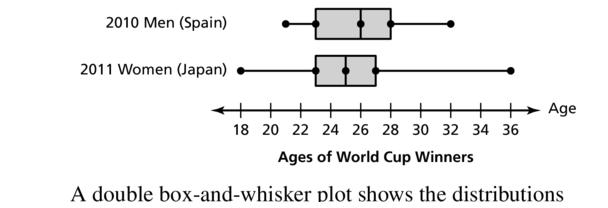
The double box-and-whisker plot represents the surfboard prices at Shop A and Shop B. Identify the shape of each distribution. Which shop’s prices are more spread out? Explain.
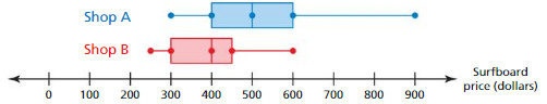
Answer:
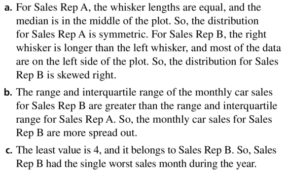
a. For shop A, the median is middle
For shop B, the right whisker is longer than the left whisker, and most of the data is on the left side of the plot.
b. Shop A prices are more spread out.
Box-and-Whisker Plots 11.2 Exercises
Vocabulary and Core Concept Check
Question 1.
WRITING
Describe how to find the first quartile of a data set.
Answer:
Question 2.
DIFFERENT WORDS, SAME QUESTION
Consider the box-and-whisker plot shown. Which is different? Find “both” answers.
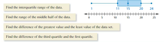
Answer:
Answers 1, 2 and 4 are all same.
20 – 11 = 9
Answer to 3rd question is 24 – 1 = 23.
So, the range of the data set is 23.
Monitoring Progress and Modeling with Mathematics
In Exercises 3–8, use the box-and-whisker plot to find the given measure.
Question 3.
least value
Answer:
![]()
Question 4.
greatest value
Answer:
The greatest value is 14
Question 5.
third quartile
Answer:
![]()
Question 6.
first quartile
Answer:
The first quartile is 6
Question 7.
median
Answer:
![]()
Question 8.
range
Answer:
Range = 14 – 3 = 11
In Exercises 9–12, make a box-and-whisker plot that represents the data.
Question 9.
Hours of television watched: 0, 3, 4, 5, 2, 4, 6, 5
Answer:
Question 10.
Cat lengths (in inches): 16, 18, 20, 25, 17, 22, 23, 21
Answer:
Median = 20.5
First quartile = 17.25
Third quartile = 22.75
ICR = 5.5
Question 11.
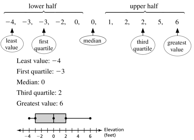
Elevations (in feet): -2, 0, 5, -4, 1, -3, 2, 0, 2, -3, 6
Answer:
Question 12.
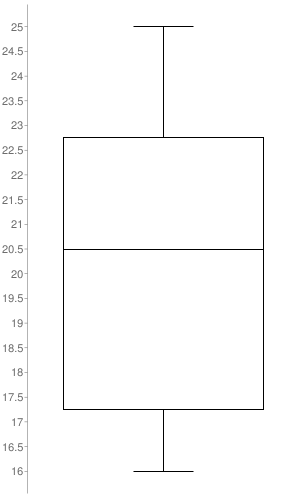
MP3 player prices (in dollars): 124, 95, 105, 110, 95, 124, 300, 190, 114
Answer:
Median: 114
Minimum: 95
Maximum: 300
First quartile: 100
Third quartile: 157
Interquartile Range: 57
Question 13.
ANALYZING DATA
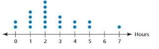
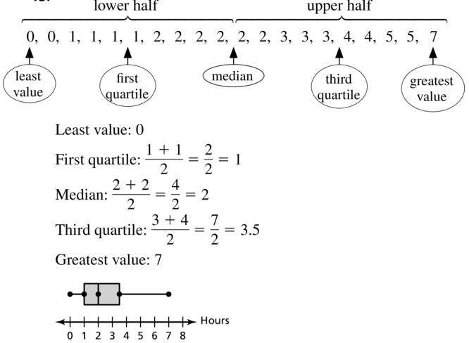
The dot plot represents the numbers of hours students spent studying for an exam. Make a box-and-whisker plot that represents the data.
Answer:
Question 14.
ANALYZING DATA
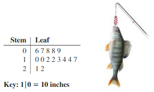
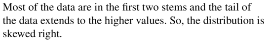
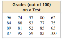
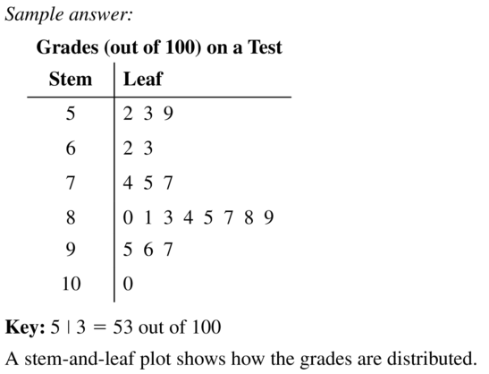
The stem-and-leaf plot represents the lengths (in inches) of the fish caught on a fishing trip. Make a box-and-whisker plot that represents the data.
Answer:
In the stem-and-leaf plot, the stem is the first digit of the value while the leaf is the second digit.
Therefore, the data set is 6, 7, 8, 8, 9, 10, 10, 12, 12, 13, 14, 14, 17, 21, 22.
As we can see the data has the least value is 6 and the greatest value is 22.
There is odd number of observations. So, the median is the middle value.
Therefore, the median is 12.
The lower half data is 6, 7, 8, 8, 9, 10, 10.
There are 7 observations, i.e. odd number of observations. So, the first quartile is the middle value from these.
Therefore, the first quartile is 8.
Upper half data is 12, 13, 14, 14, 17, 21, 22.
There are 7 observations, i.e. odd number of observations. So, the third quartile is the middle value from these.
Therefore, the third quartile is 14.
Question 15.
ANALYZING DATA
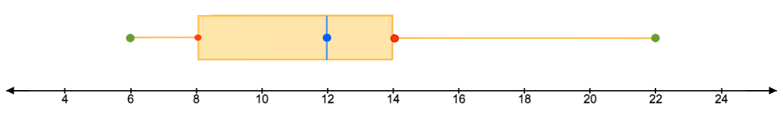
The box-and-whisker plot represents the prices (in dollars) of the entrées at a restaurant.
a. Find and interpret the range of the data.
b. Describe the distribution of the data.
c. Find and interpret the interquartile range of the data.
d. Are the data more spread out below Q1 or above or Q3? Explain.
Answer:
Question 16.
ANALYZING DATA
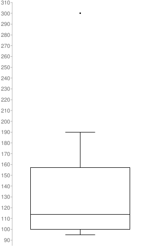
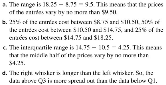
A baseball player scores 101 runs in a season. The box-and-whisker plot represents the numbers of runs the player scores against different opposing teams.
a. Find and interpret the range and interquartile range of the data.
b. Describe the distribution of the data. c. Are the data more spread out between Q1 and Q2 or between Q2 and Q3? Explain.
Answer:
a. Range = 17 – 0 = 17
ICR = 9 – 2 = 7
Question 17.
ANALYZING DATA
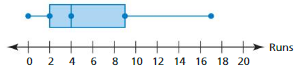
The double box-and-whisker plot represents the monthly car sales for a year for two sales representatives.
a. Identify the shape of each distribution.
b. Which representative’s sales are more spread out? Explain.
c. Which representative had the single worst sales month during the year? Explain.
Answer:
Question 18.
ERROR ANALYSIS
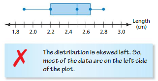
Describe and correct the error in describing the box-and-whisker plot.
Answer:
The distribution is skewed left. So most of the data are on the right side of the plot.
Question 19.
WRITING
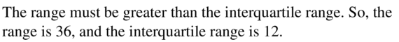
Given the numbers 36 and 12, identify which number is the range and which number is the interquartile range of a data set. Explain.
Answer:
Question 20.
HOW DO YOU SEE IT?
The box-and-whisker plot represents a data set. Determine whether each statement is always true. Explain your reasoning.
a. The data set contains the value 11.
b. The data set contains the value 6.
c. The distribution is skewed right.
d. The mean of the data is 5.
Answer:
a. Always true
b. Always true
c. Never true
d. Never true
Question 21.
ANALYZING DATA
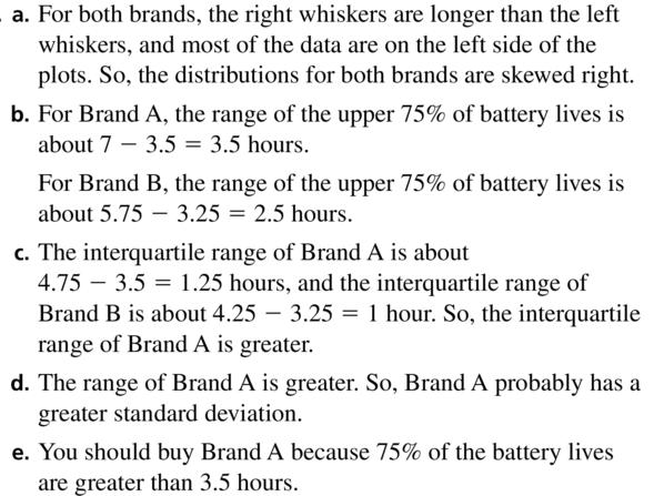
The double box-and-whisker plot represents the battery lives (in hours) of two brands of cell phones.
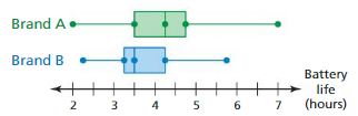
a. Identify the shape of each distribution.
b. What is the range of the upper 75% of each brand?
c. Compare the interquartile ranges of the two data sets.
d. Which brand do you think has a greater standard deviation? Explain.
e. You need a cell phone that has a battery life of more than 3.5 hours most of the time. Which brand should you buy? Explain.
Answer:
Question 22.
THOUGHT PROVOKING
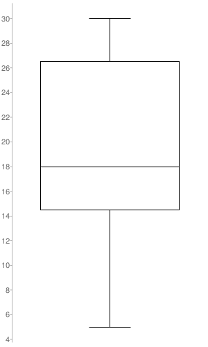
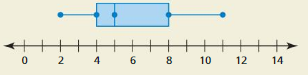
Create a data set that can be represented by the box-and-whisker plot shown. Justify your answer.
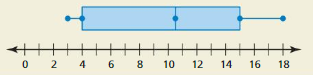
Answer:
Median = 10.5
Minimum = 3
Maximum = 18
Range = 18 – 3 = 15
Q1 = 2
Q3 = 15
ICR = 15 – 2 = 13
Question 23.
CRITICAL THINKING
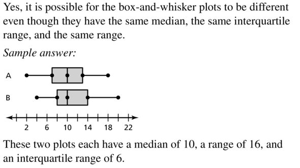
Two data sets have the same median, the same interquartile range, and the same range. Is it possible for the box-and-whisker plots of the data sets to be different? Justify your answer.
Answer:
Maintaining Mathematical Proficiency
Use zeros to graph the function. (Section 8.5)
Question 24.
f(x) = -2(x + 9)(x – 3)
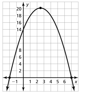
Answer:
The zeros are p = -9, q = 3
The x coordinate = \(\frac { -9 + 3 }{ 2 } \) = -3
y = -2(x + 9)(x – 3)
= -2(-3 + 9)(-3 – 3)
= -2(6)(-6) = 72
So, plot the x-intercepts (3, 0) and (-9, 0) as well as the vertex (0, 72). The parabola opens down.
Question 25.
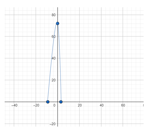
y = 3(x – 5)(x + 5)
Answer:
Question 26.
y = 4x2 – 16x – 48
Answer:
y = 4x2 – 16x – 48
y = 4(x + 2)(x − 6)
The zeros are p = -2, q = 6
The x coordinate of the vertex is \(\frac { -2 + 6 }{ 2 } \) = 2
y = 4(2)2 – 16(2) – 48
y = -64
So, plot the x intercepts (-2, 0), (6, 0) and vertex (2, -64)
Question 27.
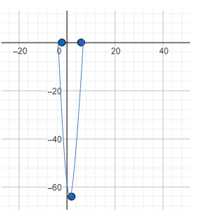
h(x) = -x2 + 5x + 14
Answer:
Lesson 11.3 Shapes of Distributions
Essential Question How can you use a histogram to characterize the basic shape of a distribution?
EXPLORATION 1
Analyzing a Famous Symmetric Distribution
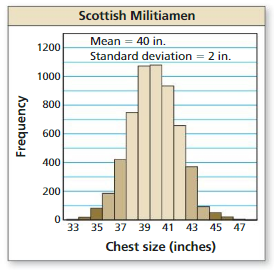
Work with a partner. A famous data set was collected in Scotland in the mid-1800s. It contains the chest sizes, measured in inches, of 5738 men in the Scottish Militia. Estimate the percent of the chest sizes that lie within (a) 1 standard deviation of the mean, (b) 2 standard deviations of the mean, and (c) 3 standard deviations of the mean. Explain your reasoning.
Answer:
EXPLORATION 2
Comparing Two Symmetric Distributions
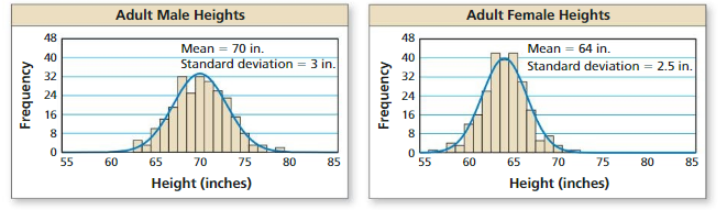
Work with a partner. The graphs show the distributions of the heights of 250 adult American males and 250 adult American females.
a. Which data set has a smaller standard deviation? Explain what this means in the context of the problem.
Answer:
The graphs show the distributions of the heights of 250 adult American males and 250 adult American females.
From the graph, we can see that the mean height of adult American males is 70 inches and the standard deviation is 3 inches. Also, the mean heights of adult American females are 64 inches and the standard deviation is 2.5 inches.
Then, the data set of adult American females has a smaller standard deviation, which is 2.5 inches.
Therefore, we can say that the heights of the 250 adult females in America do not vary as much as the heights of the 250 adult males in America. In other words, the heights of adult American females lie between 55−70 inches, while the height of adult American males lies between 60−80 inches.
b. Estimate the percent of male heights between 67 inches and 73 inches.
Answer:
Z = X – μ/σ
μ = 70
σ = 3
x1 = 67
x2 = 73
z1 = x1 – μ/σ
= 67-70/3
= -3/3
= -1
z2 = x2 – μ/σ
= 73-70/3
= 3/3
= 1
P(-1 < Z < 1) = P(-1 < Z < 0) + P(0 < Z < 1)
P(-1 < Z < 1) = P(0 < Z < 1) + P(0 < Z < 1)
P(-1 < Z < 1) = 2 × P(0 < Z < 1)
P(-1 < Z < 1) = 2 × 0.3413
= 0.6826
Then the percent of the chest sizes that lie within 1 standard deviation of the mean = 0.6826 × 100
= 68.26
So, the percent of make heights between 67 inches and 73 inches is 68.26
Communicate Your Answer
Question 3.
How can you use a histogram to characterize the basic shape of a distribution?
Answer:
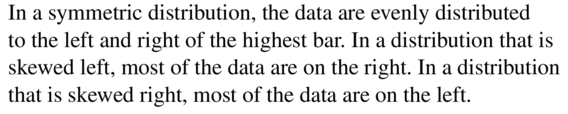
There are 3 basic shape of a distribution.
1. Symmetric: A histogram is symmetric if you reduce it down the center, and the left-hand and right-hand facets resemble replicate pics of every other.
2. Skewed right: A skewed right histogram seems like a lopsided mound with a trail going off to the proper.
3. Skewed left: It seems like a loop-sided mound with a trail going off to the left if a histogram is skewed left.
Question 4.
All three distributions in Explorations 1 and 2 are roughly symmetric. The histograms are called “bell-shaped.”
a. What are the characteristics of a symmetric distribution?
Answer:
The definition of a symmetric (bell-shaped) distribution is:
When a vertical line is drawn in the center of a graph, it creates mirror images, with the left half of the graph mirroring the right half. This form is referred to as a bell shape in the histogram. The highest vertical column is at the center of the most common symmetric histogram. A normal curve is a name given to this shape.
A symmetric distribution is a type of distribution where the left side of the distribution mirrors the right side.
A symmetric distribution occurs when the values of variables appear at regular frequencies.
In a symmetric distribution, the mean, mode and median all fall at the same point. The mode is the most common number and it matches with the highest peak.
b.Why is a symmetric distribution called “bell-shaped?”
Answer:
A bell curve, commonly known as the normal distribution, is a typical type of distribution for a variable. The phrase “bell curve” refers to the symmetrical bell-shaped curve that is used to show a normal distribution on a graph.
The most likely event in a sequence of data is represented by the highest point on the curve, or the top of the bell (its mean, mode, and median in this case), all the other possible outcomes are symmetrically distributed around the mean, resulting in a downward-sloping curve on both sides of the peak. The standard deviation describes the width of the bell curve.
c. Give two other real-life examples of symmetric distributions. Shapes of Distributions.
Answer:
First, we consider the example of the height of the population:
The population’s height is an example of normal distribution. The majority of people in a particular population are of average height. The number of persons who are higher or shorter than the average height is nearly equal, and only a small percentage of people are extraordinarily tall or short. Height, on the other hand, is not a single trait; it is influenced by a number of hereditary and environmental factors. As a result, it conforms to the normal distribution.
The other example we consider is of IQ of the population:
In this era of increased competition, most parents and children are interested in determining their Intelligent Quotient level. The IQ of a population is a normal distribution curve, which indicates that the IQ of the majority of persons in the population is in the normal range, whereas the IQ of the rest is in the deviated range.
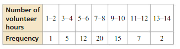
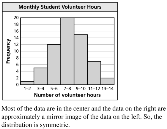
Monitoring Progress
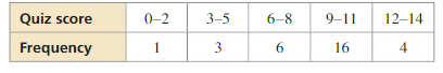
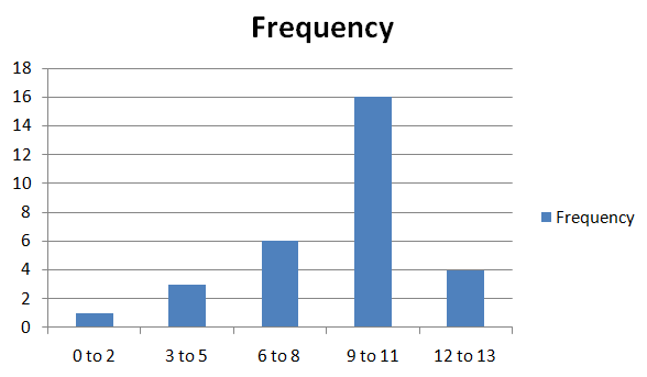
Question 1.
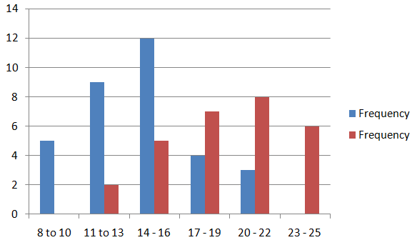
The frequency table shows the numbers of pounds of aluminium cans collected by classes for a fundraiser. Display the data in a histogram. Describe the shape of the distribution.
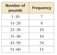
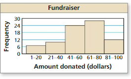
Answer:
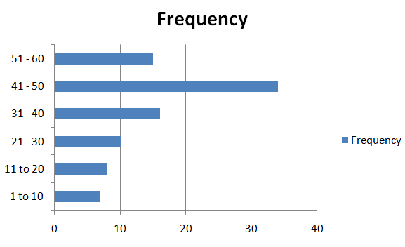
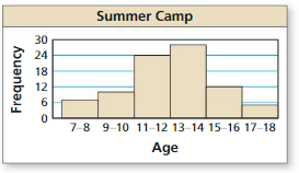
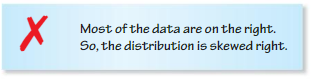
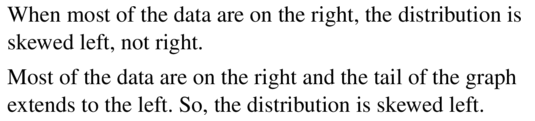
The distribution is skewed left. Most of the data is on the right.
Question 2.
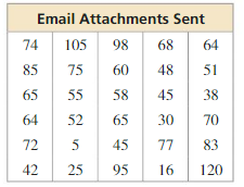
You record the numbers of email attachments sent by 30 employees of a company in 1 week. Your results are shown in the table. (a) Display the data in a histogram using six intervals beginning with 1–20. (b) Which measures of center and variation best represent the data? Explain.
Answer:
| Email Attachments Sent | Frequency |
|---|---|
| 1 – 20 | 2 |
| 21 – 40 | 3 |
| 41 – 60 | 9 |
| 61 – 80 | 10 |
| 81 – 100 | 4 |
| 101 – 120 | 2 |
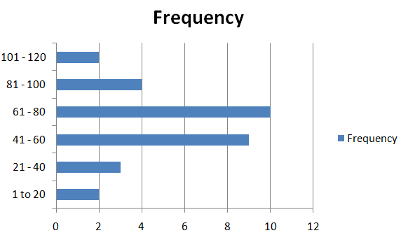
Most of the data is on the right.
Question 3.
Compare the distributions using their shapes and appropriate measures of center and variation.
Answer:
Most of the data is on the right side for the professional football players and most of the data is on the right side for company employees.
The mean of professional football players is 3-5 and the median is 6-8. The mean for company employees is 9-11 and the median is 12-14.
Question 4.
Why is the mean greater than the median for the men?
Answer:
The mean is less than the median which in most cases is less than the mode. The mean is more accurate but if the question comes for a double exponential distribution the median is more accurate. Finally, the mean is greater than the mode if the distribution is positively skewed. If the mean is less than the mode, the distribution is negatively skewed. If the mean is greater than the median, the distribution is positively skewed.
Question 5.
If 50 more women are surveyed, about how many more would you expect to own between 10 and 18 pairs of shoes?
Answer:
If 50 more women are surveyed, the median and standard deviation would not change much.
Because the mean is 14 and the standard deviation is 4, the interval from 10 to 18 represents about 68% of the data.
0.68 × 90 ≈ 61 women to own between 10 to 18 pair of shoes.
61 – 27 = 34 more women to own between 10 to 18 pair of shoes.
Shapes of Distributions 11.3 Exercises
Vocabulary and Core Concept Check
Question 1.
VOCABULARY
Describe how data are distributed in a symmetric distribution, a distribution that is skewed left, and a distribution that is skewed right.
Answer:
Question 2.
WRITING
How does the shape of a distribution help you decide which measures of center and variation best describe the data?
Answer:
The shape of the distribution describes the values of the data. In a symmetric distribution, the left and right side of the graph are mirrored images. Hence, the case of outliers are rare.
We know that mean best measures the center of data without outliers because it will work smothly with even or odd number of values.
Hence, it is best to use mean and standard deviation as measures of center and variation when the shape of the distribution is ymmetric
In a skewed distribution, the mean of the data will be in the direction in which the distribution is skewed.
hence, it would be best to use the median and the five number summery as a measure of center and variation because those would be less affected by the skewness since it only considers the ordered data.
Monitoring Progress and Modeling with Mathematics
Question 3.
DESCRIBING DISTRIBUTIONS
The frequency table shows the numbers of hours that students volunteer per month. Display the data in a histogram. Describe the shape of the distribution.
Answer:
Question 4.
DESCRIBING DISTRIBUTIONS
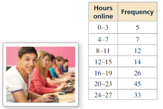
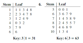
The frequency table shows the results of a survey that asked people how many hours they spend online per week. Display the data in a histogram. Describe the shape of the distribution.
Answer:
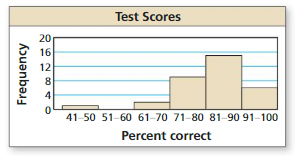
The distribution is skewed right. So most of the data is towards the right.
In Exercises 5 and 6, describe the shape of the distribution of the data. Explain your reasoning.
Question 5.
Answer:
In Exercises 7 and 8, determine which measures of center and variation best represent the data. Explain your reasoning.
Question 7.
Answer:
Question 8.
Answer:
Most of the data is on the right side.
Question 9.
ANALYZING DATA
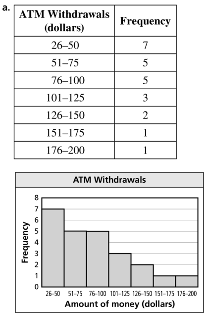
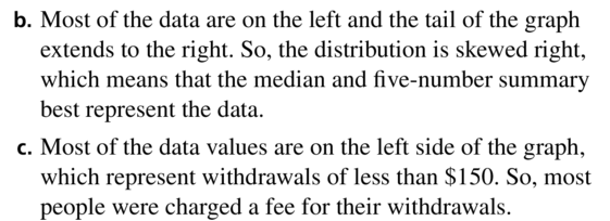
The table shows the last 24 ATM withdrawals at a bank.
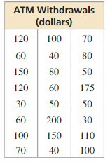
a. Display the data in a histogram using seven intervals beginning with 26–50.
b. Which measures of center and variation best represent the data? Explain.
c. The bank charges a fee for any ATM withdrawal less than $150. How would you interpret the data?
Answer:
Question 10.
ANALYZING DATA
Measuring an IQ is an inexact science. However, IQ scores have been around for years in an attempt to measure human intelligence. The table shows some of the greatest known IQ scores.
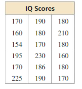
a. Display the data in a histogram using five intervals beginning with 151–166.
b. Which measures of center and variation best represent the data? Explain.
c. The distribution of IQ scores for the human population is symmetric. What happens to the shape of the distribution in part (a) as you include more and more IQ scores from the human population in the data set?
Answer:
a. 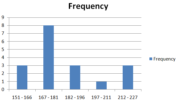
b. Mean and standard deviation best represents the data.
ERROR ANALYSIS In Exercises 11 and 12, describe and correct the error in the statements about the data displayed in the histogram.
Question 11.
Answer:
Question 12.
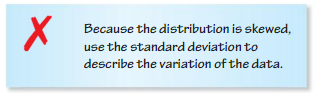
Answer: The weightage of data is on the right side so tail will extend in left side. Thus the distribution is skewed. So we will use the median to describe center and five number summary for the variance.
Question 13.
USING TOOLS
For a large data set, would you use a stem-and-leaf plot or a histogram to show the distribution of the data? Explain.
Answer:
Question 14.
REASONING
For a symmetric distribution, why is the mean used to describe the center and the standard deviation used to describe the variation? For a skewed distribution, why is the median used to describe the center and the ve-number summary used to describe the variation?
Answer:
For Symmetry distribution:
Because the mean corresponds to half of the data, on Q2 the standard deviation is the variation form of the mean.
For Skewed distribution:
Because the median corresponds most likely line where the most data are and the five number summary because the median is closer to either Q1 or Q3 in this case.
Question 15.
COMPARING DATA SETS
The double histogram shows the distributions of daily high temperatures for two towns over a 50-day period. Compare the distributions using their shapes and appropriate measures of center and variation.
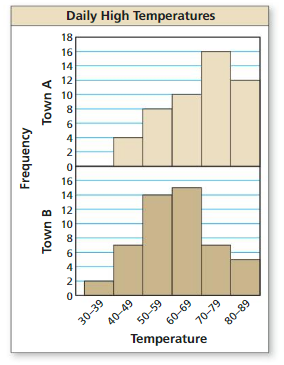
Answer:
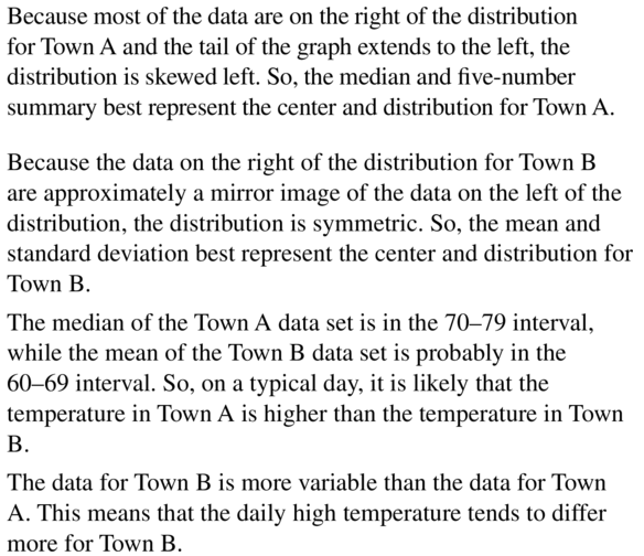
Question 16.
COMPARING DATA SETS
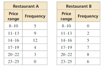
The frequency tables show the numbers of entrées in certain price ranges (in dollars) at two different restaurants. Display the data in a double histogram. Compare the distributions using their shapes and appropriate measures of center and variation.
Answer:
Question 17.
OPEN-ENDED
Describe a real-life data set that has a distribution that is skewed right.
Answer:

Question 18.
OPEN-ENDED
Describe a real-life data set that has a distribution that is skewed left.
Answer: Left skew or negative skew distribution has a long tail in negative direction of the number line.
Question 19.
COMPARING DATA SETS
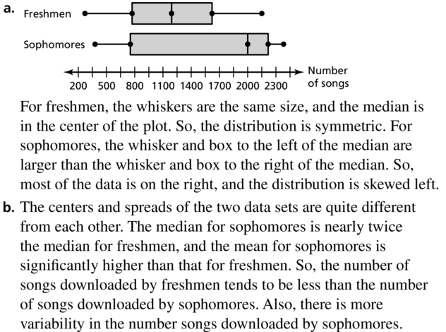
The table shows the results of a survey that asked freshmen and sophomores how many songs they have downloaded on their MP3 players.
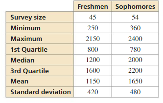
a. Make a double box-and-whisker plot that represents the data. Describe the shape of each distribution.
b. Compare the number of songs downloaded by freshmen to the number of songs downloaded by sophomores.
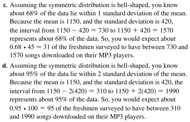
c. About how many of the freshmen surveyed would you expect to have between 730 and 1570 songs downloaded on their MP3 players?
d. If you survey100 more freshmen, about how many would you expect to have downloaded between 310 and 1990 songs on their MP3 players?
Answer:
Question 20.
COMPARING DATA SETS
You conduct the same survey as in Exercise 19 but use a different group of freshmen. The results are as follows.Survey size: 60; minimum: 200; maximum: 2400; 1st quartile: 640; median: 1670; 3rd quartile: 2150; mean: 1480; standard deviation: 500
a. Compare the number of songs downloaded by this group of freshmen to the number of songs downloaded by sophomores.
b. Why is the median greater than the mean for this group of freshmen?
Answer:
Question 21.
REASONING
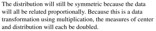
A data set has a symmetric distribution. Every value in the data set is doubled. Describe the shape of the new distribution. Are the measures of center and variation affected? Explain.
Answer:
Question 22.
HOW DO YOU SEE IT?
Match the distribution with the corresponding box-and-whisker plot.
Answer:
Question 23.
REASONING
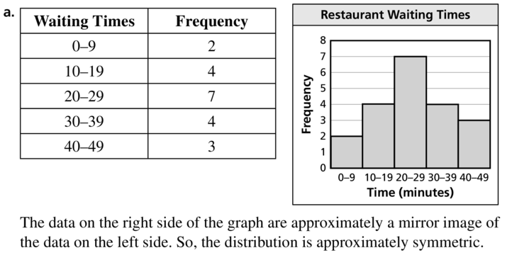
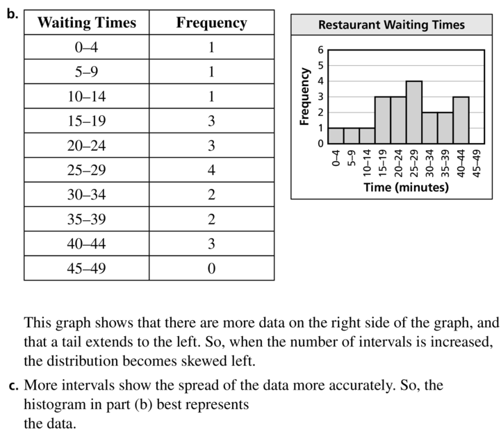
You record the following waiting times at a restaurant.
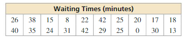
a. Display the data in a histogram using five intervals beginning with 0–9. Describe the shape of the distribution.
b. Display the data in a histogram using 10 intervals beginning with 0–4. What happens when the number of intervals is increased?
c. Which histogram best represents the data? Explain your reasoning.
Answer:
Question 24.
THOUGHT PROVOKING
The shape of a bimodal distribution is shown. Describe a real-life example of a bimodal distribution.
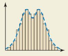
Answer: The real-life example of a bimodal distribution is the number of customers who visit a restaurant each hour since people tend to eat out during two distinct times: lunch and dinner. This underlying human behavior is what causes the bimodal distribution.
Maintaining Mathematical Proficiency
Find the domain of the function.(Section 10.1)
Question 25.
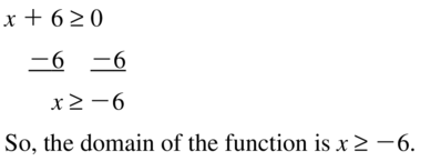
f(x) = \(\sqrt{x+6}\)
Answer:
Question 26.
f(x) = \(\sqrt{2x}\)
Answer:
2x ≥ 0
x ≥ 0
So, the domain of the function is x ≥ 0.
Question 27.
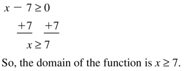
f(x) = \(\frac{1}{4} \sqrt{x-7}\)
Answer:
Data Analysis and Displays Study Skills: Studying for Finals
11.1–11.3What Did YouLearn?
Core Vocabulary
Core Concepts
Mathematical Practices
Question 1.
Exercises 15 and 16 on page 590 are similar. For each data set, is the outlier much greater than or much less than the rest of the data values? Compare how the outliers affect the means. Explain why this makes sense.
Answer:
Question 2.
In Exercise 18 on page 605, provide a possible reason for why the distribution is skewed left.
Answer:

Data Analysis and Displays 1.1–11.3 Quiz
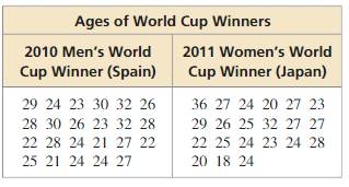
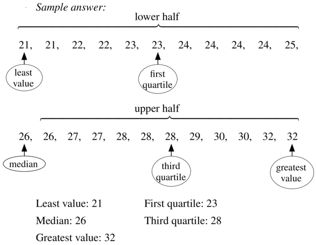
Find the mean, median, and mode of the data set. Which measure of center best represents the data? Explain.(Section 11.1)
Question 1.
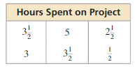
Answer:
Mean = 3
Median = 3.25
Mode = 3.5
Median best represents the data.
Explanation:
Mean = \(\frac { 3.5 + 5 + 2.5 + 3 + 3.5 + 0.5 }{ 6 } \) = 3
Arrange data 0.5, 2.5, 3, 3.5, 3.5, 5
Median = 3 + 3.5/2 = 3.25
Mode = 3.5
Question 2.
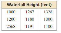
Answer:
Mean = 1314.8
Median = 1191
Mode = 1000
Median best represents the data.
Explanation:
Mean = \(\frac { 1000 + 1200 + 2568 + 1267 + 1180 + 1191 + 1328 + 1000 + 1100 }{ 9 } \) = 1314.8
Arrange data 1000, 1000, 1100, 1180, 1191, 1200, 1267, 1328, 2568
Median = 1191
Mode = 1000
Find the range and standard deviation of each data set. Then compare your results.(Section 11.1)
Question 3.
Absent students during a week of school
Female: 6, 2, 4, 3, 4
Male: 5, 3, 6, 6, 9
Answer:
The range of male is greater than the range of female.
The standard deviation of male is also greater than the female.
Explanation:
Range of female = 6 – 2 = 4
Mean of female = \(\frac { 6 + 2 + 4 + 3 + 4 }{ 5 } \) = 3.8
| x | μ | x – μ | (x – μ)² |
|---|---|---|---|
| 6 | 3.8 | 2.2 | 4.84 |
| 2 | 3.8 | -1.8 | 3.24 |
| 4 | 3.8 | 0.2 | 0.04 |
| 3 | 3.8 | -0.8 | .64 |
| 4 | 3.8 | 0.2 | 0.04 |
Variance = \(\frac { 4.84 + 3.24 + 0.04+ 0.64 + 0.04 }{ 5 } \) = 1.76
Standard deviation = 1.32
Range of male = 9 – 3 = 6
Mean of male = \(\frac { 5 + 3 + 6 + 6 + 9 }{ 5 } \) = 5.8
| x | μ | x – μ | (x – μ)² |
|---|---|---|---|
| 5 | 5.8 | -0.8 | 0.64 |
| 3 | 5.8 | -2.8 | 7.84 |
| 6 | 5.8 | 0.2 | 0.04 |
| 6 | 5.8 | 0.2 | 0.04 |
| 9 | 5.8 | 3.2 | 10.24 |
Variance = \(\frac { 0.64 + 7.84 + 0.04 + 0.04 + 10.24 }{ 5 } \) = 3.76
Standard deviation = 1.93
Question 4.
Numbers of points scored
Juniors: 19, 15, 20, 10, 14, 21, 18, 15
Seniors: 22, 19, 29, 32, 15, 26, 30, 19
Answer:
Seniors have the highest range, mean and standard deviation when compared with juniors.
Explanation:
Range of juniors = 21 – 10 = 11
Mean of juniors = \(\frac { 19 + 15 + 20 + 10 + 14 + 21 + 18 + 15 }{ 8 } \) = 16.5
| x | μ | x – μ | (x – μ)² |
|---|---|---|---|
| 19 | 16.5 | 2.5 | 6.25 |
| 15 | 16.5 | -1.5 | 2.25 |
| 20 | 16.5 | 3.5 | 12.25 |
| 10 | 16.5 | -6.5 | 45.25 |
| 14 | 16.5 | -2.5 | 6.25 |
| 21 | 16.5 | 4.5 | 20.25 |
| 18 | 16.5 | 1.5 | 2.25 |
| 15 | 16.5 | -1.5 | 2.25 |
Variance = \(\frac { 6.25 + 2.25 + 12.25 + 45.25 + 6.25 + 20.25 + 2.25 + 2.25 }{ 8 } \) = 12.125
Standard deviation = 3.48
Range of seniors = 32 – 15 = 17
Mean of seniors = \(\frac { 22 + 19 + 29 + 32 + 15 + 26 + 30 + 19 }{ 8 } \) = 24
| x | μ | x – μ | (x – μ)² |
|---|---|---|---|
| 22 | 24 | -2 | 4 |
| 19 | 24 | -5 | 25 |
| 29 | 24 | 5 | 25 |
| 32 | 24 | 8 | 64 |
| 15 | 24 | -9 | 81 |
| 26 | 24 | 2 | 4 |
| 30 | 24 | 6 | 36 |
| 19 | 24 | -5 | 25 |
Variance = \(\frac { 4 + 25 + 25 + 64 + 81 + 4 + 36 + 25 }{ 8 } \) = 33
Standard deviation = 5.7
Make a box-and-whisker plot that represents the data.(Section 11.2)
Question 5.
Ages of family members:
60, 15, 25, 20, 55, 70, 40, 30
Answer:
Median: 35
Minimum: 15
Maximum: 70
First quartile: 21.25
Third quartile: 58.75
Interquartile Range: 37.5
Question 6.
Minutes of violin practice:
20, 50, 60, 40, 40, 30, 60, 40, 50, 20, 20, 35
Answer:
Median: 40
Minimum: 20
Maximum: 60
First quartile: 22.5
Third quartile: 50
Interquartile Range: 27.5
Question 7.
Display the data in a histogram. Describe the shape of the distribution. (Section 11.3)
Answer:
The shape is skewed right. As the most of the data is on the right.
Question 8.
The table shows the prices of eight mountain bikes in a sporting goods store. (Section 11.1 and Section 11.2)
![]()
a. Find the mean, median, mode, range, and standard deviation of the prices.
b. Identify the outlier. How does the outlier affect the mean, median, and mode?
c. Make a box-and-whisker plot that represents the data. Find and interpret the interquartile range of the data. Identify the shape of the distribution.
d. Find the mean, median, mode, range, and standard deviation of the prices when the store offers a 5% discount on all mountain bikes.
Answer:
a. Mean = 122, Median = 149.5, Mode = 98, Range = 116, Standard deviation = 36
b. Outlier = 211, mean and median decreases and mode remains same
c. 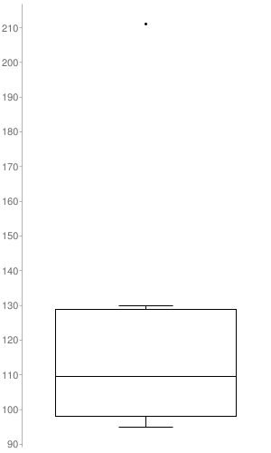
Interquartile Range: 30.75
d. Mean = 115.9, Median = 142.025, Mode = 93.1, Range = 116, Standard deviation = 36
Explanation:
a. Mean = \(\frac { 98 + 119 + 95 + 211 + 130 + 98 + 100 + 125 }{ 8 } \) = 122
Arrange the data 95, 98, 98, 100, 119, 125, 130, 211
Median = 149.5
Mode = 98
Range = 211 – 95 = 116
| x | μ | x – μ | (x – μ)² |
|---|---|---|---|
| 98 | 122 | -24 | 576 |
| 119 | 122 | -3 | 9 |
| 95 | 122 | -27 | 729 |
| 211 | 122 | 89 | 7921 |
| 130 | 122 | 8 | 64 |
| 98 | 122 | -24 | 576 |
| 100 | 122 | -22 | 484 |
| 125 | 122 | 3 | 9 |
Variance = \(\frac { 576 + 9 + 729 + 7921 + 64 + 576 + 484 + 9 }{ 8 } \) = 1296
Standard deviation = 36
b. Mean without outlier = \(\frac { 98 + 119 + 95 + 130 + 98 + 100 + 125 }{ 7 } \) = 109.28
Median without outlier = 100
Mode without outlier = 98
d. Apply 5% discount on mean, median and mode. It does not affect change on standard deviation and range.
Mean = 115.9, Median = 142.025, Mode = 93.1, Range = 116, Standard deviation = 36
Question 9.
The table shows the times of 20 presentations. (Section 11.3)
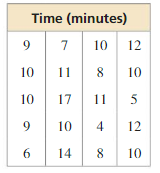
a. Display the data in a histogram using five intervals beginning with 3–5.
b. Which measures of center and variation best represent the data? Explain.
c. The presentations are supposed to be 10 minutes long. How would you interpret these results?
Answer:
a. 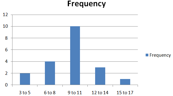
The data is symmetrical
b. Mean and standard deviation best represents the data.
Lesson 11.4 Two-Way Tables
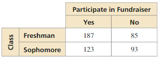
Essential Question How can you read and make a two-way table?
EXPLORATION 1
Reading a Two-Way Table
Work with a partner. You are the manager of a sports shop. The two-way tables show the numbers of soccer T-shirts in stock at your shop at the beginning and end of the selling season. (a) Complete the totals for the rows and columns in each table. (b) How would you alter the number of T-shirts you order for next season? Explain your reasoning.
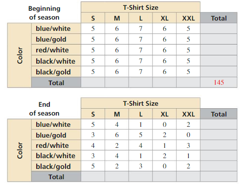
Answer:
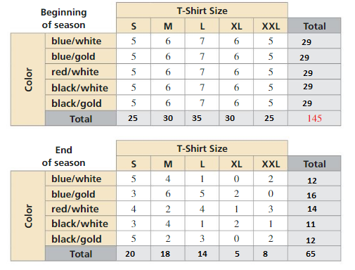
Order more L’s and XL & XXL because these sizes/colors have zero or only 1 left.
EXPLORATION 2
Making a Two-Way Table
Work with a partner. The three-dimensional bar graph shows the numbers of hours students work at part-time jobs.
a. Make a two-way table showing the data. Use estimation to find the entries in your table.
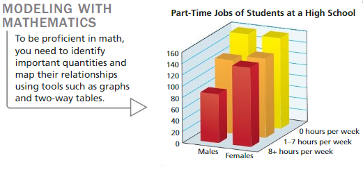
Answer:
| Boys | Girls | Total | |
| 0 hours per week | 150 | 150 | 300 |
| 1-7 hours per week | 115 | 120 | 235 |
| 8+ hours per week | 70 | 110 | 180 |
| Total | 335 | 380 | 715 |
b. Write two observations that summarize the data in your table.
Answer:
300 girls and boys both work about the same when less than 8 hours. 40 of girls is more than boys when 8 hours.
Communicate Your Answer
Question 3.
How can you read and make a two-way table?
Answer: A two way table displays two categories of data collected from the same source. You randomly survey students in your school about their grades on the last test and whether they studies for the test. The two way table shows your results. Each entry in the table is called a joint frequency. The sums of rows and columns in a two way table are called marginal frequencies.
Monitoring Progress
Question 1.
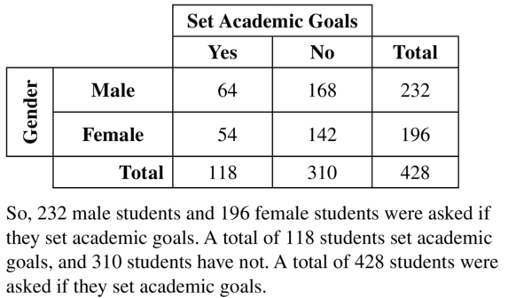
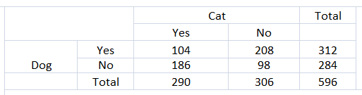
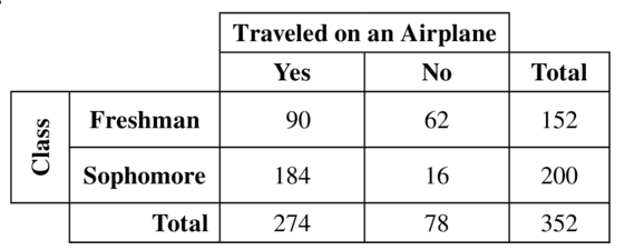
You conduct a technology survey to publish on your school’s website. You survey students in the school cafeteria about the technological devices they own. The results are shown in the two-way table. Find and interpret the marginal frequencies.
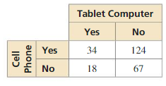
Answer:
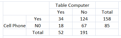
158 cell phones are responded
85 Cell Phones are not responded
52 table computers are responded
191 table computer are not responded.
Question 2.
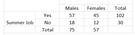
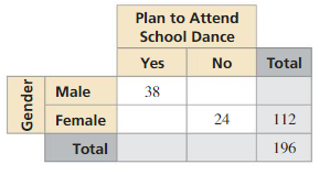
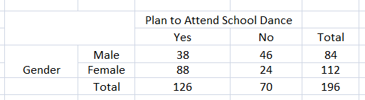
You survey students about whether they are getting a summer job. Seventy-five males respond, with 18 of them responding “no.” Fifty-seven females respond, with 45 of them responding “yes.” Organize the results in a two-way table. Include the marginal frequencies.
Answer:
Question 3.
Use the survey results in Monitoring Progress Question 2 to make a two-way table that shows the joint and marginal relative frequencies. What percent of students are not getting a summer job?
Answer:
Total number of students = 75 + 57 = 132
Number of students not getting summer job = 30
Percent of students are not getting a summer job = 30/132 = 22.72%
Question 4.
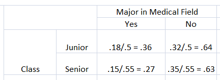
Use the survey results in Example 3 to make a two-way table that shows the conditional relative frequencies based on the row totals. Given that a student is a senior, what is the conditional relative frequency that he or she is planning to major in a medical field?
Answer:
Question 5.
Using the results of the survey in Monitoring Progress Question 1, is there an association between owning a tablet computer and owning a cell phone? Explain your reasoning.
Answer:
Two-Way Tables 11.4 Exercises
Vocabulary and Core Concept Check
Question 1.
COMPLETE THE SENTENCE
Each entry in a two-way table is called a(n) __________.
Answer:
![]()
Question 2.
WRITING
When is it appropriate to use a two-way table to organize data?
Answer: A two-way table can be used for collecting information on things that have different types of categories.
Question 3.
VOCABULARY
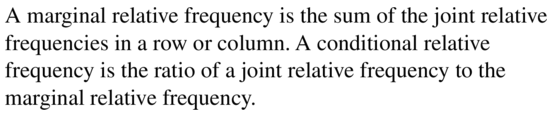
Explain the relationship between joint relative frequencies, marginal relative frequencies, and conditional relative frequencies.
Answer:
Question 4.
WRITING
Describe two ways you can find conditional relative frequencies.
Answer:
You can find a conditional relative frequency using a row total OR a column total of a two way table.
Monitoring Progress and Modeling with Mathematics
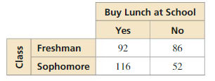
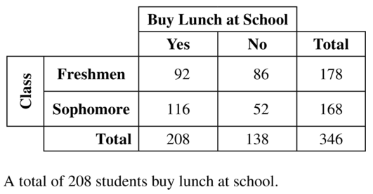
You conduct a survey that asks 346 students whether they buy lunch at school. In Exercises 5–8, use the results of the survey shown in the two-way table.
Question 5.
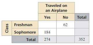
How many freshmen were surveyed?
Answer:
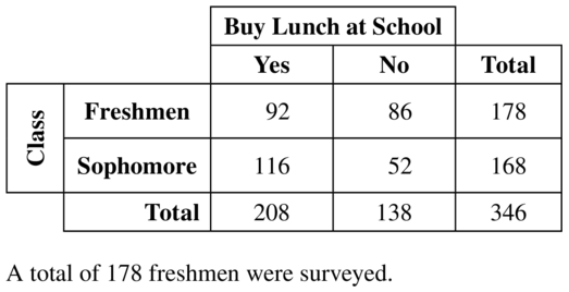
Question 6.
How many sophomores were surveyed?
Answer:
168 sophomores are surveyed.
Question 7.
How many students buy lunch at school?
Answer:
Question 8.
How many students do not buy lunch at school?
Answer:
138 students do not buy luch at school.
In Exercises 9 and 10, find and interpret the marginal frequencies.
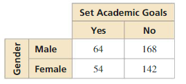
Question 9.
Answer:
Question 10.
Answer:
Question 11.
USING TWO-WAY TABLES
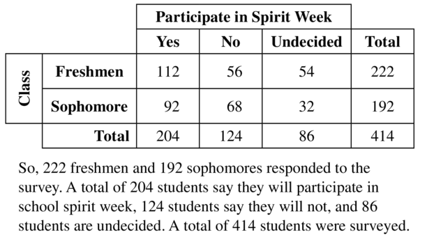
You conduct a survey that asks students whether they plan to participate in school spirit week. The results are shown in the two-way table. Find and interpret the marginal frequencies.
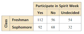
Answer:
Question 12.
USING TWO-WAY TABLES
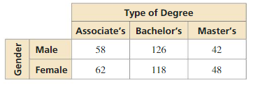
You conduct a survey that asks college-bound high school seniors about the type of degree they plan to receive. The results are shown in the two-way table. Find and interpret the marginal frequencies.
Answer:
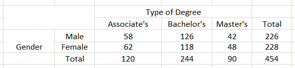
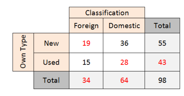
So, 120 associates plan to recieve, 244 bachelor’s plan to recieve and 90 master’s plan to recieve. 226 male plan to recieve and 228 female plan to recieve.
USING STRUCTURE In Exercises 13 and 14, complete the two-way table..
Question 13.
Answer:
Question 14.
Answer:
Question 15.
MAKING TWO-WAY TABLES
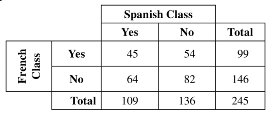
You conduct a survey that asks 245 students in your school whether they have taken a Spanish or a French class. One hundred nine of the students have taken a Spanish class, and 45 of those students have taken a French class. Eighty-two of the students have not taken a Spanish or a French class. Organize the results in a two-way table. Include the marginal frequencies.
Answer:
Question 16.
MAKING TWO-WAY TABLES
A car dealership has 98 cars on its lot. Fifty-five of the cars are new. Of the new cars, 36 are domestic cars. There are 15 used foreign cars on the lot. Organize this information in a two-way table. Include the marginal frequencies. In Exercises 17 and 18, make a two-way table that shows the joint and marginal relative frequencies.
Answer:
In Exercises 17 and 18, make a two-way table that shows the joint and marginal relative frequencies.
Question 17.
Answer:
Question 18.
Answer:
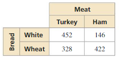
Question 19.
USING TWO-WAY TABLES
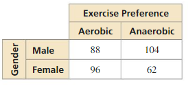
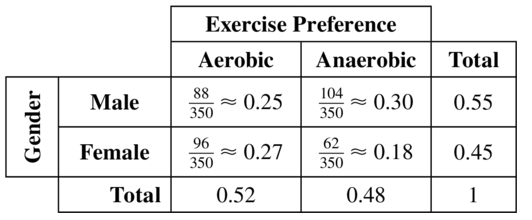
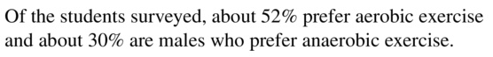
Refer to Exercise 17. What percent of students prefer aerobic exercise? What percent of students are males who prefer anaerobic exercise?
Answer:
Question 20.
USING TWO-WAY TABLES
Refer to Exercise 18. What percent of the sandwiches are on wheat bread? What percent of the sandwiches are turkey on white bread?
Answer:
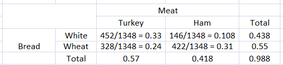
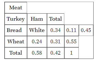
Percentage of sandwiches on wheat bread is 55%
Percentage of sandwiches are turkey on white bread is 24%
Explanation:
ERROR ANALYSIS In Exercises 21 and 22, describe and correct the error in using the two-way table.
Question 21.
Answer:
Question 22.
Answer:
Question 23.
USING TWO-WAY TABLES
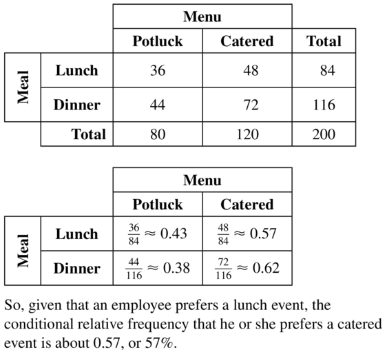
A company is hosting an event for its employees to celebrate the end of the year. It asks the employees whether they prefer a lunch event or a dinner event. It also asks whether they prefer a catered event or a potluck. The results are shown in the two-way table. Make a two-way table that shows the conditional relative frequencies based on the row totals. Given that an employee prefers a lunch event, what is the conditional relative frequency that he or she prefers a catered event?
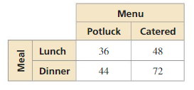
Answer:
Question 24.
USING TWO-WAY TABLES
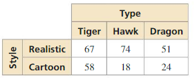
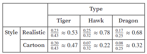
The two-way table shows the results of a survey that asked students about their preference for a new school mascot. Make a two-way table that shows the conditional relative frequencies based on the column totals. Given that a student prefers a hawk as a mascot, what is the conditional relative frequency that he or she prefers a cartoon mascot?
Answer:
Explanation:
Total number of observations = 67 + 74 + 51 + 58 + 18 + 24 = 292
For instance, the joint relative frequency of mascot of realiastic style of tiger type is 67/292 = 0.23
The correct calculation is
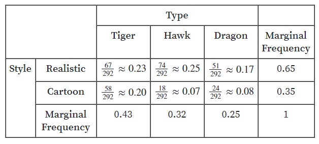
Next, divide the joint relative frequencies by the marginal relative frequencies on the column totals.
The conditional relative frequency that the students prefer a cartoon mascot that is a hawk is 0.22
Question 25.
ANALYZING TWO-WAYTABLES
You survey college-bound seniors and find that 85% plan to live on campus, 35% plan to have a car while at college, and 5% plan to live off campus and not have a car. Is there an association between living on campus and having a car at college? Explain.
Answer:
Question 26.
ANALYZING TWO-WAYTABLES
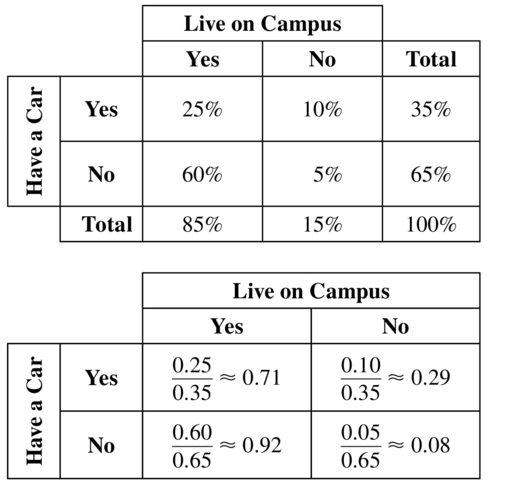
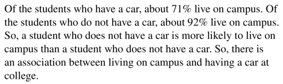
You survey students and find that 70% watch sports on TV, 48% participate in a sport, and 16% do not watch sports on TV or participate in a sport. Is there an association between participating in a sport and watching sports on TV? Explain.
Answer:
Use the given information to make a two-way table. Use reasoning to find the missing joint & marginal relative frequencies. Note that the total in row & column is 100%
Use conditional relative frequencies based on the column totals to determine whether there is an association:
Of the students who participate in sports, about 71% watch sports. Of the students who do not participate in sports, about 69% watch sports. It appears that students those who participate & those who do not participate in sports are equally likely to watch sports.
therefore, there is no association between participating in sports & watching sports in a tv.
Question 27.
ANALYZING TWO-WAY TABLES
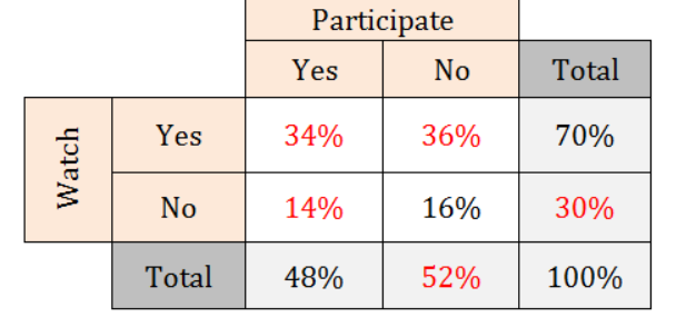
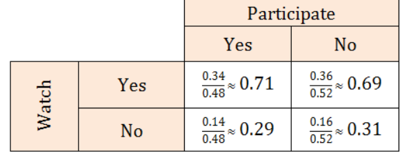
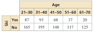
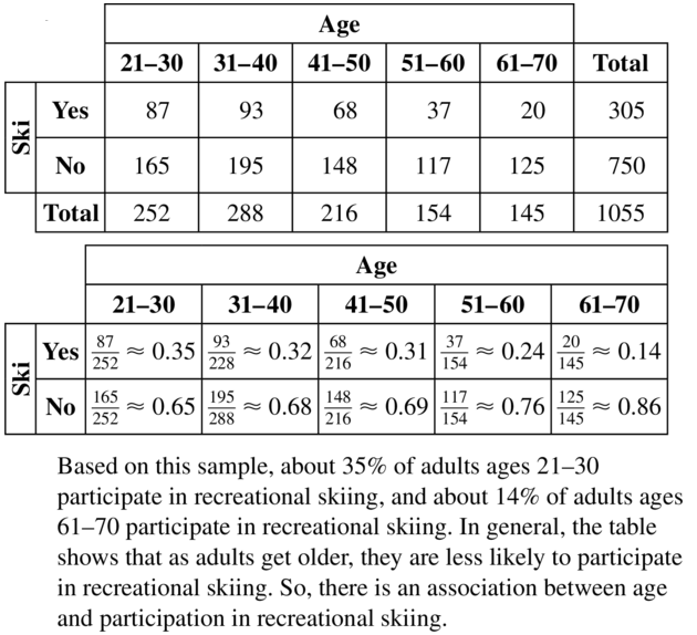
The two-way table shows the results of a survey that asked adults whether they participate in recreational skiing. Is there an association between age and recreational skiing?
Answer:
Question 28.
ANALYZING TWO-WAY TABLES
Refer to Exercise 12. Is there an association between gender and type of degree? Explain.
Answer:
Question 29.
WRITING
Compare Venn diagrams and two-way tables.
Answer:
Question 30.
HOW DO YOU SEE IT?
The graph shows the results of a survey that asked students about their favorite movie genre.
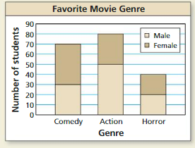
a. Display the given information in a two-way table.
b. Which of the data displays do you prefer? Explain.
Answer:
a. 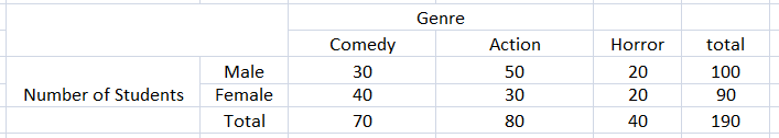
B. I prefer a two-way table. Because it is easy to read the information from a two way table.
Question 31.
PROBLEM SOLVING
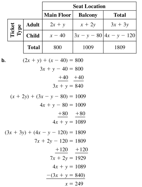
A box office sells 1809 tickets to a play, 800 of which are for the main floor. The tickets consist of 2x + y adult tickets on the main floor, x – 40 child tickets on the main floor, x + 2y adult tickets in the balcony, and 3x – y – 80 child tickets in the balcony.
a. Organize this information in a two-way table.
b. Find the values of x and y.
c. What percent of tickets are adult tickets?
d. What percent of child tickets are balcony tickets?
Answer:
Question 32.
THOUGHT PROVOKING
Compare “one-way tables” and “two-way tables.” Is it possible to have a “three-way table?” If so, give an example of a three-way table.
Answer:
One way tables represent data for a single variable while two way tables present two different categories.
Yes it is possible to have a three way table if one of the categories have another subcategory.
An example would be:
Maintaining Mathematical Proficiency
Tell whether the table of values represents a linear, an exponential, or a quadratic function. (Section 8.6)
Question 33.
Answer:
Question 34.
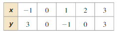
Answer:
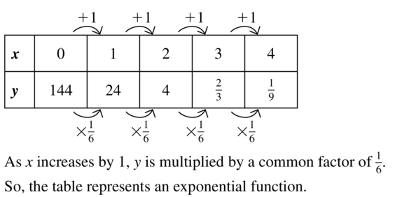
As x increases by -1. The table represents an exponential function.
Lesson 11.5 Choosing a Data Display
Essential Question How can you display data in a way that helps you make decisions?
EXPLORATION 1
Displaying Data
Work with a partner. Analyze the data and then create a display that best represents the data. Explain your choice of data display.
a. A group of schools in New England participated in a 2-month study and reported 3962 animals found dead along roads.
birds: 307
mammals: 2746
amphibiAnswer: 145
reptiles: 75
unknown: 689
Answer:
Total number of animals found dead = 3962
For 307 birds = 307/3962 × 360 = 29.9°
For 2746 mammals = 2746/3962 × 360 = 249.5°
For 145 amphibians = 145/3962 × 360 = 13.17°
For 75 reptiles = 75/3962 × 360° = 6.8°
For 689 unknown = 689/3962 × 360° = 62.6°
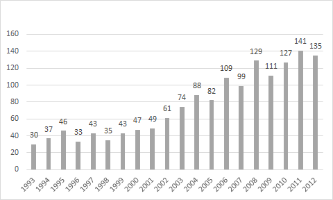
b. The data below show the numbers of black bears killed on a state’s roads from 1993 to 2012.
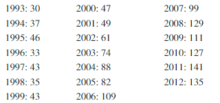
Answer:
The bar graph is used to present this data since it is very good for the comparison of different categories.
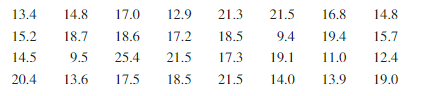
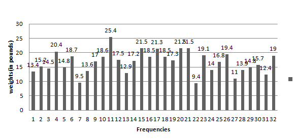
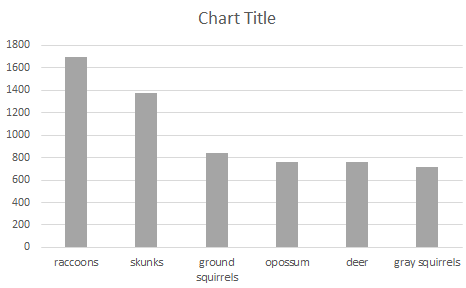
c. A 1-week study along a 4-mile section of road found the following weights (in pounds) of raccoons that had been killed by vehicles.
Answer:
The bar graph is used to present this data since it is very good for the comparison of different categories.
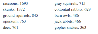
d. A yearlong study by volunteers in California reported the following numbers of animals killed by motor vehicles.
Answer:
Communicate Your Answer
Question 2.
How can you display data in a way that helps you make decisions?
Answer: Data visualization is a way to display the data that helps us in making decisions.
Question 3.
Use the Internet or some other reference to find examples of the following types of data displays.
bar graph
circle graph
scatter plot
stem-and-leaf plot
pictograph
line graph
box-and-whisker plot
histogram
dot plot
Answer:
Bar Graph: Bar graph is one of the most common data displays. It is also known as the column charts.
Example:
Circle graph: It is also known as pie chart. Pie chart represents parts of a whole.
Scatter plot: A scatter plot is a data visualization type used to analyze the correlation between variables. The data is plotted on the chart as dots at the intersection of its two values.
stem-and-leaf plot: A stem-and-leaf plot is represented in form of a special table where each first digit or digit of data value is split into a stem and the last digit of data in a leaf.
Pictograph: A pictograph, also known as a pictogram, is the pictorial representation of data using images, icons, or symbols.
Line graph: A line graph is a type of data display that changes the data over time.
box-and-whisker plot
histogram: It is similar to a bar graph that has a different plotting system. Histograms can only be vertical, differently from how bar charts can be both vertical and horizontal.
dot plot: The dot plot is a visual representation of a number line that shows the value that occurs a number of times in data using dots
Monitoring Progress
Tell whether the data are qualitative or quantitative. Explain your reasoning.
Question 1.
telephone numbers in a directory
Answer:
Telephone numbers are numerical. So the data are quantitative.
Question 2.
ages of patients at a hospital
Answer:
Ages are numerical entries. So, the data are quantitative.
Question 3.
lengths of videos on a website
Answer:
The lengths of videos are numerical. So the data are quantitative.
Question 4.
types of flowers at a florist
Answer:
Types of flowers are nonnumerical entries. So the data are qualitative.
Question 5.
Display the data in Example 2(a) in another way.
Answer:
Question 6.
Display the data in Example 2(b) in another way.
Answer:
Question 7.
Redraw the graphs in Example 3 so they are not misleading.
Answer: If you notice on the left axis the numbers do not increase by the same amounts, it goes up 10, 20, 30 etc.
It should go up the same amount each time accurately to show the data.
That is from 3.10 to 3.20 to 3.30 to 3.40 and so on.
Choosing a Data Display 11.5 Exercises
Vocabulary and Core Concept Check
Question 1.
OPEN-ENDED
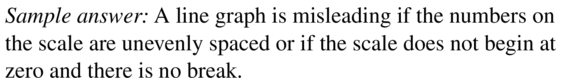
Describe two ways that a line graph can be misleading.
Answer:
Question 2.
WHICH ONE DOESN’T BELONG?
Which data set does not belong with the other three? Explain your reasoning.
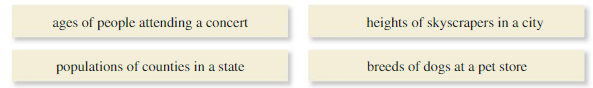
Answer:
breeds of dogs at a pet store
Monitoring Progress and Modeling with Mathematics
In Exercises 3–8, tell whether the data are qualitative or quantitative. Explain your reasoning.
Question 3.
brands of cars in a parking lot
Answer:
Question 4.
weights of bears at a zoo
Answer:
Weights are numerical entries. So the data are quantitative.
Question 5.
budgets of feature films
Answer:

Question 6.
file formats of documents on a computer
Answer:
file formats are non-numeric entries. So the data are qualitative.
Question 7.
shoe sizes of students in your class
Answer:
Question 8.
street addresses in a phone book
Answer:
Street address are non-numeric entries. So the data are qualitative.
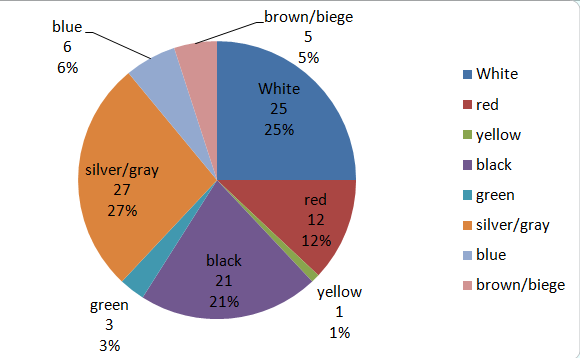
In Exercises 9–12, choose an appropriate data display for the situation. Explain your reasoning.
Question 9.
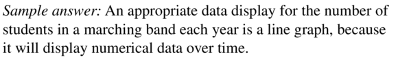
the number of students in a marching band each year
Answer:
Question 10.
a comparison of students’ grades (out of 100) in two different classes
Answer:
An appropriate data display the comparison of student grades. It can be displayed on a pie chart.
Question 11.
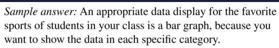
the favorite sports of students in your class
Answer:
Question 12.
the distribution of teachers by age
Answer:
An appropriate data display fo the distribution of teachers age by a bar graph.
In Exercises 13–16, analyze the data and then create a display that best represents the data. Explain your reasoning.
Question 13.
Answer:
Question 14.
Answer:
Question 15.
Answer:
Question 16.
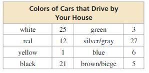
Answer:
Question 17.
DISPLAYING DATA
Display the data in Exercise 13 in another way.
Answer:
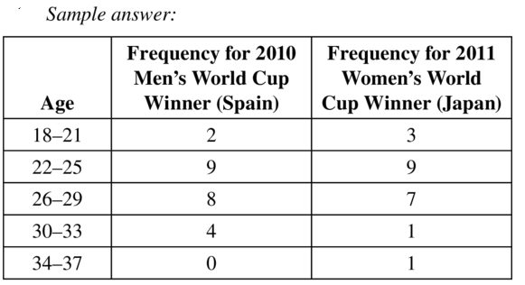
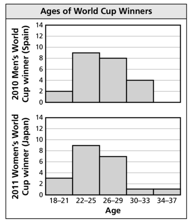
Question 18.
DISPLAYING DATA
Display the data in Exercise 14 in another way.
Answer:
Question 19.
DISPLAYING DATA
Display the data in Exercise 15 in another way.
Answer:
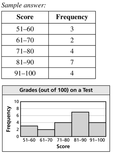
Question 20.
DISPLAYING DATA
Display the data in Exercise 16 in another way.
Answer:
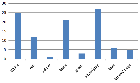
In Exercises 21–24, describe how the graph is misleading. Then explain how someone might misinterpret the graph.
Question 21.
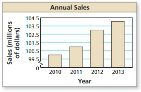
Answer:
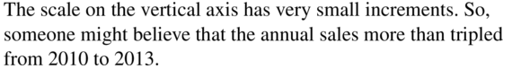
Question 22.
Answer:
The frequency on the vertical axis has very small increment. So, someone might believe that minutes are doubled from 0 – 29 to 60 – 119.
Question 23.
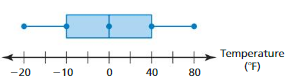
Answer:
Question 24.
Answer:
The increments on the y-axis are not equal.
Question 25.
DISPLAYING DATA
Redraw the graph in Exercise 21 so it is not misleading.
Answer:
Question 26.
DISPLAYING DATA
Redraw the graph in Exercise 22 so it is not misleading.
Answer:
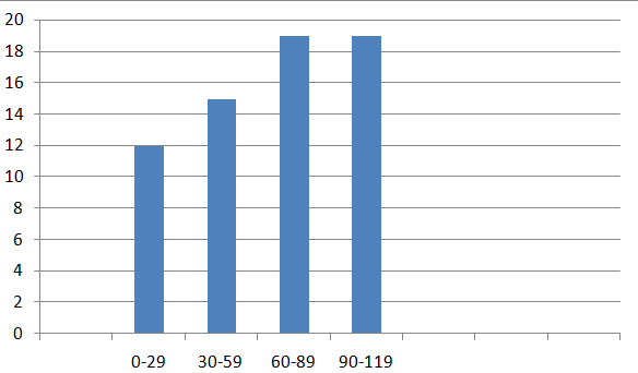
Question 27.
MAKING AN ARGUMENT
A data set gives the ages of voters for a city election. Classmate A says the data should be displayed in a bar graph, while Classmate B says the data would be better displayed in a histogram. Who is correct? Explain.
Answer:
Question 28.
HOW DO YOU SEE IT?
The manager of a company sees the graph shown and concludes that the company is experiencing a decline. What is missing from the graph? Explain why the manager may be mistaken.
Answer:
The y-axis label is missing.
Question 29.
REASONING
A survey asked 100 students about the sports they play. The results are shown in the circle graph.
a. Explain why the graph is misleading.
b. What type of data display would be more appropriate for the data? Explain.
Answer:
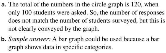
Question 30.
THOUGHT PROVOKING
Use a spreadsheet program to create a type of data display that is not used in this section.
Answer:
Question 31.
REASONING
What type of data display shows the mode of a data set?
Answer:

Maintaining Mathematical Proficiency
Determine whether the relation is a function. Explain.(Section 3.1)
Question 32.
(-5, -1), (-6, 0), (-5, 1), (-2, 2), (3 , 3)
Answer:
Each input has exactly one output. So, the relation is a function.
Question 33.
(0, 1), (4, 0), (8, 1), (12, 2), (16, 3)
Answer:
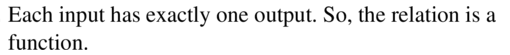
Data Analysis and Displays Performance Task: College Students Study Time
11.4–11.5 What Did You Learn?
Core Vocabulary
Core Concepts
Mathematical Practices
Question 1.
Consider the data given in the two-way table for Exercises 5–8 on page 614. Your sophomore friend responded to the survey. Is your friend more likely to have responded “yes” or “no” to buying a lunch? Explain.
Answer:
Question 2.
Use your answer to Exercise 28 on page 622 to explain why it is important for a company manager to see accurate graphs.
Answer:
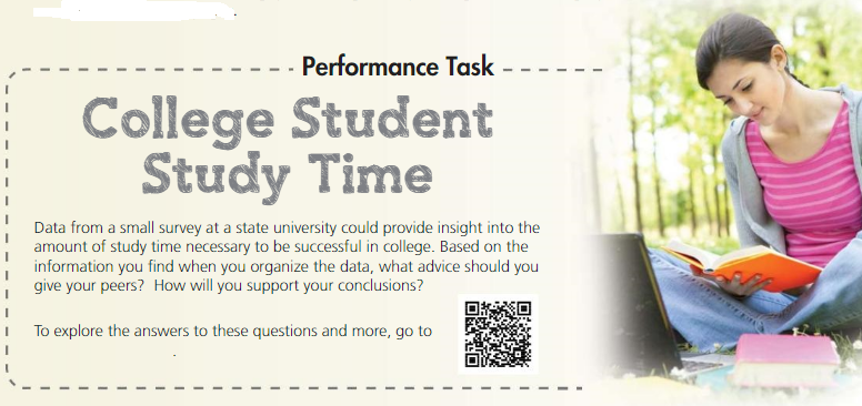
Data Analysis and Displays Chapter Review
11.1 Measures of Center and Variation (pp. 585–592)
Question 1.
Use the data in the example above. You run 4.0 miles on Day 11. How does this additional value affect the mean, median, and mode? Explain.
Answer:
Mean remains the same, median decreases and mode remain the same.
Explanation:
Mean is 4 miles. Median is 4.2 miles and mode is 4.3 miles.
Question 2.
Use the data in the example above. You run 10.0 miles on Day 11. How does this additional value affect the mean, median, and mode? Explain.
Answer:
Mean, median increases and mode remains the same.
Explanation:
Mean = 4.5
Median = 4.3
Mode = 4.3
Find the mean, median, and mode of the data.
Question 3.
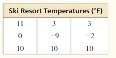
Answer:
Mean = 4, Median = 3, mode = 10
Explanation:
Mean = \(\frac { 11 + 0 + 10 + 3 – 9 + 10 + 3 – 2 + 10 }{ 9 } \) = 4
Arrange the data
-9, -2, 0, 3, 3, 10, 10, 10, 11
Median = 3
Mode = 10
Question 4.
Answer:
Mean = 1.7
Median = 1
Mode = 1
Explanation:
Arrange the data
0, 0, 1, 1, 1, 1, 2, 2, 4, 5
Mean = 1.7
Median = 1
Mode = 1
Find the range and standard deviation of each data set. Then compare your results.
Question 5.
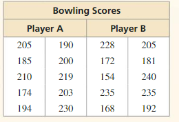
Answer:
Range of part A = 56
The standard deviation of part A = 17.97
Range of part B = 86
The standard deviation of part B = 31.63
Explanation:
Range of part A = 230 – 174 = 56
Mean = \(\frac { 205 + 185 + 210 + 174 + 194 + 190 + 200 + 219 + 203 + 230 }{ 10 } \) = 201
| x | μ | x – μ | (x – μ)² |
|---|---|---|---|
| 205 | 210 | -5 | 25 |
| 185 | 210 | -25 | 625 |
| 210 | 210 | 0 | 0 |
| 174 | 210 | -36 | 1296 |
| 194 | 210 | -16 | 256 |
| 190 | 210 | -20 | 400 |
| 200 | 210 | -10 | 100 |
| 219 | 210 | 9 | 81 |
| 203 | 210 | -7 | 49 |
| 230 | 210 | 20 | 400 |
Variance = \(\frac { 25 + 625 + 1296 + 256 + 400 + 100 + 81 + 49 + 400 }{ 10 } \) = 323.2
Standard deviation = 17.97
Range of part B = 240 – 154 = 86
Mean = \(\frac { 228 + 172 + 154 + 235 + 168 + 205 + 181 + 240 + 235 + 192 }{ 10 } \) = 201
| x | μ | x – μ | (x – μ)² |
|---|---|---|---|
| 228 | 210 | 18 | 324 |
| 172 | 210 | -38 | 1444 |
| 154 | 210 | -56 | 3136 |
| 235 | 210 | 25 | 625 |
| 168 | 210 | -42 | 1764 |
| 205 | 210 | -5 | 25 |
| 181 | 210 | -29 | 841 |
| 240 | 210 | 30 | 900 |
| 235 | 210 | 25 | 625 |
| 192 | 210 | -18 | 324 |
Variance = \(\frac { 324+1444+3136+625+1764+25+841+900+625+324 }{ 10 } \) = 1000.8
Standard deviation = 31.63
Question 6.
Answer:
Range of store A = 110
Standard deviation of store A = 39.37
Range of store B = 150
Standard deviation of store B = 48.08
Explanation:
Range of store A = 250 – 140 = 110
Mean = 190
| x | μ | x – μ | (x – μ)² |
|---|---|---|---|
| 140 | 190 | -50 | 2500 |
| 200 | 190 | 10 | 100 |
| 150 | 190 | -40 | 1600 |
| 250 | 190 | 60 | 3600 |
| 180 | 190 | -10 | 100 |
| 250 | 190 | 60 | 3600 |
| 190 | 190 | 0 | 0 |
| 160 | 190 | -30 | 900 |
Variance = 1550
Standard deviation of store A = 39.37
Range of store B = 310 – 160 = 150
Mean = 232.5
| x | μ | x – μ | (x – μ)² |
|---|---|---|---|
| 225 | 232.5 | -7.5 | 56.25 |
| 260 | 232.5 | 27.5 | 756.25 |
| 190 | 232.5 | -42.5 | 1806.25 |
| 160 | 232.5 | -72.5 | 5256.25 |
| 310 | 232.5 | 77.5 | 6006.25 |
| 190 | 232.5 | -42.5 | 1806.25 |
| 285 | 232.5 | 52.5 | 2756.25 |
| 240 | 232.5 | 7.5 | 56.25 |
Variance = 2312.5
The standard deviation of store B = 48.08
Find the values of the measures shown after the given transformation.
Mean: 109 Median: 104 Mode: 96 Range: 45 Standard deviation: 3.6
Question 7.
Each value in the data set increases by 25
Answer:
mean = 109 + 25 = 134
median = 104 + 25 = 129
mode = 96 + 25 = 121
range = 45
standard deviation = 3.6
Question 8.
Each value in the data set is multiplied by 0.6
Answer:
Mean = 109 x 0.6 = 65.4
Median = 104 x 0.6 = 62.4
Mode = 96 x 0.4 = 38.4
range = 45
standard deviation = 3.6
11.2 Box-and-Whisker Plots (pp. 593–598)
Make a box-and-whisker plot that represents the data. Identify the shape of the distribution.
Question 9.
Ages of volunteers at a hospital:
14, 17, 20, 16, 17, 14, 21, 18, 22
Answer:
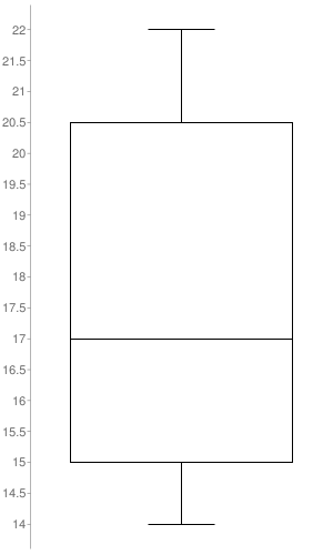
Median: 17
Minimum: 14
Maximum: 22
First quartile: 15
Third quartile: 20.5
Interquartile Range: 5.5
Question 10.
Masses (in kilograms) of lions:
120, 230, 180, 210, 200, 200, 230, 160
Answer:
Median: 200
Minimum: 120
Maximum: 230
First quartile: 165
Third quartile: 225
Interquartile Range: 60
11.3 Shapes of Distributions (pp. 599–606)
Question 11.
The frequency table shows the amounts (in dollars) of money the students in a class have in their pockets.
a. Display the data in a histogram. Describe the shape of the distribution.
b. Which measures of center and variation best represent the data?
c. Compare this distribution with the distribution shown above using their shapes and appropriate measures of center and variation.
Answer:
a. 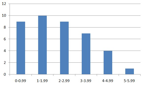
The shape of the distribution is skewed right.
b. Mean and median best represents the data.
11.4 Two-Way Tables (pp. 609–616)
Question 12.
The two-way table shows the results of a survey that asked shoppers at a mall about whether they like the new food court.
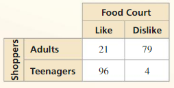
a. Make a two-way table that shows the joint and marginal relative frequencies.
b. Make a two-way table that shows the conditional relative frequencies based on the column totals.
Answer:
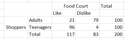
11.5 Choosing a Data Display (pp. 617–622)
Question 13.
Analyze the data in the table at the right and then create a display that best represents the data. Explain your reasoning.
Answer:
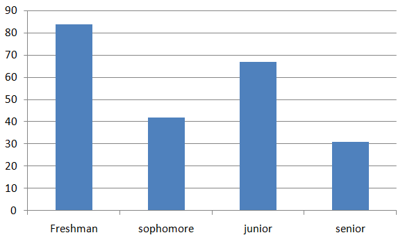
Tell whether the data are qualitative or quantitative. Explain.
Question 14.
heights of the members of a basketball team
Answer:
Hights are numerical entries. So heights of the members of a basketball team are quantitative data.
Question 15.
grade level of students in an elementary school
Answer:
Grade levels are non-numerical entries. So grade level of students in an elementary school are qualittaivedata.
Data Analysis and Displays Chapter Test
Describe the shape of the data distribution. Then determine which measures of center and variation best represent the data.
Question 1.
Answer:
The shape is symmetric. Mean best represents the data.
Question 2.
Answer:
The shape is skewed right. Mean and median best represents the data.
Question 3.
Answer:
The shape is skewed left. Mean and median best represents the data.
Determine whether each statement is always, sometimes, or never true. Explain your reasoning.
a. The sum of the marginal relative frequencies in the “total” row and the “total” column of a two-way table should each be equal to 1.
b. In a box-and-whisker plot, the length of the box to the left of the median and the length of the box to the right of the median are equal.
c. Qualitative data are numerical.
Answer:
a. Always true
b. sometimes true
c. Sometimes true
Explanation:
a. Always true
The marginal relative frequency is the sum of the joint relative frequencies. Each joint relative frequency is the ratio a frequency that is not in the total observations.
Because the total row corresponds to the total observations or 100% of the number of observation, and the total row and column are equal. It is always true that the total row and column are equal
b. sometimes true
The length of each side varies depending to the shape of the distribution of the data represented by the box-and-whisker plot. Only when the distribution is symmetric that the length of each side is equal. Otherwise, the distribution is skewed.
c. Sometimes true
There are qualitative data that appears to be numerical. An example is grade levels. Grade levels appear to be numerical but applying mathematical operations with it do not make sense.
Question 5.
Find the mean, median, mode, range, and standard deviation of the prices.
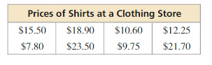
Answer:
Mean = 15, median = 11.425, no mode
Range = 15.7
Standard deviation = 5.46
Explanation:
Mean = \(\frac { 15.5+7.8+18.9+23.5+10.6+9.75+12.25+21.7 }{ 8 } \) = 15
Arrange the data
7.80, 9.75, 10.6, 12.25, 15.5, 18.9, 21.70, 23.50
Median = 10.6 + 12.25/2 = 11.425
No mode
Range = 23.50 – 7.8 = 15.7
| x | μ | x – μ | (x-μ)² |
|---|---|---|---|
| 15.5 | 15 | 0.5 | 0.25 |
| 7.8 | 15 | -7.2 | 51.84 |
| 18.9 | 15 | 3.9 | 15.21 |
| 23.5 | 15 | 8.5 | 72.25 |
| 10.6 | 15 | -4.4 | 19.36 |
| 9.75 | 15 | -5.25 | 27.56 |
| 12.25 | 15 | -2.75 | 7.56 |
| 21.7 | 15 | 6.7 | 44.89 |
Variance = 29.86
Standard deviation = 5.46
Question 6.
Repeat Exercise 5 when all the shirts in the clothing store are 20% off.
Answer:
Mean = 12
Median = 9.14
no mode
range = 15.7
Standard deviation = 5.46
Explanation:
Mean = 15 – 3 = 12
Median = 11.425 – 2.285 = 9.14
no mode
range = 15.7
Standard deviation = 5.46
Question 7.
Which data display best represents the data, a histogram or a stem-and-leaf plot? Explain.
15, 21, 18, 10, 12, 11, 17, 18, 16, 12, 20, 12, 17, 16
Answer:
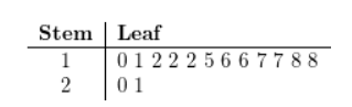
Explanation:
The stem-and-leaf plot would be better than the histogram to represent the given data
This is because of the following:
There are few values in the data
The stem-and-leaf organizes and orders the data
When views sideways, it will resemble the corresponding histogram
Question 8.
The tables show the battery lives (in hours) of two brands of laptops.
a. Make a double box-and-whisker plot that represents the data.
b. Identify the shape of each distribution.
c. Which brand’s battery lives are more spread out? Explain.
d. Compare the distributions using their shapes and appropriate measures of center and variation.
Answer:
a. Brand A

Lowest value = 8.5
highest value = 20.75
lowest quartile = 13.5
upper quartile = 16.75
median = 15
Brand B
Lowest value = 7.8
highest value = 12.5
lowest quartile = 8.5
upper quartile = 10.25
median = 9.25
b. For both brands distribution is skewed right.
c. Brand A having lives more spread out.
d. As distributions are skewed, median should be used as a measure of center and five number summery for measuring variation. For brand A median is 15 while for brand B median is 9.25.
Question 9.
The table shows the results of a survey that asked students their preferred method of exercise. Analyze the data and then create a display that best represents the data. Explain your reasoning.
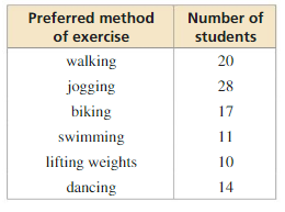
Answer:
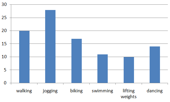
Question 10.
You conduct a survey that asks 271 students in your class whether they are attending the class field trip. One hundred twenty-one males respond 92 of which are attending the field trip. Thirty-one females are not attending the field trip.
a. Organize the results in a two-way table. Find and interpret the marginal frequencies.
b. What percent of females are attending the class field trip?
Answer:
a. 
From the table,
121 male students were surveyed
60 female students were surveyed
271 students were surveyed
211 students will attend the field trip
60 students will not attend the field trip
(b) 119/150 = 0.79 or 79% of the females are attending the class field trip.
Data Analysis and Displays Cumulative Assessment
Question 1.
You ask all the students in your grade whether they have a cell phone. The results are shown in the two-way table. Your friend claims that a greater percent of males in your grade have cell phones than females. Do you support your friend’s claim? Justify your answer.
Answer:
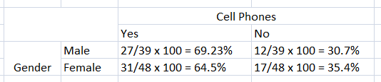
Question 2.
Use the graphs of the functions to answer each question.
a. Are there any values of x greater than 0 where f (x) > h(x)? Explain.
b. Are there any values of x greater than 1 where g(x) > f(x)? Explain.
c. Are there any values of x greater than 0 where g(x) > h(x)? Explain.
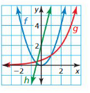
Answer:
a. f(x) is a quadratic function and h(x) is a linear function.
Yes, f(x) > h(x) it is a solution.
b. g(x) is an exponential function and f(x) is a quadratic function.
Yes, g(x) > f(x), is a solution
c. g(x) is an exponential function and h(x) is a linear function.
Yes, g(x) > h(x), is a solution.
Question 3.
Classify the shape of each distribution as symmetric, skewed left, or skewed right.
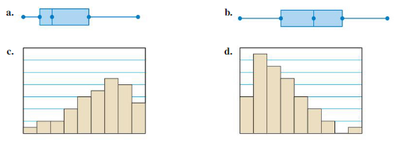
Answer:
a. The distribution is skewed left
b. The distribution is symmetric
c. The distribution is skewed left
d. the distribution is skewed right.
Question 4.
Complete the equation so that the solutions of the system of equations are (-2, 4) and (1, -5).
Answer:
Slope = \(\frac { 4 + 5 }{ 1 + 2 } \) = 3
y – 4 = 3(x + 2)
y – 4 = 3x + 6
y = 3x + 6 + 4
y = 3x + 10
Question 5.
Pair each function with its inverse.
Answer:
y = -3x² and y = √\(\frac { -x }{ 3 } \)
y = -x + 7 and y = -x + 7
y = 2x – 4 and y = 0.5x + 2
y = x² – 5 and y = √x + 5
Explanation:
y = -3x², x² = -y/3
x = √\(\frac { -y }{ 3 } \)
y = -x + 7
-x = y – 7
x = 7 – y
y = 2x – 4
y + 4 = 2x
x = y + 4/2
Question 6.
The box-and-whisker plot represents the lengths (in minutes) of project presentations at a science fair. Find the interquartile range of the data. What does this represent in the context of the situation?
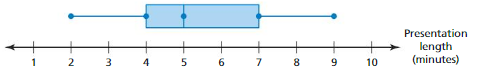
A. 7; The middle half of the presentation lengths vary by no more than 7 minutes.
B. 3; The presentation lengths vary by no more than 3 minutes.
C. 3; The middle half of the presentation lengths vary by no more than 3 minutes.
D. 7; The presentation lengths vary by no more than 7 minutes.
Answer:
C. 3; The middle half of the presentation lengths vary by no more than 3 minutes.
Explanation:
Interquartile range = 7 – 4 = 3
Question 7.
Scores in a video game can be between 0 and 100. Use the data set shown to fill in a value for x so that each statement is true.
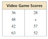
a. When x = ____, the mean of the scores is 45.5.
b. When x = ____, the median of the scores is 47.
c. When x = ____, the mode of the scores is 63.
d. When x = ____, the range of the scores is 71.
Answer:
a. 38
b. 47
c. 63
d. 99
Explanation:
a. Mean = 45.5
Sum = 326 + x
45.5 x 8 = 326 + x
x = 38
b. Arrange the data
28, 36, 42, 48, 52, 57, 63, x
x = 47
Question 8.
Select all the numbers that are in the range of the function shown.
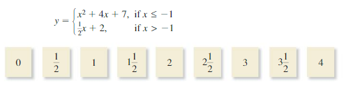
Answer:
y = x² + 4x + 7
This is a quadratic function. To graph this piece lets first create a table of values.
Since the rule states that x ≤ -1, we must use x values less than or equal to -1.
| x | x² + 4x + 7 | simplify | (x,y) |
| -4 | (-4)² + 4(-4) + 7 | 7 | (-4,7) |
| -3 | (-3)² + 4(-3) + 7 | 4 | (-3,4) |
| -2 | (-2)² + 4(-2) + 7 | 3 | (-2,3) |
| -1 | (-1)² + 4(-1) + 7 | 4 | (-1,4) |
The number that are in range of the function are 2, 2 1/2, 3, 3 1/2, 4.
Question 9.
A traveler walks and takes a shuttle bus to get to a terminal of an airport. The function y = D(x) represents the traveler’s distance (in feet) after x minutes.
a. Estimate and interpret D(2).
b. Use the graph to find the solution of the equation D(x) = 3500. Explain the meaning of the solution.
c. How long does the traveler wait for the shuttle bus?
d. How far does the traveler ride on the shuttle bus?
e. What is the total distance that the traveler walks before and after riding the shuttle bus?
Answer:
a. D(2) = 500
b. D(15) = 3500
c. waiting time is 8 minutes
d. The distance covered by the traveler on shuttle bus is 2000 ft
e. The total distance that the traveler walks before and after riding the shuttle bus is 1500 ft
Explanation:
b. D(x) = 3500
D(15) = 3500
c. Waiting time = 12 – 4 = 8
d. Distance covered on shuttle bus = 3000 – 1000 = 2000
e. distance covered by foot = (1000 – 0) + (3500 – 3000) = 1500 ft